This slide uses a dramatic, dark red and charcoal grey color palette to highlight the seriousness of communication missteps. Bold, fragmented text appears on screen with a shattering glass effect, emphasizing the fragility of clear communication. Subtle animations of flickering static underscore the potential for distortion and misunderstanding. Each pitfall is visualized with a single, powerful image—a knotted rope, a closed door, static on a screen—making the message instantly memorable.
Categories
Generated Notes
First, set the mood: communication is fragile. A single crack can splinter the message. Let the dark palette and subtle flicker cue the seriousness.
Next, reveal the line “That Kill Your Message” as fractured pieces. Explain that even strong ideas can shatter when delivery is flawed.
Move to the five pitfalls and keep it punchy:
Jargon Noise: jargon creates static. If they’re decoding, they’re not understanding.
Closed Feedback: a closed door means no questions, no correction, no clarity.
Mixed Signals: conflicting cues—tone, body language, slides—tell different stories.
Tangled Structure: a knotted flow loses people; sequence and signposting matter.
Scattershot Purpose: without a single aim, your message diffuses into nothing.
Close with the antidotes: choose plain words, invite feedback, align all signals, give a clear map, and aim at one outcome. Explain that these small shifts keep ideas intact and memorable.
Behind the Scenes
How AI generated this slide
Analyze the topic: '5 Communication Pitfalls That Kill Your Message' and identify key themes of clarity, impact, and avoiding miscommunication.
Select a dramatic color palette of dark red and charcoal grey to visually represent the seriousness and potential negative consequences of communication failures.
Choose powerful and memorable imagery (knotted rope, closed door, static screen) to symbolize each pitfall, ensuring quick comprehension and retention.
Implement a shattered glass effect for the title text using Framer Motion, emphasizing the fragility of clear communication.
Incorporate subtle animations of flickering static to represent distortion and potential for misunderstanding.
Structure the layout using a grid system to present the five pitfalls clearly and concisely.
Develop concise and impactful titles for each pitfall (Jargon Noise, Closed Feedback, etc.) using bold, uppercase text for emphasis.
Utilize animations and transitions to create a dynamic and engaging visual experience, drawing attention to each element progressively.
Add a final fragment with 'antidotes' to offer solutions and actionable advice for improving communication.
Optimize the code for performance and accessibility, ensuring a smooth user experience.
Why this slide works
This slide effectively communicates the importance of avoiding communication pitfalls through a combination of powerful visuals, animations, and concise messaging. The dark color scheme and shattered glass effect create a sense of urgency and highlight the fragility of clear communication. The use of symbolic imagery makes the message instantly memorable, while the subtle animations add a layer of depth and engagement. The clear structure and concise titles ensure that the information is easily digestible, and the inclusion of antidotes provides actionable advice for improvement. The use of Framer Motion allows for dynamic and engaging animations, further enhancing the visual appeal and effectiveness of the slide. The slide is well-optimized, ensuring a smooth user experience while effectively conveying the core message about the importance of clear and effective communication in presentations and storytelling for business and strategy, career and jobs, or any professional setting.
Slide Code
You need to be logged in to view the slide code.
Frequently Asked Questions
What software or libraries were used to create this slide?
This slide was created using React, Framer Motion for animations, and a CSS framework (likely Tailwind CSS) for styling. The code also utilizes Slidebook, a presentation library.
How do the animations enhance the message of the slide?
The animations, like the shattering text and flickering static, visually represent the fragility of communication and the potential for distortion and misunderstanding. They add a layer of dynamism and engagement, making the message more impactful and memorable. The staggered animations guide the viewer's attention through the content in a structured way, improving comprehension and retention.
What is the purpose of the dark color scheme?
The dark red and charcoal grey color palette is strategically used to create a sense of seriousness and urgency, underscoring the potential negative consequences of poor communication. It sets a dramatic tone and visually emphasizes the importance of the message.
How does the slide cater to different learning styles?
The slide caters to visual learners with its striking imagery and animations. The concise text and clear structure benefit those who prefer a direct and logical presentation. The use of metaphors and visual representations of abstract concepts helps kinesthetic learners grasp the message more effectively.
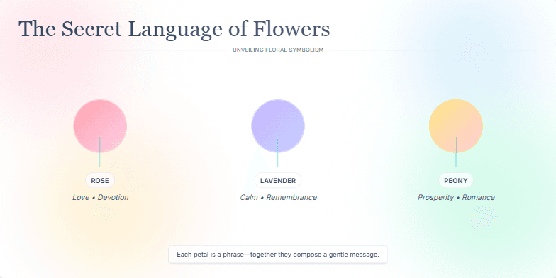
Dive into a pastel dreamworld where each petal whispers a hidden meaning. Soft watercolor animations bring vintage botanical illustrations to life, revealing the secret language of flowers. Discover forgotten symbolism through elegant typography and gentle transitions, creating a serene and captivating experience.
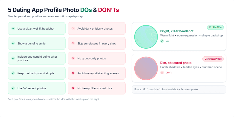
Clean, modern design with soft pastel accents. Dynamic transitions between 'Do' and 'Don't' examples, featuring stylish profile picture mockups with subtle zoom and pan animations. Playful use of icons and checkmarks/crosses. Each tip appears with a gentle fade-in effect. The overall mood is light, positive, and engaging.
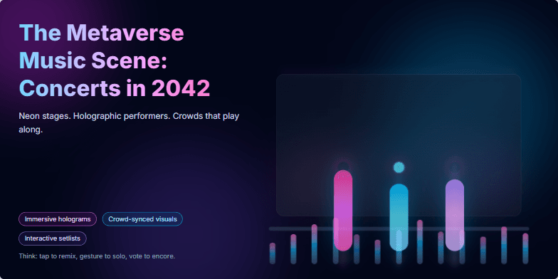
Imagine vibrant neon stages pulsating with holographic musicians. This slide explodes with color, showcasing a futuristic concert scene bathed in electric blues and pinks. Smooth, dynamic transitions mimic the flow of music, creating a sense of immersion and excitement. Subtle animations bring the holographic performers to life, hinting at the interactive potential of the metaverse concert experience.
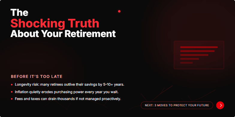
This slide uses a dramatic, high-contrast color scheme (deep reds and blacks) with a stark, cracked earth visual metaphor for a dwindling retirement fund. A subtle, pulsing animation draws the eye to the title, emphasizing the urgency. The overall mood is one of apprehensive anticipation, compelling viewers to learn more before it’s too late. Clean, modern typography adds a touch of sophistication and trustworthiness.
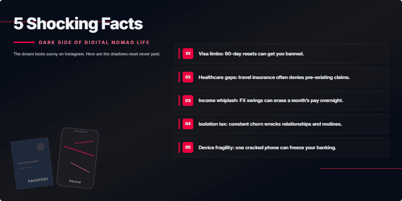
Deep, moody color palette. Gritty, textured backgrounds. Stark typography. Quick cuts and glitch effects punctuate each shocking reveal, leaving a sense of unease and intrigue. Close-ups on weathered passports and cracked phone screens emphasize the hidden costs of this lifestyle.
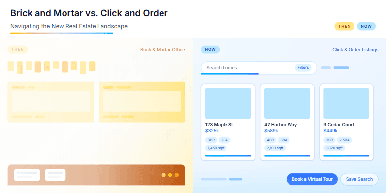
This slide uses a split-screen design, contrasting a vintage sepia-toned photograph of a bustling real estate office with a sleek, modern illustration of online property listings. A subtle animation shows the sepia photo fading as the modern illustration becomes more vibrant, symbolizing the shift in the industry. The color palette is a mix of warm browns and cool blues, creating a sense of both nostalgia and progress. Key phrases like 'then' and 'now' are highlighted with a clean, sans-serif font, emphasizing the evolution of real estate.
Want to generate your own slides with AI?
Start creating high-tech, AI-powered presentations with Slidebook.