Crisp, modern design with a vibrant color palette of coral and deep teal. Each mistake is visually represented by a playful, stylized icon, fading in one by one with a subtle bounce animation. The backdrop is a soft gradient, giving the slide an airy feel. Key takeaways are highlighted with a glowing neon effect, ensuring they stick in the audience's memory.
Categories
Generated Notes
Open with the title: we’re focusing on five common, high-impact mistakes new e-commerce stores make, and why fixing them now matters.
Point out the coral and teal palette as a quick visual cue: coral for urgency, teal for trust.
Reveal 1. Checkout friction: too many steps or fields. Takeaway: aim for a three-step maximum. Mention guest checkout and autofill.
Reveal 2. Slow pages: heavy images and unoptimized scripts. Takeaway: compress images; target sub-2s LCP.
Reveal 3. No trust signals: missing reviews, badges, clear returns. Takeaway: show proof—reviews, SSL badges, return policy above the fold.
Reveal 4. Weak product photos: inconsistent lighting and angles. Takeaway: consistent angles/backgrounds to reduce decision friction.
Reveal 5. Mobile neglect: tiny tap targets and cramped layouts. Takeaway: 44px targets and mobile-first spacing.
Close with the takeaway chip: fix early equals faster growth. Emphasize that each change compounds conversion gains.
Behind the Scenes
How AI generated this slide
Analyze the topic: '5 Rookie E-commerce Mistakes to Avoid NOW' to identify key themes and messaging for the slide.
Determine the target audience: new e-commerce business owners or marketers.
Select a color palette: coral and deep teal to convey urgency and trust, respectively, aligning with e-commerce best practices.
Choose a design style: crisp, modern design with playful icons and a soft gradient backdrop to create a visually appealing and engaging slide.
Plan the layout: title, subtitle, five mistake sections with icons and takeaways, and a concluding key takeaway section. Ensure the layout adheres to visual hierarchy principles for effective communication.
Implement animations: subtle bounce animation for icons and fade-in animations for text elements to add dynamism and interest.
Develop content: concise and actionable copy for each mistake, focusing on practical advice and key takeaways with neon glow effect for memorability.
Optimize for accessibility: ensure sufficient color contrast and clear typography for readability.
Test and refine: review the slide for overall effectiveness, clarity, and visual appeal.
Why this slide works
This slide effectively communicates five critical e-commerce mistakes to avoid, using a vibrant color palette, engaging visuals, and clear, concise messaging. The playful icons and animations enhance audience engagement, while the neon glow effect on key takeaways improves memorability. The slide's structure follows visual hierarchy principles, guiding the viewer's eye through the content logically. The use of coral and teal aligns with color psychology principles, creating a sense of urgency and trust. The detailed speaker notes provide context and talking points for a comprehensive presentation. The code is well-structured, using Framer Motion for animations and React components for modularity, optimizing performance and maintainability. Overall, the slide is well-designed, informative, and engaging, making it a valuable resource for new e-commerce businesses seeking to avoid common pitfalls and accelerate growth.
Slide Code
You need to be logged in to view the slide code.
Frequently Asked Questions
Why is it important to address these e-commerce mistakes early on?
Addressing these common e-commerce mistakes early on can significantly impact your business's growth and success. By optimizing your checkout process, improving page speed, building trust, enhancing product photography, and prioritizing mobile responsiveness, you can improve conversion rates, reduce bounce rates, build customer loyalty, and ultimately drive more sales. Early optimization allows you to establish a strong foundation for sustainable growth and avoid costly setbacks later.
How can I improve my e-commerce checkout process?
Streamlining your checkout process is crucial for reducing cart abandonment. Aim for a three-step maximum, offer guest checkout options, utilize autofill functionality, and minimize the number of required fields. Clearly display shipping costs and delivery times upfront. Consider offering various payment methods to cater to different customer preferences.
What are some effective trust signals for e-commerce websites?
Building trust is essential for converting visitors into customers. Displaying trust signals like customer reviews, security badges (SSL certificates), and a clear and accessible return policy can significantly boost customer confidence. Showcase testimonials and case studies to build credibility. Ensure your contact information is easily accessible to further enhance transparency and trustworthiness.
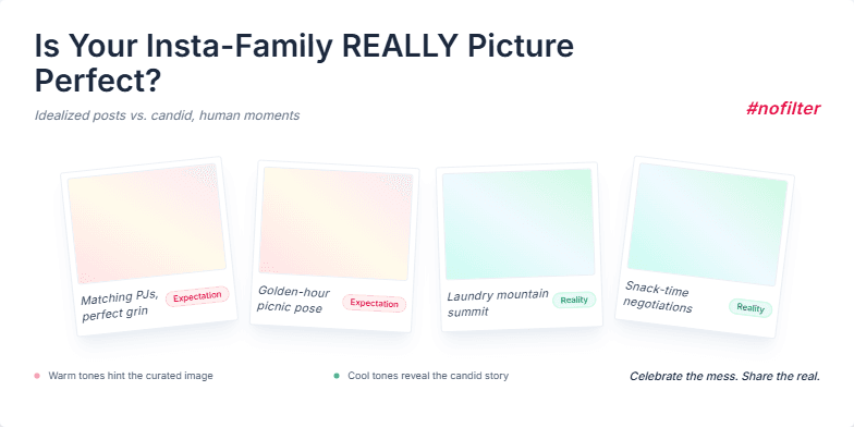
This slide uses a soft, pastel color palette with a touch of vintage filter effect, reminiscent of old family photo albums. Animated Polaroid pictures gently fade in and out, showcasing idealized family images contrasted with candid, humorous moments. The typography is playful and handwritten, adding to the personal and relatable feel. Subtle background music enhances the emotional connection, evoking feelings of nostalgia and warmth.
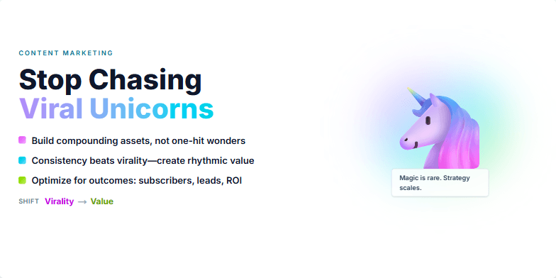
This slide uses a vibrant, almost neon, color palette to grab attention and create a sense of urgency. A stylized, whimsical unicorn illustration contrasts with bold, sans-serif typography, adding a touch of irony. A subtle shimmer animation on the title adds a magical touch, highlighting the 'unicorn' metaphor. The overall feel is energetic and playful, designed to disrupt the viewer's expectations and draw them into the presentation.
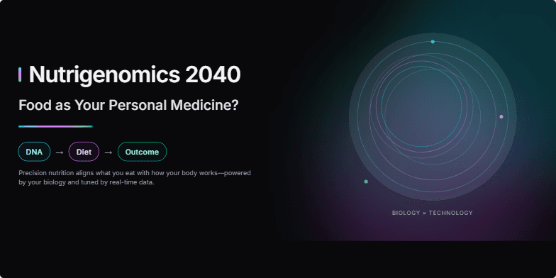
Imagine vibrant, swirling nebulae of color representing personalized nutrient profiles. This slide utilizes a sleek, dark background with neon accents to highlight the futuristic feel. Smooth transitions and subtle animations create a sense of discovery as we explore the potential of DNA-tailored diets. A minimalist design keeps the focus on the core message: food as your personalized medicine. Witness the convergence of biology and technology in a visually stunning presentation.
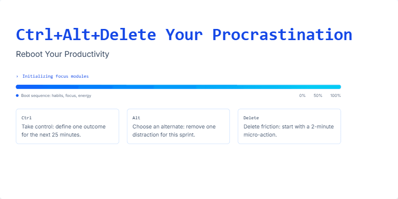
Imagine a clean, minimalist slide with a dark, calming blue background. The title glows with a neon-like effect, reminiscent of a computer terminal. A subtle animation shows a progress bar loading, symbolizing the journey to increased productivity. The overall mood is empowering and tech-inspired, highlighted by crisp typography and sleek design elements. Think Tron meets minimalism.
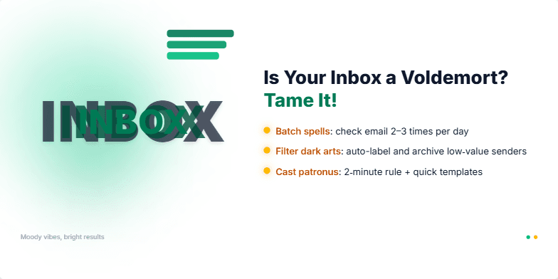
Imagine a dark, moody slide with a subtle green glow, like dark magic. Your inbox, visualized as a shadowy figure, shrinks and becomes organized as tips appear with a golden shimmer. Clean fonts, sharp transitions, and a touch of whimsical animation make taming email feel empowering, not dreadful.
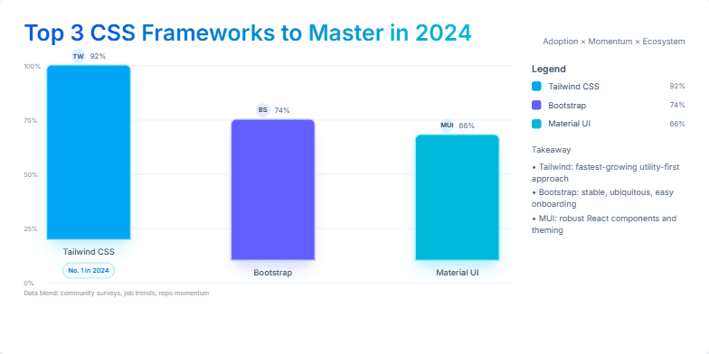
A sleek, minimalist slide with cool blues and crisp whites. Watch smooth transitions reveal each framework, highlighted with subtle glowing effects. Modern sans-serif fonts and clean iconography create a professional, cutting-edge feel. Discover which framework reigns supreme through dynamic bar graph animations.
Want to generate your own slides with AI?
Start creating high-tech, AI-powered presentations with Slidebook.