Is Your Inbox a Black Hole? Conquer Email Chaos Today!
Description provided by the user:
Imagine a minimalist, calming slide bathed in gentle blues and greens. A stylized animation of a paper airplane smoothly transforming into a neatly organized inbox. Clean fonts, airy spacing, and subtle highlight animations on key actionable tips will make this a visually appealing and memorable experience.
Categories
Generated Notes
Open by asking: “Does your inbox feel like a black hole?” Pause to let hands go up or smiles appear.
Point to the title and set the tone: today is about a calm, minimalist way to reclaim your attention.
On the first reveal, highlight the transformation metaphor: a messy stream becomes an organized inbox. Emphasize the goal—flow over constant checking.
Then walk through the three steps:
1. Batch twice daily: schedule two 15-minute windows. Explain that this instantly breaks the habit loop of perpetual checking.
2. Triage with only three actions: Archive, Quick reply under two minutes, or Snooze. Make it binary and frictionless.
3. Use zones: Today, This Week, Later. This prevents your inbox from being a to-do list.
Close with a concrete commitment: ask everyone to block the next two 15-minute email windows on their calendar before the break.
Behind the Scenes
How AI generated this slide
Analyze the topic and context to identify key themes: email management, productivity, minimalism, and calmness.
Select a color palette of blues and greens to evoke a sense of tranquility and focus.
Choose clean, readable fonts and incorporate airy spacing to enhance visual appeal.
Design a stylized animation of a paper airplane transforming into an organized inbox to symbolize the transition from chaos to order.
Develop actionable tips for email management and highlight them with subtle animations to draw attention.
Structure the slide content with clear headings, subheadings, and bullet points for easy comprehension.
Use Framer Motion library for smooth animations and transitions, enhancing user engagement.
Implement a responsive design to ensure optimal viewing across different devices.
Why this slide works
This slide effectively combines visuals, animation, and concise messaging to deliver a compelling presentation on email management. The calming color scheme, clean typography, and strategic use of animation create a visually appealing and memorable experience. The step-by-step approach to conquering email chaos provides practical advice, while the transformation animation reinforces the message of achieving a more organized and productive inbox. The use of Framer Motion ensures smooth and engaging animations, further enhancing the overall impact of the slide. Keywords: email management, productivity, minimalism, animation, Framer Motion, visual design, user experience, responsive design.
Slide Code
You need to be logged in to view the slide code.
Frequently Asked Questions
What is the main purpose of this slide?
The main purpose of this slide is to provide viewers with a concise and visually appealing presentation on how to manage email effectively and overcome inbox chaos. It offers a three-step method to achieve a more organized and productive email experience. Keywords: email management, productivity, inbox zero, time management.
What software libraries or tools were used to create this slide?
The slide was created using Framer Motion for animations and transitions. It also leverages a component-based approach for a clean and maintainable code structure. Keywords: Framer Motion, animation, React, JavaScript, front-end development.
What are the key takeaways for the audience?
The audience should take away a simple, three-step process for email management: batching emails twice daily, triaging emails with quick actions (archive, reply, snooze), and sorting emails into zones (today, this week, later). They are also encouraged to schedule dedicated email time blocks. Keywords: email management, productivity tips, time blocking, inbox organization.
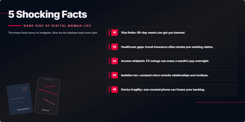
Deep, moody color palette. Gritty, textured backgrounds. Stark typography. Quick cuts and glitch effects punctuate each shocking reveal, leaving a sense of unease and intrigue. Close-ups on weathered passports and cracked phone screens emphasize the hidden costs of this lifestyle.
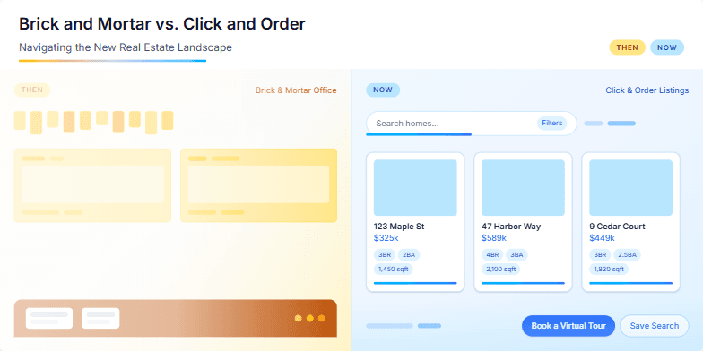
This slide uses a split-screen design, contrasting a vintage sepia-toned photograph of a bustling real estate office with a sleek, modern illustration of online property listings. A subtle animation shows the sepia photo fading as the modern illustration becomes more vibrant, symbolizing the shift in the industry. The color palette is a mix of warm browns and cool blues, creating a sense of both nostalgia and progress. Key phrases like 'then' and 'now' are highlighted with a clean, sans-serif font, emphasizing the evolution of real estate.
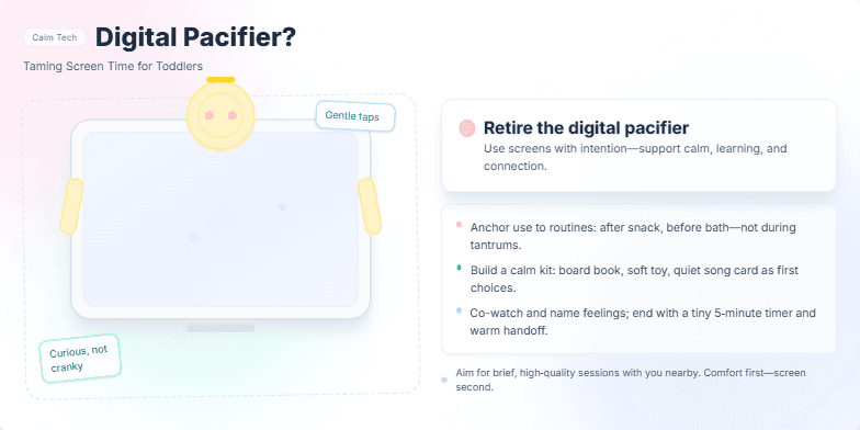
This slide uses a calming pastel palette with gentle animations of a child interacting with a stylized tablet. We'll explore the metaphor of the 'digital pacifier' through playful, hand-drawn illustrations. The key message is presented with a soft drop shadow effect for emphasis, offering practical tips against a backdrop of soothing watercolor textures. The overall feel is comforting and reassuring, like a bedtime story.
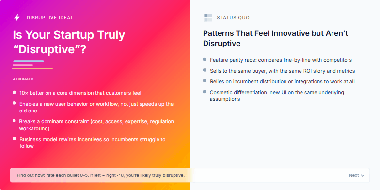
This slide uses a dynamic, split-screen design. One side showcases vibrant, energetic colors representing the 'disruptive' ideal, contrasted with a muted, minimalist aesthetic on the other, representing the status quo. A subtle glitch effect animation adds a touch of edgy futurism. Clean typography and bold iconography complete the look.
Bold typography on a backdrop of lush greenery dissolving into stark images of overflowing landfills. Deep emerald and earthy browns transition to alarming reds and stark blacks as the narrative progresses. Animated clothing icons morph into symbols of environmental impact. Smooth transitions and impactful visuals highlight eco-friendly fashion choices. Minimalist design emphasizes the urgent message.
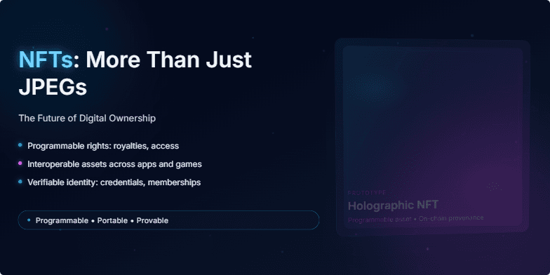
Imagine a sleek, dark slide with neon accents. The title glows with a subtle electric blue. Animated particles, resembling digital dust, drift across the screen, hinting at the intangible yet valuable nature of NFTs. The background features a slowly rotating, holographic 3D model of an NFT, showcasing its potential beyond a static image. Short, sharp transitions add a dynamic feel.
Want to generate your own slides with AI?
Start creating high-tech, AI-powered presentations with Slidebook.