This slide uses a split-screen design, contrasting muted, desaturated tones representing the 'myth' with vibrant, energetic colors for 'reality'. A subtle glitch effect adds a touch of intrigue to the 'myth' side, while smooth, flowing animations bring the 'reality' side to life. Concise text overlays appear with elegant fade-in transitions. The overall mood is thought-provoking and visually arresting.
Categories
Generated Notes
First, set the frame: Quiet Quitting is often framed as a culture war issue. This slide separates myth from reality visually—muted on the left, vibrant on the right.
Call out the left title, “Myth,” and note the subtle glitch—misconceptions distort the picture.
Reveal the first pair: the myth is laziness; the reality is boundary-setting that prevents burnout. Emphasize that doing your job as scoped is not disengagement.
Reveal the second pair: it’s not just Gen‑Z. Data and behavior show cross‑generational adoption where expectations are unclear or workloads are unsustainable.
Reveal the third pair: productivity doesn’t collapse—focus improves core output when work is prioritized and scope is respected.
Conclude by pointing to the “vs” in the middle: our task isn’t choosing sides; it’s aligning expectations, clarity of scope, and healthy norms so performance is sustainable.
Behind the Scenes
How AI generated this slide
Analyze the topic 'Quiet Quitting: Myth vs Reality' and identify key visual elements for a contrasting presentation.
Select a split-screen layout to directly compare 'Myth' and 'Reality'.
Choose a desaturated color palette with glitch effects for 'Myth' to represent distortion and misconception.
Choose vibrant colors and smooth animations for 'Reality' to represent clarity and energy.
Structure content with concise bullet points for easy comprehension and visual appeal.
Implement fade-in animations for text elements to create a dynamic and engaging flow.
Add a central 'vs' element to emphasize the comparison.
Incorporate subtle background animations and effects to enhance visual interest without overwhelming the core message.
Why this slide works
This slide effectively communicates the complexities of 'quiet quitting' through a visually compelling contrast. The split-screen design, combined with distinct color palettes and animation styles, clearly separates myth from reality. The desaturated, glitching 'Myth' side visually represents the misconceptions surrounding the topic, while the vibrant and dynamic 'Reality' side showcases a more nuanced perspective. The concise bullet points and elegant fade-in transitions ensure the information is easily digestible and engaging for the audience. The use of subtle background animations adds depth and visual interest without distracting from the core message. The slide leverages visual storytelling techniques to create a memorable and thought-provoking experience for the viewer, enhancing understanding and prompting discussion around 'quiet quitting' in the workplace. The use of Framer Motion adds a professional polish and allows for sophisticated animation control. The code is well-structured and utilizes modern React best practices, making it easily adaptable and maintainable. This approach caters to a modern audience familiar with dynamic web design and enhances the overall impact of the presentation.
Slide Code
You need to be logged in to view the slide code.
Frequently Asked Questions
What is 'quiet quitting'?
'Quiet quitting' is a workplace trend where employees do the bare minimum required of their job and don't go above and beyond. It's often associated with setting boundaries to prevent burnout and prioritize work-life balance. It's important to distinguish between setting healthy boundaries and actual disengagement or laziness.
How does this slide explain 'quiet quitting'?
The slide visually deconstructs common misconceptions ('Myths') about quiet quitting, such as it being laziness or a generational fad, and contrasts them with the 'Reality', which emphasizes setting boundaries, cross-generational relevance, and improved focus on core work. This visual approach clarifies the nuances of the topic and encourages a more informed discussion.
What technologies were used to create this slide?
This slide was created using React, Framer Motion for animations, and Tailwind CSS for styling. The combination allows for complex animations and a polished, modern design aesthetic while keeping the code clean and manageable.
Why is the 'Myth' side visually distorted?
The glitch effect and muted colors on the 'Myth' side visually represent the distorted perceptions and misinformation surrounding 'quiet quitting'. This stylistic choice effectively contrasts with the clarity and vibrancy of the 'Reality' side.
This slide opens with a dramatic visual – a stylized website icon slowly dripping crimson droplets onto a pile of coins. The backdrop is a deep, luxurious navy, creating a sense of urgency and importance. Crisp white text emphasizes the question, while subtle animations of financial charts subtly flicker in the background, adding a touch of dynamic intrigue without being overwhelming. The overall mood is sophisticated and slightly unsettling, prompting the viewer to consider the hidden costs of a poorly designed website.
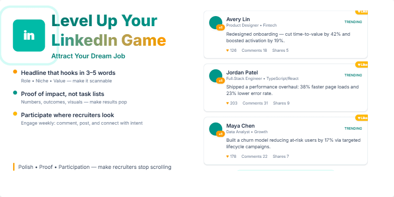
Imagine a sleek, modern slide with a vibrant teal and gold color palette. A stylized LinkedIn logo subtly pulses with light, drawing the eye. Smooth, dynamic transitions between points mimic the scrolling action of the LinkedIn feed. Crisp, clean typography emphasizes key takeaways, while subtle animations – like profile picture ‘likes’ popping up – add a touch of playfulness and engagement. This visually appealing slide promises a boost to your career prospects.
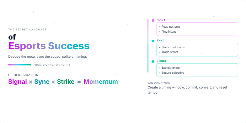
Dive into a visually stunning world of neon and digital artistry as we unveil the hidden strategies behind esports dominance. Dynamic transitions and glowing particle effects highlight key concepts, while stylized player silhouettes create a powerful and mysterious atmosphere. Experience the thrill of victory through pulsating sound design and captivating close-ups of iconic gaming moments. This slide is a masterpiece of dark elegance.
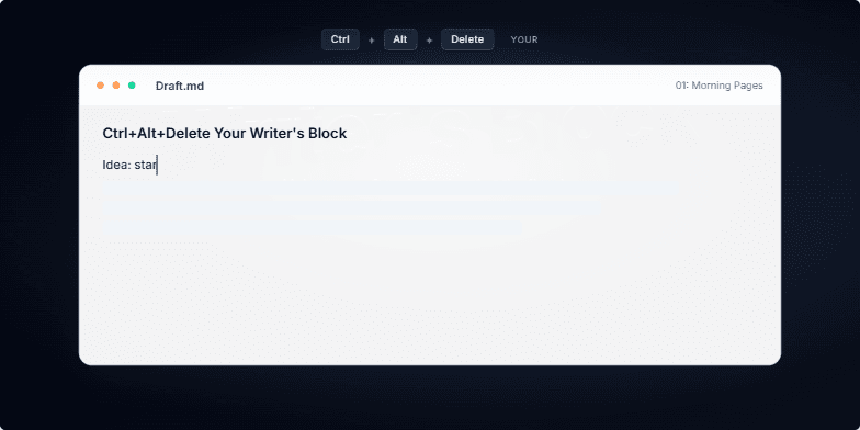
This slide explodes with vibrant, graffiti-inspired typography against a dark, textured background. Watch as the words 'Writer's Block' literally crumble away with a dynamic shattering animation, revealing a clean, minimalist workspace bathed in soft, inspiring light. Subtle, pulsating cursor animations and the gentle sound of typing keys add to the immersive feel, promising a renewed sense of creative flow.
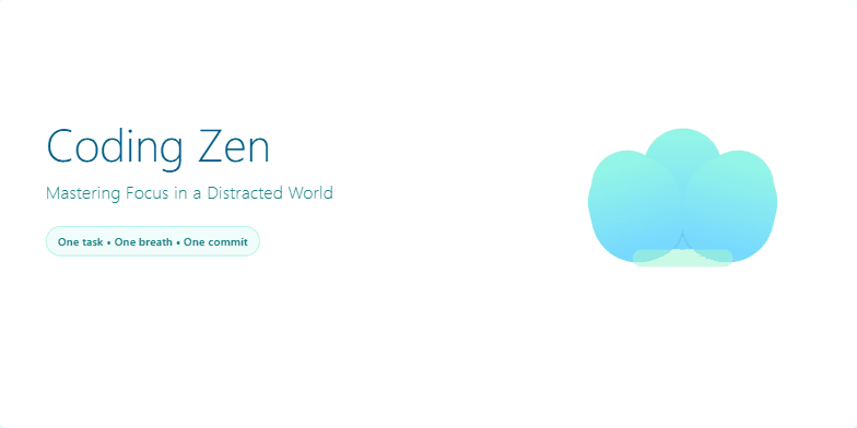
Imagine a minimalist slide bathed in calming blues and greens. A single, stylized lotus flower gently unfolds as the title appears in elegant, sans-serif font. Subtle animations of falling leaves evoke a sense of tranquility and focus. The overall design promotes a sense of calm and control, hinting at the power of mindfulness in coding.
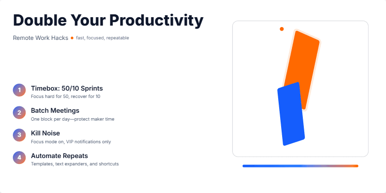
Energetic orange and calming blues create a dynamic yet focused mood. Fast-paced transitions showcase each productivity hack with a sleek, modern design. Watch how icons morph and transform, illustrating the power of each tip. Clean typography and minimalist layouts ensure clarity and impact, leaving you feeling inspired and ready to conquer your workday.
Want to generate your own slides with AI?
Start creating high-tech, AI-powered presentations with Slidebook.