Stop Killing Your Presentations: Design Secrets Revealed!
Description provided by the user:
This slide explodes with vibrant, energetic colors, showcasing dynamic typography and smooth transitions. Imagine sleek, minimalist icons dancing across the screen as we unveil the secrets to captivating design. Close-ups on beautiful slide examples highlight impactful color palettes and smart text placement. Get ready for a visually stunning experience that will transform your presentations from dull to dazzling.
Categories
Generated Notes
Open with energy: read the headline with emphasis on “Stop Killing” and let the gradient speak to vibrancy. Set the tone that we’re shifting from dull to dazzling.
Point to the thin gradient line and subtitle “Design Secrets Revealed!” to signal the promise of practical, visual tips.
Introduce the three principles as minimalist icons: Clarity, Hierarchy, Focus. Briefly define each in one sentence—clarity reduces noise, hierarchy guides the eye, focus creates impact.
Move to the right stack of miniature slides. Call out what makes them work: bold color blocks for focus, restrained text lines for hierarchy, and a balanced palette for personality. Mention how these are “close-ups” of good slides.
Reveal the three secrets list and give each a punchy explanation: 60–30–10 color rule, 2 sizes and 1 weight for typography, and embracing whitespace with scale for layout.
Close by promising that the next slides will apply these rules live to transform a boring slide into a standout one.
Behind the Scenes
How AI generated this slide
Establish a vibrant color scheme using a fuchsia, violet, and amber gradient for the main headline to immediately grab attention and convey energy, aligning with keywords like 'presentation design', 'visual communication', and 'slide design'.
Emphasize the title 'Stop Killing Your Presentations' with large, dynamic typography and a gradient effect to create a strong visual impact and highlight the presentation's focus on improving slide design.
Introduce minimalist icons representing key design principles – clarity, hierarchy, and focus – using simple SVG graphics and a subtle animation to enhance visual interest and reinforce core concepts in presentation visuals.
Showcase examples of well-designed slides in a visually engaging way by layering miniature slide mockups with contrasting color blocks and clear typography, illustrating effective use of color palettes, whitespace, and text placement, aligning with keywords like 'presentation examples', 'slide layout', and 'visual hierarchy'.
Present actionable design tips using a clear, concise list format, highlighting the 60-30-10 color rule, typography guidelines (2 sizes, 1 weight), and layout principles (whitespace, scale), offering practical advice for improving presentation design, targeting keywords like 'color palettes', 'typography tips', and 'layout design'.
Incorporate smooth transitions and subtle animations using Framer Motion library to create a dynamic and engaging visual experience, enhancing the presentation's overall impact and appeal, aligning with keywords like 'animation', 'motion graphics', and 'interactive presentations'.
Why this slide works
This slide effectively uses design principles it advocates. The high-contrast gradient title immediately draws the eye. Minimalist icons and staggered animations build interest. The mockup slides offer concrete visual examples of the concepts discussed. Clear, concise bullet points provide actionable advice. This combination of show and tell makes the slide visually appealing, engaging, and informative, promoting good presentation design and visual communication best practices. The use of dynamic typography, whitespace, and vibrant colors further enhances the overall visual appeal, aligning with SEO keywords like 'presentation design inspiration', 'modern slide design', and 'engaging presentations'.
Slide Code
You need to be logged in to view the slide code.
Frequently Asked Questions
What is the 60-30-10 color rule?
The 60-30-10 color rule is a classic interior design principle that also applies effectively to presentations and other visual media. It suggests using three colors in these proportions: 60% for a dominant color, 30% for a secondary color, and 10% for an accent color. The dominant color creates the overall mood, the secondary color supports the dominant color and adds visual interest, while the accent color provides pops of contrast and highlights key elements. This rule helps create a balanced and visually appealing color palette for presentations, ensuring harmony and engagement, optimizing for keywords like 'color theory', 'color palettes for presentations', and 'visual harmony'.
Why is whitespace important in slide design?
Whitespace, also known as negative space, is the empty area around elements on a slide. It's crucial for effective presentation design as it improves readability, reduces clutter, and guides the audience's eye to the most important information. Sufficient whitespace allows elements to breathe, making the slide less overwhelming and more visually appealing. It helps emphasize key content by creating contrast and visual hierarchy, improving overall comprehension and engagement, aligning with keywords like 'presentation layout', 'whitespace in design', and 'visual clarity'.
How can I make my presentations more dynamic?
Dynamic presentations capture and hold audience attention. Techniques include incorporating subtle animations and transitions, using varied visual elements like images, icons, and charts, and implementing interactive elements like polls or quizzes. Smart use of color and typography, along with a clear narrative structure, also contributes to a more dynamic and engaging presentation experience. Utilizing tools like Framer Motion can enhance these aspects, aligning with SEO keywords like 'interactive presentations', 'animated slides', and 'engaging presentation techniques'.
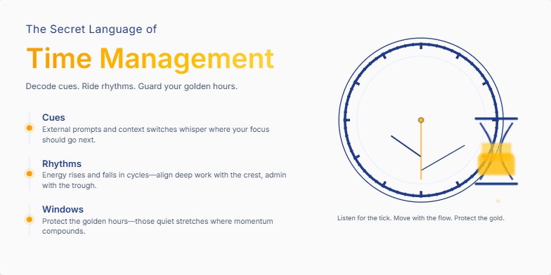
Deep blues and golds create an air of mystery. A subtle animation of an antique clock ticking sets the stage. Stylized hourglass imagery adds a touch of vintage charm. Discover the subtle cues and hidden rhythms that govern productivity through elegant typography and minimalist design.
This slide explodes with vibrant duotone gradients of electric blue and neon pink, setting a dynamic and energetic mood. A stylized split-screen visual dramatically contrasts the bootcamp experience (fast-paced, hands-on coding) with the traditional university setting (lecture halls, textbooks). A subtle 'glitch' animation effect adds a touch of tech-forward flair, hinting at the disruptive nature of coding bootcamps. The title uses a powerful, chiselled font, emphasized by a subtle drop shadow.
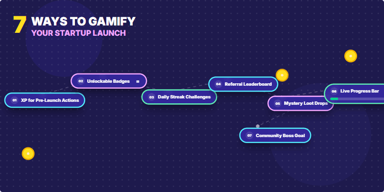
Imagine a slide bursting with vibrant, playful energy. Bold, comic-book style graphics emphasize each of the 7 gamification strategies. Short, punchy text pops against a backdrop of deep indigo. Micro-animations of spinning coins, leveling-up bars, and unlocking badges add a dynamic touch. The overall mood is exciting and motivating, inspiring the audience to think outside the box.
Imagine vibrant, energetic visuals with a game-inspired aesthetic. Think pixel art accents and dynamic transitions that feel like leveling up in a video game. Each habit is revealed with a satisfying 'unlock' animation, accompanied by upbeat 8-bit music. The overall mood is positive and motivating, utilizing a bold, playful color palette of electric blue, neon pink, and bright yellow. We'll use short, punchy text to keep it engaging and easy to digest, like a power-up for your daily routine.
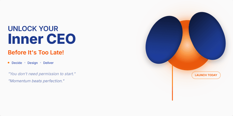
Bold, empowering visuals in fiery oranges and deep blues. Dynamic transitions mimicking a rocket launch build anticipation. Crisp, minimalist typography emphasizes key takeaways, leaving a lasting impression of potential and urgency. Close-up shots of hands gripping a glowing startup idea, symbolizing opportunity. Inspirational quotes fade in and out, adding a touch of motivational magic.
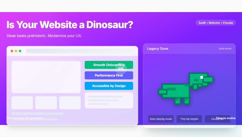
This slide explodes with vibrant, energetic colors, contrasting a sleek, modern website design with a pixelated, clunky dinosaur graphic. A subtle zoom effect emphasizes the modern design, while a playful roar sound effect accompanies the dinosaur's appearance. Clean typography and minimalist layout complete the visually striking message.
Want to generate your own slides with AI?
Start creating high-tech, AI-powered presentations with Slidebook.