Top 5 E-commerce Photo Mistakes (And How to Fix Them)
Description provided by the user:
Clean, minimalist design with crisp white backgrounds and pops of vibrant color highlighting key mistakes. Smooth, subtle animations reveal corrected photos alongside the originals, emphasizing the dramatic impact of good product photography. Each 'fix' showcases specific editing techniques with before-and-after sliders for an interactive feel. Imagine sleek transitions and the sound of a camera shutter.
Categories
Generated Notes
Open with the title and set the expectation: we will dramatically improve product photos by fixing five common mistakes.
Point to the large example on the left: this simulates a before-and-after slider. First, show the flawed shot—tinted light, harsh shadow, clutter.
Advance to reveal the after layer sliding in. Emphasize: neutral light, clean white background, centered product, subtle shadow—instant credibility.
Now walk through the list on the right, briefly explaining each fix:
1. Harsh shadows/mixed lighting: diffuse light at 45 degrees, bounce cards, match color temperature.
2. Cluttered backgrounds: use pure white or a neutral sweep; remove distractions.
3. Inconsistent white balance: shoot a gray card, set and sync white balance in post.
4. Soft focus/low resolution: tripod, base ISO, aperture around f/8–f/11, light sharpening.
5. Sloppy cropping/alignment: center with consistent margins, use gridlines for alignment.
Close with the pro tip: build a repeatable setup and batch your edits to keep consistency across the catalog.
Behind the Scenes
How AI generated this slide
Analyze the topic 'Top 5 E-commerce Photo Mistakes (And How to Fix Them)' and the desired minimalist design with vibrant color pops.
Structure the content with a title and two sections: a before-and-after photo comparison and a list of mistakes with fixes.
Implement the before-and-after image comparison using layered divs and a sliding overlay animation to simulate an interactive slider, using gradients and blur for visual interest.
Design a numbered list for the mistakes, using distinct colors (rose for initial, teal for subsequent) and subtle animations to emphasize each point.
Add micro-interactions like the 'drag feel' label to enhance the illusion of interactivity and reinforce the concept of a slider.
Optimize for a clean, minimalist aesthetic by using white space effectively and a simple color palette with strategic pops of rose and teal.
Incorporate smooth transitions and motion effects using Framer Motion to create visually engaging animations, enhancing the presentation's flow.
Ensure responsiveness and accessibility by using semantic HTML and appropriate ARIA attributes.
Why this slide works
This slide effectively communicates the top 5 e-commerce photography mistakes and their solutions. The clean, minimalist design with vibrant color accents and smooth animations creates an engaging and visually appealing experience. The interactive before-and-after slider clearly demonstrates the impact of proper photo editing techniques. The numbered list of mistakes and fixes provides concise and actionable advice, while the subtle animations and micro-interactions enhance engagement. The use of Framer Motion adds a polished and professional touch. Keywords: e-commerce photography, product photography, photo editing, image optimization, online sales, visual marketing, conversion rates, before-and-after, interactive slider, minimalist design, animations, Framer Motion.
Slide Code
You need to be logged in to view the slide code.
Frequently Asked Questions
What are the most common e-commerce photography mistakes?
Common e-commerce photography mistakes include harsh shadows or mixed lighting, cluttered or colored backgrounds, inconsistent white balance, soft focus or low resolution, and sloppy cropping or alignment. These issues can negatively impact product perception and conversion rates.
How can I improve my product photography for e-commerce?
Use diffuse lighting at a 45-degree angle, bounce cards, and match color temperatures to eliminate harsh shadows. Shoot on a pure white or neutral background to remove distractions. Use a gray card and sync white balance in post-processing for consistent colors. Use a tripod, base ISO, and an aperture around f/8-f/11 for sharp images. Center the product and use gridlines for consistent cropping and alignment. Building a repeatable setup and batch editing can improve efficiency and maintain consistency across your product catalog.
Why is good product photography important for e-commerce?
High-quality product photography builds trust and credibility, showcasing products in their best light. It enhances product perception, improves conversion rates, reduces returns, and strengthens brand identity. By avoiding common mistakes and following best practices, online retailers can maximize the impact of their product visuals and drive sales.
Imagine a calming gradient of sunset hues – oranges, pinks, and deep purples – as the backdrop. Each income stream is revealed with a gentle ripple animation, like a note spreading through water. Delicate musical notes dance around the numbers, creating a sense of flowing harmony. The overall feel is serene, inspiring, and filled with the promise of creative abundance.
Imagine vibrant, energetic neon colors against a dark, sleek backdrop. Watch code snippets come alive with subtle animations, weaving a story of transformation. Clean typography highlights key skills and pathways, creating a visual roadmap to your future. This slide pulsates with possibility, igniting inspiration to launch your coding journey and unlock your dream career.
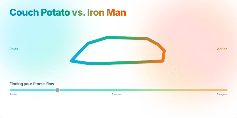
This slide bursts with vibrant energy, contrasting cool blues and greens representing relaxation with fiery oranges and reds symbolizing action. A morphing animation smoothly transforms a comfy couch into a sleek running shoe, capturing the transition from sedentary to active. Clean typography and minimalist design highlight the core message: finding your perfect balance.
This slide bursts with vibrant, energetic oranges and yellows, reflecting the increased productivity it promises. A stylized, animated hourglass subtly reminds viewers of the preciousness of time. Three sleek icons, each representing a key ritual, pulse with a gentle glow, drawing the eye and hinting at the transformative power within. Clean typography and minimalist design create a sense of clarity and focus, mirroring the effects of the rituals themselves.
Experience a captivating morphing animation showcasing the evolution of coding, from punch cards to sleek modern interfaces. Deep blues and vibrant greens highlight the contrast, while nostalgic pixel art transitions into smooth, minimalist visuals. A mesmerizing journey through time.
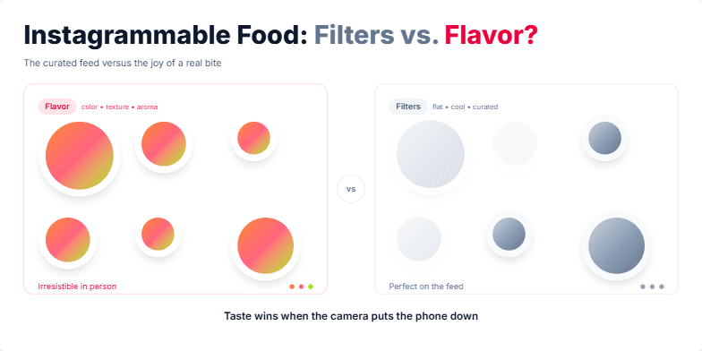
A vibrant, mouthwatering exploration of food photography in the age of social media. Expect juicy close-ups of colorful dishes contrasted with the muted tones of filtered images. Playful animations highlight the difference between the curated online experience and the real, tangible joy of tasting. Warm, inviting color palettes and stylized typography create a delicious visual feast.
Want to generate your own slides with AI?
Start creating high-tech, AI-powered presentations with Slidebook.