Visualizing Information Architecture for Enhanced User Experience
Description provided by the user:
Create a slide visualizing the information architecture of a web application. The visualization should depict a hierarchical structure with the main app at the top, branching into four primary sections (Dashboard, Projects, Billing, Settings). Each section further expands into 1-2 core tasks (e.g., Dashboard -> Quick Stats, Reports). The visual style should be clean and minimal, using boxes for elements and lines to represent connections. Include tooltips on hover to provide brief descriptions of each element. The overall message should emphasize how clear information architecture improves navigation and reduces cognitive load for users.
First, I want you to see this as a map. Information architecture is the skeleton that holds the app together.
We start at the top with the App — a unified shell that carries navigation and shared context across screens.
Next, the four primary sections appear: Dashboard, Projects, Billing, and Settings. These are the main entry points your users recognize.
Notice the thin lines: a single trunk from the App, then a horizontal rail that fans into each section. Straight, minimal, and predictable.
Now we reveal the second level. Each section branches into 1–2 core tasks: quick stats and reports for Dashboard; list and detail for Projects; plans and invoices for Billing; profile and security for Settings.
The faint grid behind everything reinforces alignment. Boxes are concise, icons communicate category at a glance, and tooltips add just-in-time detail on hover.
The key message: a clear hierarchy reduces cognitive load and makes navigation obvious. Users can predict where things live and move faster with confidence.
Behind the Scenes
How AI generated this slide
Analyze the provided context to identify key elements and relationships within the application's information architecture.
Design a hierarchical structure with the 'App' as the root, followed by primary sections, and finally their respective sub-tasks.
Choose a clean and minimalist visual style using boxes, lines, and tooltips to effectively represent the hierarchy and information.
Implement the visualization using a suitable framework (e.g., React, Framer Motion) to create interactive elements like tooltips and transitions.
Refine the layout, spacing, and color scheme to ensure visual clarity and accessibility.
Why this slide works
This slide effectively communicates the application's information architecture through a clear and visually appealing hierarchical diagram. The use of boxes, lines, and tooltips provides a structured and informative representation of the app's structure. The minimalist design and interactive elements enhance user understanding and engagement. By visualizing the hierarchy, the slide emphasizes the importance of clear information architecture for improving navigation and user experience. The inclusion of tooltips with concise descriptions adds value by providing context and detail on demand. The animation enhances the presentation by progressively revealing information and guiding the viewer through the hierarchy. This approach facilitates a better understanding of the app's organization and its impact on user interaction. Utilizing Framer Motion adds a layer of sophistication with smooth transitions and animations, making the presentation more engaging and dynamic. This visualization also promotes a user-centered design approach, highlighting how a well-structured information architecture contributes to a positive user experience.
Slide Code
You need to be logged in to view the slide code.
Frequently Asked Questions
What is information architecture?
Information architecture (IA) is the structural design of shared information environments. It focuses on organizing, structuring, and labeling content in a way that is intuitive and easy for users to find and understand. A well-designed IA ensures efficient navigation and a positive user experience.
Why is good information architecture important?
Good information architecture is crucial for several reasons. It improves findability of information, making it easier for users to locate what they need. It enhances usability by providing a clear and logical structure for navigating through the application. This reduces cognitive load, allowing users to focus on their tasks rather than struggling to find their way around. Ultimately, a well-structured IA leads to increased user satisfaction and engagement.
How can I improve the information architecture of my application?
Improving IA involves user research, card sorting, and usability testing to understand how users think about the information. Create clear and concise labels, establish a logical hierarchy, and ensure consistent navigation throughout the application. Use sitemaps, wireframes, and prototypes to visualize and test the IA before implementation. Regularly evaluate and iterate based on user feedback to ensure it continues to meet their needs.
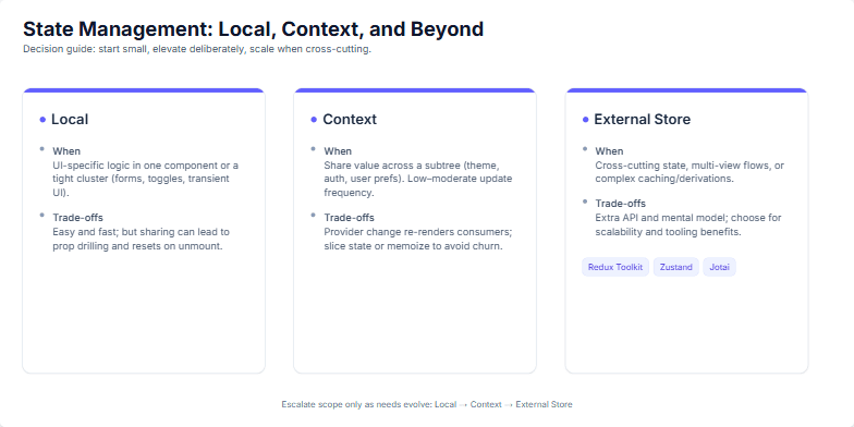
Create a slide about choosing the right state management solution in React applications. It should guide developers on when to use local state, Context, or an external store. Explain the trade-offs of each approach and suggest popular external store libraries like Redux Toolkit, Zustand, and Jotai. The slide should be visually appealing and easy to understand. Include speaker notes with detailed explanations of each state management approach.
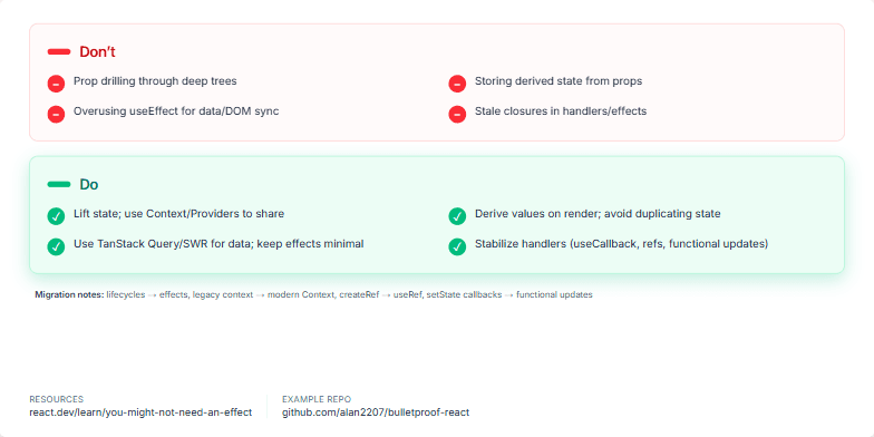
Create a slide contrasting React anti-patterns with recommended practices. It should highlight common mistakes like prop drilling, storing derived state, overusing useEffect, and stale closures. Then, present the better alternatives: lifting state, deriving values on render, using TanStack Query/SWR, and stabilizing handlers. Include brief migration notes for transitioning from older patterns and links to relevant resources like the 'You Might Not Need an Effect' article and the 'Bulletproof React' repository. The slide should have a professional, clean design and clear explanations.
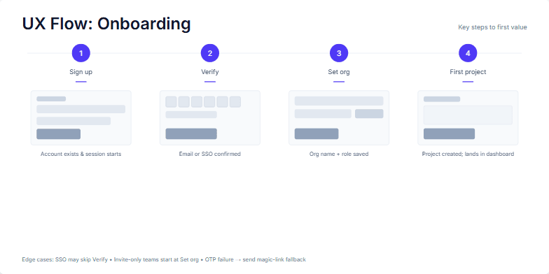
Create a slide visualizing the UX onboarding flow for a software product, highlighting the key steps a user takes from initial signup to achieving their first value within the application. The slide should emphasize the critical actions and criteria for success at each step. Include micro-interactions or UI thumbnails to illustrate each stage. Additionally, mention edge cases and alternative paths within the onboarding process, such as SSO logins or invitation-based onboarding. Provide speaker notes elaborating on each step and addressing the edge cases.
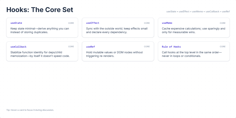
Create a slide summarizing the core React Hooks (useState, useEffect, useMemo, useCallback, useRef, and the Rule of Hooks), their primary use cases, and concise best practice tips for each. The slide should be visually appealing and easy to understand, with a professional design suitable for a presentation or educational material. Include speaker notes that elaborate on each hook, emphasizing best practices, potential pitfalls, and trade-offs to consider. The design should incorporate smooth animations for a dynamic presentation. The target audience is developers familiar with React, seeking to refine their understanding and usage of hooks.
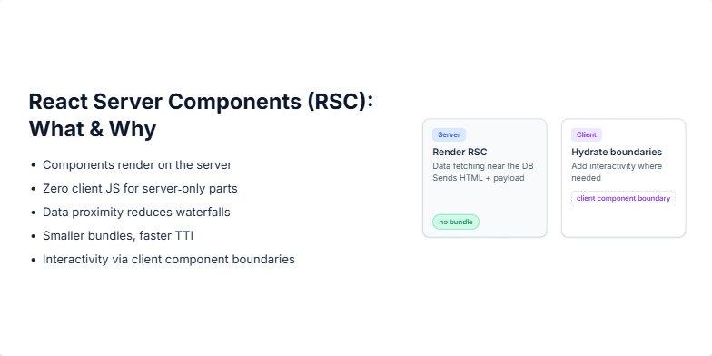
Explain React Server Components (RSCs), their purpose, and advantages. Include a visual representation of the server-client interaction, highlighting the server rendering, client hydration, and the impact on bundle size. Explain how RSCs improve performance by rendering components on the server and reducing the amount of JavaScript sent to the client. Emphasize the benefits like zero client JS for server-only parts, data proximity to the database, smaller bundles, faster Time To Interactive (TTI), and interactivity enabled by client component boundaries. Also, explain the concept of hydration and how it works with RSCs.
This slide is the opening slide for a case study presentation about the development of a SaaS product called Dlidebook. The presenter wants to convey a sense of calm, modern professionalism, and highlight their role in the project. The slide includes a title, subtitle, project details (product name, role, year), and a subtle animated accent. The background features a soft gradient and a moving dot grid to add visual interest. The animation sequence is designed to draw the audience's attention to the key elements of the slide in a structured manner, starting with the title and then revealing the subtitle and project details. The speaker notes provide further context about the presentation's flow and the design choices made for the slide.
Want to generate your own slides with AI?
Start creating high-tech, AI-powered presentations with Slidebook.