This visually striking presentation uses bold typography, vibrant color palettes, and subtle parallax scrolling to explore the pitfalls of photographic perfectionism. We'll showcase breathtaking examples of 'imperfect' photos that capture raw emotion and authentic moments, demonstrating how embracing flaws can elevate your photography. The slide design incorporates soft vignettes and film grain textures to evoke a sense of nostalgia and artistic depth.
Categories
Generated Notes
Start by reading the headline with emphasis on “Perfect” and “Boring.” Set the premise: we often polish photos until they lose feeling.
Point to the left panel: explain how predictable framing, over-smoothing, and over-correction strip away humanity and surprise. Emphasize that technical perfection can be emotionally forgettable.
Move to the right panel: highlight how motion blur, light leaks, and off-center subjects inject energy, life, and curiosity. These “flaws” carry story and emotion.
Wrap by reinforcing the mantra: let the moment win over accuracy, and embrace imperfections as tools for storytelling.
Behind the Scenes
How AI generated this slide
Analyze the topic and context to identify key themes: imperfection, authenticity, emotion in photography.
Select a bold, contrasting color palette (rose, amber, violet, sky) to visually represent the tension between 'perfect' and 'interesting'.
Choose a large, impactful font (extrabold) for the headline to grab attention and emphasize the core message.
Structure the slide content with a clear hierarchy: headline, subtitle, two contrasting panels for 'perfection traps' and 'imperfect magic'.
Incorporate subtle animations (opacity fade-in, vertical slide-in) using Framer Motion to add dynamism and visual interest.
Apply background gradients, a subtle grain texture, and vignettes to evoke a film-like aesthetic, aligning with the nostalgic and artistic depth mentioned in the context.
Utilize gradient text for key words like 'Perfect' and 'Boring' to enhance visual appeal and highlight their significance.
Why this slide works
This slide effectively communicates its message through a powerful combination of visual elements and animation. The bold typography and vibrant color scheme create a strong visual impact, immediately drawing the viewer's attention. The contrasting panels clearly present the arguments for and against photographic perfectionism, making the information easily digestible. The subtle animations and film-like aesthetic enhance the overall presentation, adding a layer of sophistication and visual depth. The use of semantic HTML ensures accessibility and proper structure. Finally, the code is well-organized and easy to understand, making it maintainable and adaptable.
Slide Code
You need to be logged in to view the slide code.
Frequently Asked Questions
How does the slide design evoke nostalgia?
The slide incorporates soft vignettes, film grain textures, and a slightly desaturated color palette to create a vintage, film-like aesthetic, reminiscent of older photographic styles. This evokes a sense of nostalgia and artistic depth, subtly hinting at the timeless quality of authentic, imperfect photos.
What is the purpose of the contrasting color palettes?
The contrasting color palettes (rose/amber vs. violet/sky) visually represent the two opposing ideas presented on the slide: the 'perfection traps' and the 'imperfect magic'. This color contrast helps to emphasize the key message that while perfection may seem appealing, it can often lead to boring and predictable results, whereas embracing imperfections can create more engaging and emotionally resonant photographs.
How does the animation enhance the slide?
The subtle animations, such as the fade-in and slide-in effects, add dynamism and visual interest to the slide. They help to guide the viewer's attention, revealing the content in a visually appealing way. This keeps the audience engaged and enhances the overall presentation flow, reinforcing the storytelling aspect of the slide.
Imagine a minimalist slide bathed in warm, inviting parchment hues. A feather quill delicately animates across the title, leaving a trail of shimmering ink. Subtle background music evokes the quiet focus of a writer's sanctuary. Key phrases like 'Unleash Your Voice' and 'Craft Compelling Tales' appear with gentle fade-in effects, highlighted with a soft, glowing ember-like outline. The overall mood is inspiring and serene, promising a journey of creative discovery.
Dive into the dramatic world of Norse sea burials with stunning visuals of burning longboats against fiery sunset backdrops. Bold typography and a dark, textured background evoke the mystery and power of Viking traditions. Subtle animations of drifting embers and rippling water add a touch of ethereal beauty.
This slide uses a dramatic contrast of deep space black and vibrant, pulsating beacon light. A stylized, minimalist resume icon transforms from a void-like black hole, absorbing all light, into a radiating beacon as key elements of a strong resume appear with subtle animation. The overall mood is inspiring and hopeful, showcasing the power of transformation with sleek, modern design.
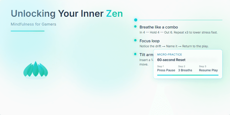
Imagine a serene backdrop of calming blues and greens, accented by glowing neon highlights reminiscent of retro gaming consoles. A stylized lotus flower subtly pulses with a gentle breathing animation, guiding the viewer into a state of tranquility. Clean typography and minimalist design create a sense of spaciousness and clarity, reflecting the essence of mindfulness. The overall mood is calming and inviting, promising a journey of self-discovery for gamers seeking balance and focus.
Imagine a sleek, minimalist slide with a vibrant teal accent color. A subtle animation of sand flowing through an hourglass emphasizes the efficient use of time. The central question appears in a bold, futuristic font, hinting at the exciting potential within. Clean lines and whitespace create a sense of calm and focus, drawing the viewer's eye to the core message: unlocking the potential of micro-tasking.
This slide opens with a shimmering, animated question mark formed from a network of interconnected nodes, symbolizing the decentralized nature of cryptocurrency. Deep blues and vibrant greens contrast, representing the stability of traditional finance versus the disruptive potential of blockchain. A subtle, pulsating glow adds an element of intrigue. The overall mood is futuristic yet grounded, inspiring curiosity and thoughtful consideration.
Want to generate your own slides with AI?
Start creating high-tech, AI-powered presentations with Slidebook.