Your Dinner Plate: Nutrient Symphony or Silent Saboteur?
Description provided by the user:
Imagine vibrant, watercolor illustrations of food groups swirling together like a nebula, gradually transforming into a dynamic, animated scale balancing health and depletion. Deep blues and greens evoke tranquility, while pops of orange and red symbolize vitality. The slide transitions with a gentle ripple effect, highlighting the delicate balance of nutrition in our lives. This visually captivating presentation explores the profound impact of food choices on overall well-being, offering practical tips and inspiring a mindful approach to eating.
Categories
Generated Notes
1. Open by inviting the audience to look at their dinner plate as a canvas. Emphasize the idea of a symphony versus a saboteur to frame the narrative.
2. Point to the watercolor swirls representing food groups blending together. Note the calming blues and greens contrasted with energizing oranges and reds.
3. Introduce the scale. Explain that every meal subtly tips toward health or depletion, and the goal is balance over perfection.
4. Highlight the left pan labeled “Symphony.” Describe diversity: plants, colors, and whole foods combining to support energy, mood, and immunity.
5. Highlight the right pan labeled “Saboteur.” Call out ultra-processed foods and sugar spikes that can deplete focus and recovery.
6. Transition to the practical tips. Walk through each: half the plate plants, protein anchor, color contrast, and swapping ultra-processed for whole options.
7. Close with the mindset: small, consistent shifts compose a better score. Encourage one mindful tweak at the next meal.
Behind the Scenes
How AI generated this slide
Analyze the provided topic and context to understand the core message of healthy eating and its impact on well-being.
Conceptualize a visual metaphor of a scale to represent the balance between 'Nutrient Symphony' (healthy choices) and 'Silent Saboteur' (unhealthy choices).
Select a color palette with calming blues and greens for tranquility and vibrant oranges and reds for vitality, aligning with the watercolor theme described in the context.
Implement the scale using Framer Motion, animating its movement to symbolize the delicate balance of nutrition.
Populate the scale's pans with visually distinct representations of healthy and unhealthy food choices using colorful circles.
Add supporting text elements like 'Health' and 'Depletion' to clarify the scale's meaning.
Incorporate background elements with blurred, colorful shapes to create a visually appealing and dynamic backdrop reminiscent of a watercolor nebula.
Animate the background elements and text using Framer Motion to enhance the overall visual experience and create a sense of flow.
Structure the slide content using a grid layout for clear organization and visual hierarchy.
Add practical tips for healthy eating as actionable takeaways for the audience.
Why this slide works
This slide effectively communicates the impact of food choices on overall well-being through a visually compelling metaphor of a balancing scale. The use of vibrant colors, smooth animations, and clear text elements enhances engagement and understanding. The scale visually represents the delicate balance between healthy and unhealthy choices, while the supporting text and practical tips provide actionable insights. The watercolor-inspired background adds an artistic touch and contributes to the overall aesthetic appeal, aligning with the initial creative brief. The animation, powered by Framer Motion, brings the slide to life and emphasizes the dynamic nature of nutritional balance. The combination of compelling visuals, informative content, and smooth animations makes this slide highly effective in conveying its message about mindful eating and its impact on health and wellness. The use of keywords like 'nutrition,' 'well-being,' 'healthy eating,' 'mindful eating,' 'food choices,' and 'health and wellness' reinforces the slide's focus on these important themes. The clear visual hierarchy and well-organized layout ensure that the message is easily digestible and memorable for the audience. This slide effectively uses animation and visual metaphors to translate complex concepts into an easily understood and engaging format, promoting audience comprehension and retention of key information.
Slide Code
You need to be logged in to view the slide code.
Frequently Asked Questions
How does the animation enhance the slide's message?
The animation brings the concept of balance to life. The scale subtly moves, highlighting the dynamic nature of nutrition. The gentle ripple effect during transitions further emphasizes this delicate balance and creates a visually engaging experience. The gradual appearance of elements also helps guide the viewer's attention and build anticipation.
What is the significance of the watercolor effect in the background?
The watercolor effect contributes to the overall aesthetic of the slide. It creates a visually appealing backdrop that evokes a sense of tranquility and natural flow, aligning with the themes of health and well-being. The blurred, colorful shapes resemble a nebula, hinting at the complex interplay of nutrients in our bodies. This artistic approach makes the slide more engaging and memorable.
How do the colors used in the slide contribute to its message?
The color palette is strategically chosen to reinforce the message. Deep blues and greens evoke tranquility and stability, representing the positive effects of a balanced diet. Pops of orange and red symbolize vitality and energy, adding a dynamic element. The contrast between these color families highlights the difference between healthy and unhealthy food choices and their respective impacts on well-being.
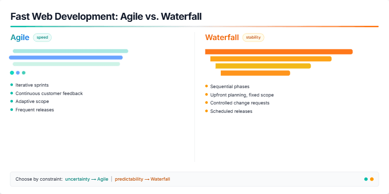
Imagine a vibrant split-screen: one side showcasing the dynamic, cascading flow of Agile, the other the structured, linear descent of Waterfall. Cool blues and greens contrast with warm oranges and yellows, visualizing speed and stability. Animated icons pulse and shift, highlighting key differences. Clean typography and minimalist design ensure the focus remains on this core contrast, leaving a crisp, memorable impression.
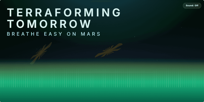
Bold, futuristic typography against a deep space backdrop. Animated Martian dust devils swirl across the screen, transitioning into a vibrant visualization of a terraformed Mars with lush vegetation and breathable atmosphere. Cool blues and greens contrast with the warm oranges of the Martian landscape, creating a hopeful and inspiring mood. Subtle sound effects of wind and flowing water enhance the immersive experience.
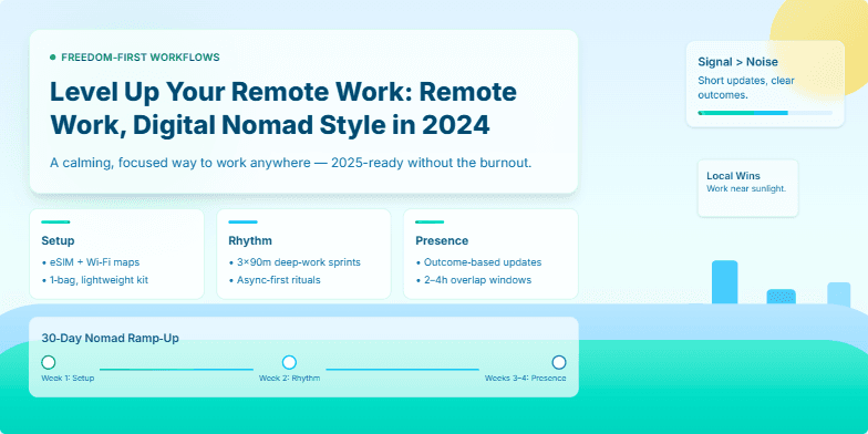
Imagine vibrant, sun-drenched visuals of tropical beaches and bustling cityscapes blending seamlessly with sleek, minimalist design. This slide uses a dynamic parallax scrolling effect as you explore the key elements of the digital nomad lifestyle in 2025. Clean typography and a calming color palette of blues and greens create a sense of freedom and possibility, highlighted by subtle animations that bring the journey to life.
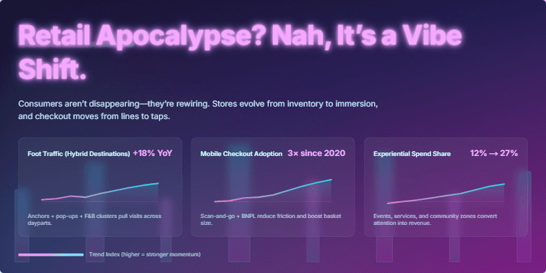
Bold neon-pink title against a deep, cyberpunk-inspired backdrop of holographic cityscapes. Glitch animation subtly disrupts the title, giving a sense of dynamic change. Clean, minimalist data visualizations with vibrant color gradients highlight key shopping trends. Transitions feature smooth, flowing animations, echoing the adaptable nature of consumer behavior. The overall mood is energetic and optimistic, reflecting the exciting potential of the evolving retail landscape.
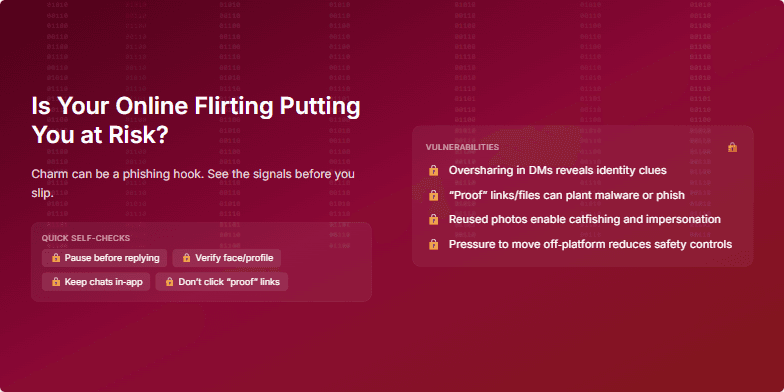
Deep, seductive crimson backdrop with subtly animated binary code cascading down, representing the hidden dangers. Crisp white text and stylized lock icons highlight the vulnerability aspects. The overall mood is intriguing and slightly unsettling, using a blend of glamour and suspense. Transition effects are smooth, ghosting images to emphasize the ephemeral nature of online interactions.
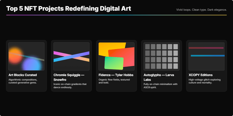
Dive into a vibrant world of color and motion as we explore the top 5 NFT projects. Each project is showcased with mesmerizing animated loops highlighting their unique style and artistic vision. Clean typography and a dark, elegant background ensure the artwork takes center stage. Prepare to be captivated by the future of digital art.
Want to generate your own slides with AI?
Start creating high-tech, AI-powered presentations with Slidebook.