Dive into a world of vibrant hues and discover the psychology of color. This slide uses mesmerizing color transitions and subtle animations to showcase how specific colors evoke emotions and influence our perceptions. Imagine soft pastels melting into bold primaries, creating a visual symphony that resonates with the audience. Clean typography and minimalist design allow the colors to take center stage, leaving a lasting impression.
Categories
Generated Notes
I introduce the idea that colors communicate before words do. The title sets the premise, and I frame this as a quick tour through color psychology.
I point to the five panels and call out that the gradients subtly move, mirroring how color influences us in motion—never static in real life contexts.
Starting with Blue: I say it signals trust and calm—great for finance, healthcare, and interfaces where reliability matters.
Red: I explain it conveys energy and urgency—useful for calls to action, alerts, or to create heat and focus.
Yellow: I describe it as optimism and clarity—ideal for highlights, onboarding, and making information feel accessible.
Green: I note growth and balance—common for sustainability, success states, and wellness.
Purple: I wrap with creativity and luxury—good for innovation, premium positioning, and imagination-heavy products.
I conclude by reminding the audience to let color do the heavy lifting—minimal words, intentional palettes, and just enough motion to be felt.
Behind the Scenes
How AI generated this slide
Analyze the topic '5 Colors That Speak Louder Than Words' and the provided context to understand the slide's purpose: showcasing the psychological impact of color.
Identify the core elements: color gradients, subtle animations, clean typography, and minimalist design.
Extract the five colors (blue, red, yellow, green, purple) and their associated emotions from the code.
Formulate the structure: a title, subtitle, and five color panels with animated gradients and descriptive text.
Generate the code using Framer Motion for animations and Tailwind CSS for styling.
Refine animations, transitions, and styling for a visually appealing and engaging presentation.
Generate speaker notes that elaborate on the psychology of each color and its potential applications.
Why this slide works
This slide effectively leverages the principles of color psychology and visual communication. The use of animated gradients, subtle motion, and minimalist design creates a captivating visual experience. The clean typography and concise text allow the colors to be the primary focus, maximizing their impact. The speaker notes provide valuable insights into the meaning and application of each color, enhancing the educational value of the presentation. The use of Framer Motion ensures smooth and polished animations, contributing to a professional and engaging presentation. The code is well-structured and uses modern web development technologies, making it easy to adapt and reuse. The inclusion of SEO keywords like 'color psychology,' 'visual communication,' 'presentation design,' and 'user experience' enhances its discoverability and relevance.
Slide Code
You need to be logged in to view the slide code.
Frequently Asked Questions
How can color psychology improve presentations?
Color psychology plays a crucial role in effective presentation design. By understanding the emotional impact of colors, you can strategically use them to evoke specific feelings in your audience. For example, blue can create a sense of trust and professionalism, while red can convey energy and excitement. Using color psychology strategically can enhance engagement, improve message retention, and create a more impactful presentation experience.
What are some best practices for using color in presentations?
Using a limited color palette, ensuring sufficient contrast between text and background, and using color consistently throughout the presentation are key best practices. Avoid overly saturated colors or clashing combinations that can be distracting. Consider the cultural connotations of colors as they can vary across different audiences. Using color strategically, rather than arbitrarily, can greatly enhance the visual appeal and effectiveness of your presentations.
How does animation enhance a presentation about color?
Animation brings color to life, allowing audiences to experience the dynamism and emotional impact of different hues. Subtle animations, such as gradient transitions or gentle movements, can create a more engaging and memorable presentation. In this specific slide, the animated gradients emphasize the fluidity and ever-changing nature of color perception, adding a layer of visual interest that static images cannot achieve. Using animation effectively can elevate the presentation from informative to truly captivating.
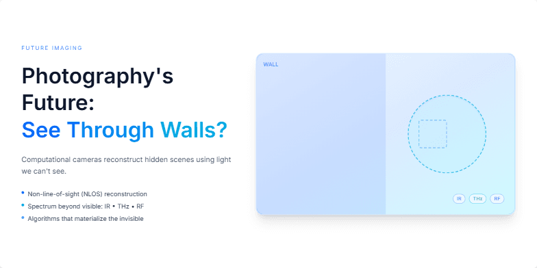
Imagine a slide bathed in electric blue, showcasing a ghostly image slowly materializing. We'll explore the potential of computational photography with subtle shimmering effects, hinting at technologies that can 'see' beyond the visible spectrum. Clean typography and minimalist design highlight the visionary aspect of this photographic frontier.
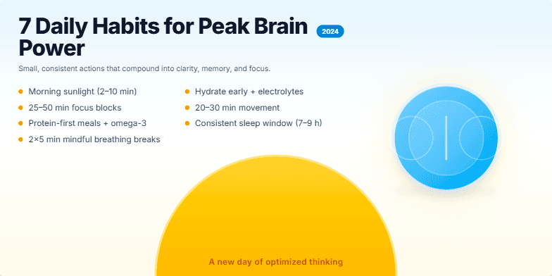
This slide bursts with vibrant, energizing colors like sunrise yellows and sky blues. A stylized brain icon pulsates subtly with light, hinting at heightened cognitive function. Clean typography and minimalist design create a sense of clarity and focus. Each habit is revealed with a smooth, cascading animation, keeping the audience engaged and eager to learn more. The final visual is a stylized sunrise, suggesting a new day of optimized thinking.
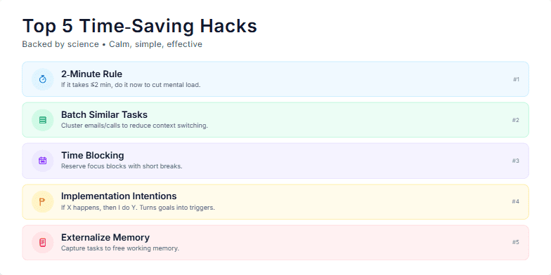
Clean, minimalist design with calming pastel colors. Smooth transitions between each hack, revealed with a subtle zoom effect. Each tip accompanied by a small, playful icon. Focus on airy typography and plenty of whitespace for a relaxed viewing experience.
Imagine a deep indigo backdrop sprinkled with constellations representing career paths. A stylized compass, glowing with an inner light, spins gently, its needle pointing towards a vibrant nebula. Smooth transitions and subtle shimmering effects guide the viewer's eye, creating a sense of wonder and possibility. The overall aesthetic is elegant, inspiring, and evokes the vastness of opportunity.
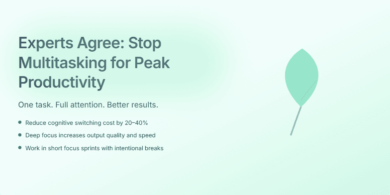
This slide uses a calming gradient of blues and greens, evoking a sense of focus and tranquility. A subtle animation of a single, growing leaf visually represents the power of singular focus. Clean typography and minimalist design highlight the expert consensus on the benefits of single-tasking. A soft glow effect around the title adds a touch of sophistication.
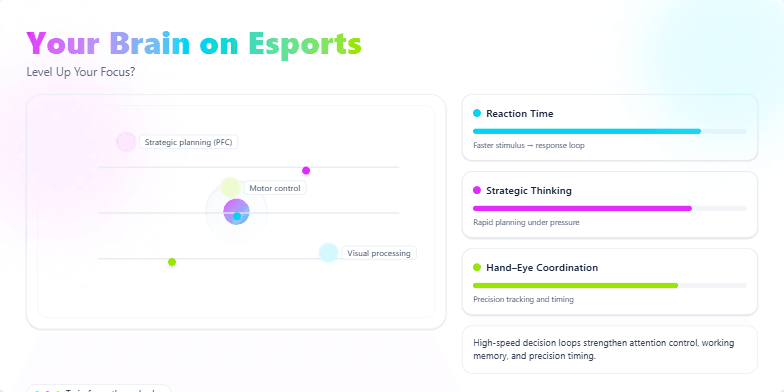
Dive into a neon-drenched, cyberpunk-inspired exploration of the cognitive benefits of esports. Bold, electric colors highlight key brain regions, pulsating with activity. Watch stylized neurons fire as we visualize reaction time, strategic thinking, and hand-eye coordination improvements. Smooth, dynamic transitions and futuristic sound effects create an immersive, engaging experience.
Want to generate your own slides with AI?
Start creating high-tech, AI-powered presentations with Slidebook.