Bold, energetic typography layered over dramatic grayscale images of failed product launches. Fast-paced transitions and glitch effects emphasize the critical nature of avoiding these pitfalls. Deep reds highlight the 'mistakes', creating a sense of urgency and a memorable visual hook. Clean, minimalist slide design keeps the focus sharp.
Categories
Generated Notes
Open with urgency: we’re looking at five rookie mistakes that quietly kill a startup’s vibe before the market even decides.
Point to the title: the red “Mistakes” signals danger; the grayscale background sets a failed-launch mood.
First mistake: no crisp positioning. If the story is foggy, every touchpoint feels uncertain. Clarity beats clever.
Second: generic look. Template branding drains energy; shape a distinctive visual hook from day one.
Third: feature dump. Instead of listing features, anchor a sharp “why” that people can repeat.
Fourth: silent socials. If your channels feel empty, your product feels empty. Build momentum with community moments.
Fifth: tone drift. Inconsistent microcopy breaks trust. Lock a voice guide and apply it everywhere.
Close with action: fix these five, and your launch feels intentional, energetic, and worth following.
Behind the Scenes
How AI generated this slide
Analyze the topic: '5 Rookie Mistakes Killing Your Startup's Vibe'
Visualize the slide: bold typography, grayscale images, glitch effects, red highlights, minimalist design
Structure the content: title, subtitle, numbered list of mistakes
Implement animations: staggered list items, title fade-in, glitch effect on numbers
Choose color scheme: deep reds for urgency, grayscale for contrast, white background for clarity
Select fonts: bold and energetic for titles, clean and legible for list items
Optimize for accessibility: add aria-hidden attributes to decorative elements
Why this slide works
This slide effectively communicates the topic of common startup mistakes through a visually engaging and memorable design. The use of bold typography, dramatic grayscale imagery, and glitch effects creates a sense of urgency and reinforces the critical nature of avoiding these pitfalls. The red highlights draw attention to the mistakes, while the minimalist design keeps the focus sharp and avoids visual clutter. The staggered animations add a dynamic touch, and the clear numbering makes the information easy to digest. The combination of visual elements and concise messaging makes this slide impactful and memorable for the audience. Furthermore, the code is well-structured and uses semantic HTML for better accessibility.
Slide Code
You need to be logged in to view the slide code.
Frequently Asked Questions
What are some common mistakes startups make with their branding?
Common branding mistakes include using generic templates, lacking a clear brand voice, inconsistent messaging across platforms, and failing to differentiate themselves from competitors. These mistakes can lead to a weak brand identity and make it difficult to connect with target audiences.
How important is social media for startup success?
Social media is crucial for startup success as it provides a platform for building community, engaging with potential customers, generating buzz, and driving traffic to their product or service. A silent social media presence can make a startup appear inactive or irrelevant, hindering its growth potential.
What is meant by 'crisp positioning' for a startup?
Crisp positioning refers to having a clear, concise, and compelling message that explains what a startup does, who it serves, and why it's unique. A foggy or unclear story makes it difficult for potential customers and investors to understand the value proposition and can hinder the startup's success.
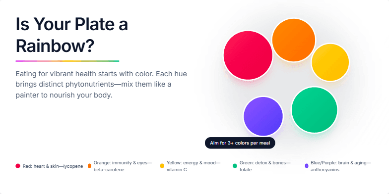
This slide explodes with color! Imagine a dark, sophisticated backdrop contrasting with vibrant, almost neon, images of fruits and vegetables arranged like a painter's palette. A subtle shimmer animation highlights the natural textures, making them look almost edible. Clean, modern typography complements the visuals, creating a slide that’s both informative and visually stunning. We’ll explore the simple joy of adding color to your meals for maximum health benefits.
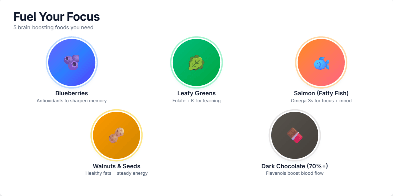
Imagine vibrant close-ups of colorful fruits and vegetables, pulsating with energy, against a clean, minimalist white background. The slide transitions with a smooth, satisfying swipe, revealing each food alongside its key benefits displayed in a modern, sans-serif font. Subtle animation adds a touch of sparkle to antioxidant-rich berries and leafy greens. Warm, inviting lighting creates a sense of nourishment and vitality. The overall design is fresh, modern, and undeniably appetizing.
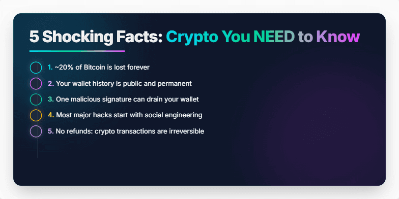
Dive into the mesmerizing world of cryptocurrency with vibrant neon accents against a dark, sleek backdrop. Animated transitions reveal each shocking fact, accompanied by crisp sound effects that keep you on the edge of your seat. Clean, minimalist design ensures the information pops, making these crypto secrets unforgettable.
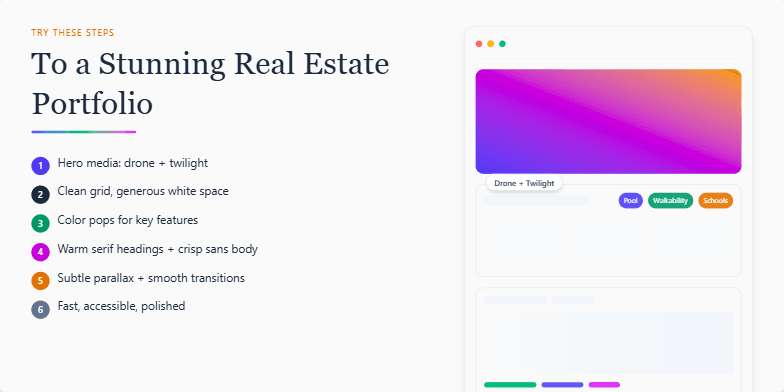
Imagine crisp, clean lines, a minimalist aesthetic with pops of vibrant color highlighting key property features. Smooth transitions and subtle parallax scrolling create an immersive viewing experience, drawing the eye to breathtaking drone footage and twilight photography that truly captures the essence of each listing. Warm, inviting typography complements the overall design, leaving a lasting impression of professionalism and sophistication.
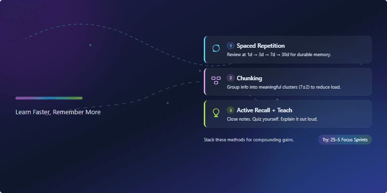
Imagine vibrant, energetic visuals exploding across a dark, sleek backdrop. Think neon accents against deep indigo, pulsating with each key takeaway. Kinetic typography brings 'Brain Hacks' to life, morphing and shifting as we reveal the secrets to enhanced learning. Clean, minimalist icons illustrate memory techniques, while smooth transitions and subtle sound effects create a premium, immersive experience. Close your eyes and picture the satisfaction of unlocking your brain's full potential, visualized by a glowing network of synapses firing across the screen.
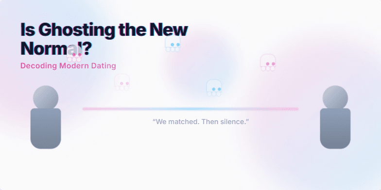
Dive into the perplexing world of modern dating with a vaporwave aesthetic. Soft pastel hues of pink and blue blend seamlessly with glitching text effects, mimicking the ephemeral nature of digital connections. Stylized silhouette figures represent the anonymity of online interactions. Animated ghost icons playfully float across the screen, adding a touch of ironic humor. Short, poignant quotes about ghosting appear and fade, leaving a lingering sense of the emotional impact.
Want to generate your own slides with AI?
Start creating high-tech, AI-powered presentations with Slidebook.