5 Shocking Stats: Unlocking Remote Work Productivity
Description provided by the user:
Imagine a slide bathed in calming blues and greens, evoking a sense of tranquility and focus. Clean, minimalist design highlights five key statistics, each revealed with a subtle animation – perhaps a gentle ripple effect or a growing circle. Icons representing each stat (a coffee cup for breaks, a clock for time management) add a touch of whimsy. The overall mood is professional yet inviting, promising actionable insights into maximizing productivity while working remotely.
Categories
Generated Notes
Set the tone: remote work can be calm and focused. We’ll reveal five data points that unlock practical wins.
First: 7.5 hours per week back without a commute. Invite the audience to reinvest that time into deep work, learning, or recovery.
Second: flexible hours correlate with a 21% output boost. Encourage aligning work blocks to personal energy peaks.
Third: async-first norms cut interruptions by about half. Tips: default to docs, batch notifications, and use clear handoffs.
Fourth: time-boxing yields 2.1x more deep-work blocks. Suggest reserving two 90-minute focus sessions daily.
Fifth: microbreaks matter. A 5-minute break each hour sustains attention and nudges a 7% output lift.
Close with a prompt: pick two experiments to try this week—one time policy (flex/async) and one personal habit (time-boxing/breaks).
Behind the Scenes
How AI generated this slide
Analyze the topic and context to understand the core message: showcasing shocking statistics about remote work productivity in a visually appealing and insightful manner.
Select a calming color palette (blues and greens) to create a tranquil atmosphere.
Choose a minimalist design approach to ensure clarity and focus on the statistics.
Incorporate subtle animations (ripple effect, growing circle) for each statistic to enhance engagement.
Design simple icons representing each statistic to add visual interest and aid comprehension.
Structure the layout with a clear title, subtitle, and a grid for the five statistics.
Implement the design using a component-based framework (React) with animation libraries (Framer Motion).
Develop speaker notes that provide context and actionable insights for each statistic.
Why this slide works
This slide effectively communicates key statistics about remote work productivity. The calming color scheme and minimalist design create a professional and inviting atmosphere, while the subtle animations and icons add visual appeal. The clear hierarchy of information and concise presentation make the data easy to understand and remember. The use of Framer Motion adds a polished and dynamic feel to the slide. The comprehensive speaker notes provide valuable context and actionable insights, making the presentation more impactful. Keywords: remote work, productivity, statistics, data visualization, animation, minimalist design, user experience, engagement, presentation, speaker notes.
Slide Code
You need to be logged in to view the slide code.
Frequently Asked Questions
What is the purpose of this slide?
The purpose of this slide is to present five compelling statistics about remote work productivity in a visually engaging and informative manner. It aims to highlight the benefits and potential of remote work by showcasing data-driven insights. Keywords: remote work, productivity, statistics, data visualization, presentation.
Why were these specific statistics chosen?
These statistics were chosen to represent key areas where remote work can significantly impact productivity, such as time saved from commuting, the benefits of flexible hours, the reduction in interruptions, the impact of time-boxing, and the effectiveness of microbreaks. They were selected based on their relevance, impact, and potential to offer actionable insights for improving remote work practices. Keywords: remote work, productivity, statistics, time management, work-life balance, focus, deep work.
How do the animations enhance the slide?
The subtle animations, like the ripple effect and growing circle, serve to draw attention to each statistic as it's presented. This dynamic element enhances engagement and makes the data more memorable. The animations also contribute to the overall polished and professional feel of the slide. Keywords: animation, user experience, engagement, presentation design, visual appeal.
What is the significance of the color scheme?
The calming blues and greens create a sense of tranquility and focus, which aligns with the theme of productivity and effective remote work. This color palette contributes to a positive and inviting atmosphere, making the information more accessible and appealing to the audience. Keywords: color psychology, design aesthetics, user experience, visual communication.
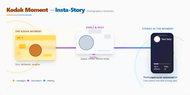
A visually stunning journey through photography's transformation. Sepia-toned vintage photos gently transition into vibrant, modern digital imagery. Subtle animations bring old cameras to life, morphing into sleek smartphones. Smooth parallax scrolling reveals hidden details, mimicking the unfolding of a photographic story. Clean typography and a minimalist design ensure the focus remains on the captivating visuals, evoking a sense of nostalgia and wonder.
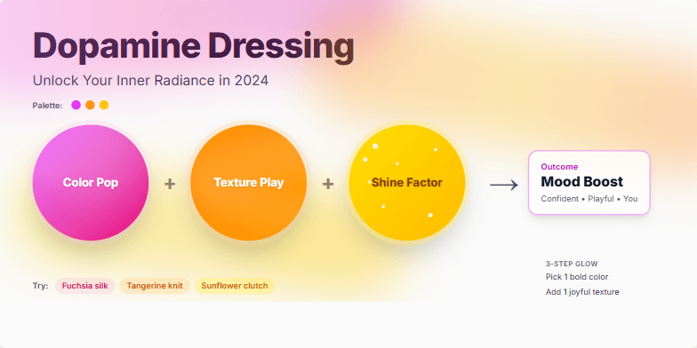
Imagine a slide bathed in vibrant, mood-boosting hues – fuchsia, tangerine, sunflower yellow. Dynamic transitions mimic the swish of fabrics and the sparkle of accessories. Close-ups on textures like silk and sequins add a touch of tactile luxury. The overall mood is joyful, playful, and empowering, reflecting the transformative power of color and style.
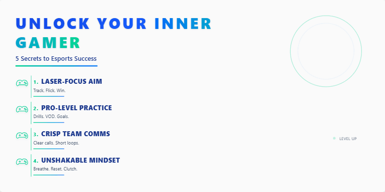
Dive into a world of vibrant neon and electric energy. This slide pulses with dynamic transitions, spotlighting each secret with a stylized game controller icon animation. Deep blues and electric greens create a sense of excitement and possibility. Bold, futuristic typography adds a cutting-edge feel, inspiring you to level up your game. Imagine short, punchy text appearing with satisfying sound effects, mimicking in-game notifications.
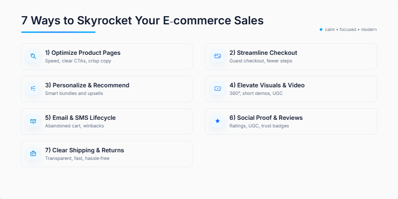
Imagine a sleek, minimalist design with cool blues and crisp whites. Each of the 7 ways is revealed with a subtle zoom animation, accompanied by a delicate chime. Icons are clean and modern, creating a sense of effortless sophistication. The overall feel is calming yet dynamic, promising valuable insights delivered with style.
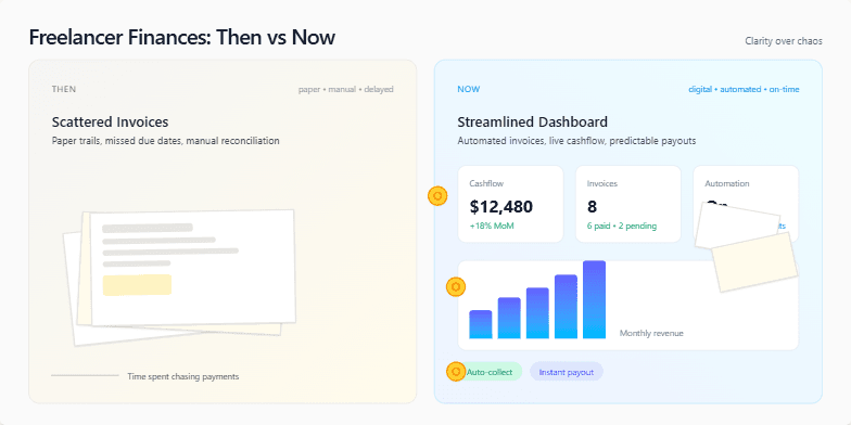
A sleek, minimalist slide with a split-screen design. One side showcases a muted, vintage color palette representing the 'Then' – chaotic paperwork, scattered invoices. The other side explodes with vibrant, modern hues for the 'Now' – streamlined digital dashboards, automated payments. Subtle animations of coins flowing and graphs rising add a touch of dynamism. Clean typography and strategic use of whitespace create a sense of clarity and control.
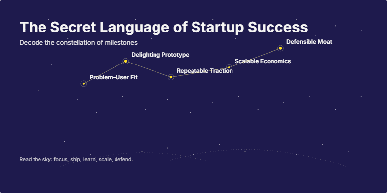
Deep indigo background with constellations of twinkling golden stars representing key startup milestones. Smooth, elegant transitions reveal each 'star' and its meaning. Minimalist typography in warm white emphasizes the mystical yet achievable nature of success. Inspiring ambient soundtrack complements the visual journey.
Want to generate your own slides with AI?
Start creating high-tech, AI-powered presentations with Slidebook.