AI-Powered Slide Generation: From Frustration to Effortless Design
Description provided by the user:
Create a slide demonstrating the frustration of manual slide creation versus the ease and beauty of AI-generated slides. The manual slide should appear messy and chaotic, with mismatched fonts, colors, and overlapping elements. It should evoke a feeling of stress and wasted time. The AI-generated slide, in contrast, should be clean, modern, and visually appealing, emphasizing the speed, consistency, and effortless design achievable with AI. Include a transition between the two slides to highlight the dramatic shift from chaos to order. The overall message should be that AI empowers users to focus on their ideas, leaving the design work to the technology.
Start by showing the "manual" slide at the top. The typography is bold but the slide is a mess: random sticky notes, odd colors, chaotic layout. There’s a clear sense of frustration — call out the "manual" badge and the emoji. Emphasize how much time and energy is wasted, and how the result still feels unsatisfying.
Next, an arrow appears, signaling a dramatic transition.
Finally, the bottom slide animates in — clean, harmonious, and labeled "AI-generated." The typography is still bold, but now organized. Highlight the checkmarks: beautiful in seconds, always consistent, zero frustration. End on the calm emoji and the quote: "Just focus on ideas. Let AI do the rest."
The emotional journey goes from stress and messiness to relief and clarity. The audience should feel the contrast viscerally.
Behind the Scenes
How AI generated this slide
Analyze user request for contrasting visual styles: 'messy and chaotic' vs. 'clean, modern'
Select appropriate visual elements for 'manual' slide: mismatched fonts (using font-bold, font-extrabold, font-semibold, font-medium), clashing colors (rose, amber, slate, lime, pink, cyan), overlapping design elements, rotated text elements
Implement animation using Framer Motion to simulate 'messiness' with staggered animations, varied rotation angles, and slightly off-kilter positioning
Craft 'AI-generated' slide with clean design: consistent font (font-semibold), harmonious color palette (emerald, cyan), structured layout (using flexbox with justify-between and items-center)
Enhance 'AI-generated' slide with subtle animation for polish: smooth entrance animation (using opacity and x-axis translation), gentle bounce animation on the sparkle emoji
Introduce a transition between slides using a downward arrow with a bouncing animation to symbolize the shift from manual to AI-driven design
Why this slide works
This slide effectively communicates the contrast between manual and AI-driven slide creation through deliberate visual choices and animations. The 'manual' slide's chaotic design, achieved through varied fonts, clashing colors, overlapping elements, and dynamic rotations, evokes the frustration of traditional design. In contrast, the 'AI' slide's clean aesthetic, built with a consistent font, harmonious color scheme, structured layout, and polished animation, showcases the ease and efficiency of AI design. The use of Framer Motion adds a layer of dynamic engagement, further emphasizing the contrast and making the message more impactful. The transition arrow seamlessly guides the viewer's eye and reinforces the narrative of moving from a state of frustration to one of effortless creation. The slide incorporates relevant SEO keywords like 'AI-generated,' 'slide design,' 'presentation design,' and 'Framer Motion animation' for enhanced discoverability.
Slide Code
You need to be logged in to view the slide code.
Frequently Asked Questions
How does AI improve slide creation?
AI streamlines the slide creation process by automating design choices, ensuring consistency, and drastically reducing the time and effort required. It handles tasks such as selecting fonts, colors, and layouts, allowing users to focus on content creation rather than design intricacies. This results in professional-looking slides generated quickly and efficiently, eliminating the frustration often associated with manual design.
What are the benefits of using Framer Motion for slide animation?
Framer Motion is a powerful animation library that allows for creating smooth and engaging transitions and effects. It provides fine-grained control over animation parameters, enabling developers to create complex animations with ease. Using Framer Motion can enhance presentations by adding visual interest, improving storytelling, and highlighting key information. Its declarative syntax simplifies the implementation of sophisticated animations, leading to more dynamic and engaging presentations.
What design principles are important for creating effective presentations?
Effective presentations prioritize clear and concise messaging, using visual elements to reinforce key points. Consistent typography, a harmonious color palette, and thoughtful use of whitespace contribute to a professional and engaging look. Strategic animation, such as the use of Framer Motion, can further enhance presentations by drawing attention to specific elements and guiding the viewer's eye through the content. Adhering to these principles ensures that presentations are not only visually appealing but also communicate information effectively.
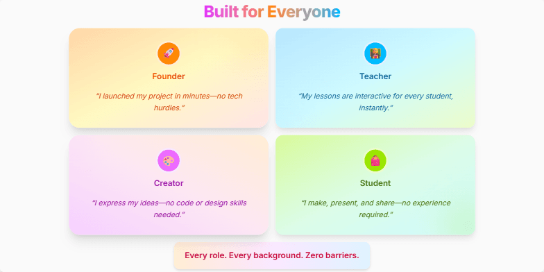
Create a slide showcasing how a product caters to diverse user roles and backgrounds, emphasizing ease of use and inclusivity. The design should be vibrant and engaging, highlighting four key user types: Founder, Teacher, Creator, and Student. Each user type should have a dedicated section with a short, impactful testimonial about how the product benefits them. The overall message should be that the platform breaks down barriers and empowers everyone to create, innovate, and learn, regardless of their prior experience or technical skills.
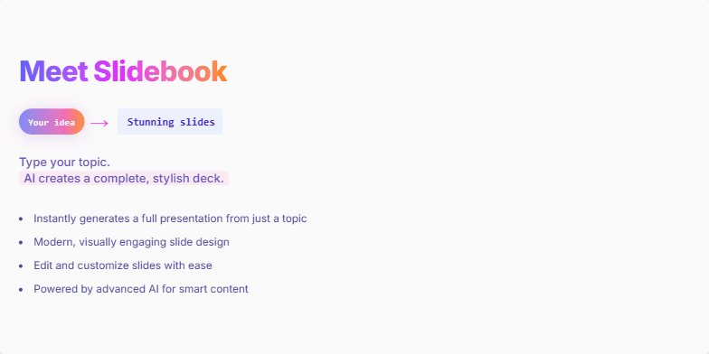
Create a slide introducing Slidebook, an AI-powered presentation maker that generates stylish slide decks from a simple topic. The slide should have a captivating headline, highlight the ease of use (just type a topic and get a presentation), and showcase the key features. The animation should focus on the transformation of an idea into a stunning slide deck, with a visual 'your idea → stunning slides' element. The overall tone should be exciting and modern, emphasizing the speed and simplicity of the process.
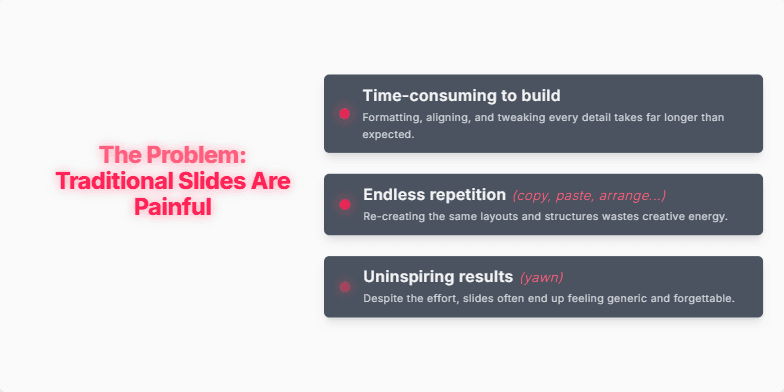
Create a slide that highlights the frustrations and problems associated with creating traditional slides. The slide should emphasize how time-consuming, repetitive, and uninspiring the process can be. Use animations and visuals to convey a sense of friction and frustration, making the audience feel the pain points. The overall tone should be dramatic and slightly urgent, setting the stage for a solution to these problems. The slide should resonate with anyone who has struggled with building presentations, making them eager for a better way.
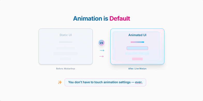
Create a slide that visually demonstrates the difference between static UI elements and UI elements enhanced with subtle animations, emphasizing that this animation is now automatically applied by default, requiring no user intervention or configuration. Showcase a 'before' and 'after' comparison, highlighting how the animated elements bring the interface to life. Convey the message that motion design is no longer an extra step but an integrated part of the user interface design process, making the experience more engaging and visually appealing. The slide should have a title, a clear visual comparison, and a concise, impactful message reinforcing the ease of use and automatic nature of these new animations. Target audience is UI/UX designers and developers.
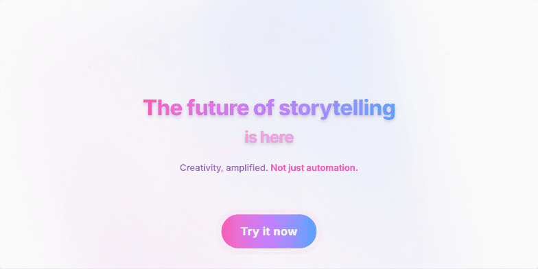
Create a visually stunning and inspiring closing slide for a presentation about a new storytelling technology. It should have a futuristic, energetic feel and a clear call to action. The slide should convey the message that this technology empowers creativity, not just automates tasks. The target audience is creative professionals interested in innovation. Include a vibrant background, a powerful quote, and a prominent "Try it now" button. The overall tone should be exciting and motivational, encouraging the audience to explore the possibilities of this technology. The slide should emphasize how the technology amplifies human imagination, not replaces it.
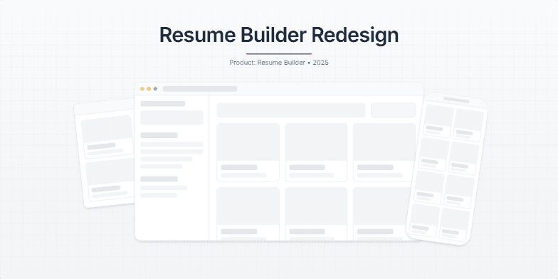
Create a slide showcasing a redesign of a resume builder application. The slide should have a clean, modern aesthetic, emphasizing the minimalist design of the new interface. It should feature mockups of the application on different devices (desktop, laptop, phone) and a title highlighting the redesign. The overall tone should be premium and calm, setting the stage for a detailed case study presentation. Use a subtle background gradient, a hint of a grid, and a slight grain effect to create a tactile feel. Animate the mockups with subtle movements for visual interest. Include speaker notes explaining the design choices and the intended mood.
Want to generate your own slides with AI?
Start creating high-tech, AI-powered presentations with Slidebook.