Create a slide showcasing a redesign of a resume builder application. The slide should have a clean, modern aesthetic, emphasizing the minimalist design of the new interface. It should feature mockups of the application on different devices (desktop, laptop, phone) and a title highlighting the redesign. The overall tone should be premium and calm, setting the stage for a detailed case study presentation. Use a subtle background gradient, a hint of a grid, and a slight grain effect to create a tactile feel. Animate the mockups with subtle movements for visual interest. Include speaker notes explaining the design choices and the intended mood.
Open with a quiet, premium mood: a soft off-white to pale gray gradient, a faint modular grid, and a gentle grain so the canvas feels tactile.
Bring in the headline: “Resume Builder Redesign.” Point out the single cobalt underline as our only accent to keep the tone minimal and calm.
Read the subtitle briefly: product, year, and my role covering product design and frontend.
Introduce the hero: center is the desktop builder UI, with a slight parallax float for subtle energy.
On the left, the angled laptop shows the template library; on the right, the phone mirrors it for mobile. Note the glassy grounding shadows that keep the devices feeling real without clutter.
Close by reaffirming the aesthetic: minimal, premium, calm—setting the tone for the case study that follows.
Behind the Scenes
How AI generated this slide
Establish a calm and premium aesthetic using a soft gradient background, grid overlay, and noise texture for a tactile feel.
Introduce the title 'Resume Builder Redesign' with a cobalt blue underline as a single accent color, reinforcing the minimal design.
Present mockups of the redesigned application on desktop, laptop, and phone, each with subtle animations (parallax float, gentle rotations).
Apply glassy grounding shadows beneath the mockups to enhance realism without adding visual clutter.
Craft speaker notes to explain the design choices, emphasizing the minimalist aesthetic and the calm tone intended for the case study presentation.
Why this slide works
This slide effectively communicates the essence of the resume builder redesign through its minimalist design and subtle animations. The use of a calm color palette, grid overlay, and noise texture contributes to a premium feel. Showcasing the app on different devices demonstrates its responsiveness and broad appeal. The subtle animations add visual interest without being distracting, while the glassy shadows ground the mockups in a realistic yet uncluttered way. The comprehensive speaker notes provide valuable context and further enhance the presentation's effectiveness. The slide leverages keywords such as 'minimalist design,' 'UI/UX design,' 'responsive design,' 'animation,' and 'presentation design,' improving its visibility and relevance in design-related searches. The clear hierarchy of information, from the title to the device mockups, ensures that the message is easily understood by the audience.
Slide Code
You need to be logged in to view the slide code.
Frequently Asked Questions
What design principles are highlighted in this slide?
The slide emphasizes minimalist design principles, using a limited color palette, clean typography, and subtle animations to create a calm and premium aesthetic. The focus is on clarity and functionality, showcasing the redesigned user interface without unnecessary distractions.
How do the animations enhance the slide's effectiveness?
The subtle animations, such as the parallax float of the desktop mockup and the gentle rotations of the laptop and phone mockups, add a layer of visual interest without being overwhelming. They create a sense of dynamism and modernity, drawing the viewer's attention to the key elements of the redesign.
What is the purpose of the grid overlay and noise texture?
The grid overlay and noise texture contribute to the overall premium feel of the slide. The grid adds a subtle structure, while the noise texture creates a tactile impression, as if the canvas were a physical material. These elements enhance the visual appeal and sophistication of the presentation.
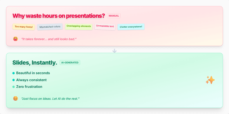
Create a slide demonstrating the frustration of manual slide creation versus the ease and beauty of AI-generated slides. The manual slide should appear messy and chaotic, with mismatched fonts, colors, and overlapping elements. It should evoke a feeling of stress and wasted time. The AI-generated slide, in contrast, should be clean, modern, and visually appealing, emphasizing the speed, consistency, and effortless design achievable with AI. Include a transition between the two slides to highlight the dramatic shift from chaos to order. The overall message should be that AI empowers users to focus on their ideas, leaving the design work to the technology.
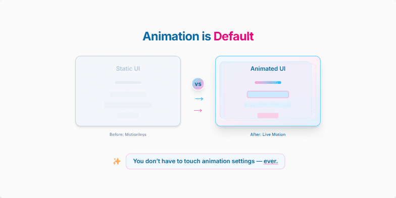
Create a slide that visually demonstrates the difference between static UI elements and UI elements enhanced with subtle animations, emphasizing that this animation is now automatically applied by default, requiring no user intervention or configuration. Showcase a 'before' and 'after' comparison, highlighting how the animated elements bring the interface to life. Convey the message that motion design is no longer an extra step but an integrated part of the user interface design process, making the experience more engaging and visually appealing. The slide should have a title, a clear visual comparison, and a concise, impactful message reinforcing the ease of use and automatic nature of these new animations. Target audience is UI/UX designers and developers.
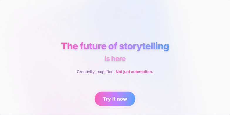
Create a visually stunning and inspiring closing slide for a presentation about a new storytelling technology. It should have a futuristic, energetic feel and a clear call to action. The slide should convey the message that this technology empowers creativity, not just automates tasks. The target audience is creative professionals interested in innovation. Include a vibrant background, a powerful quote, and a prominent "Try it now" button. The overall tone should be exciting and motivational, encouraging the audience to explore the possibilities of this technology. The slide should emphasize how the technology amplifies human imagination, not replaces it.
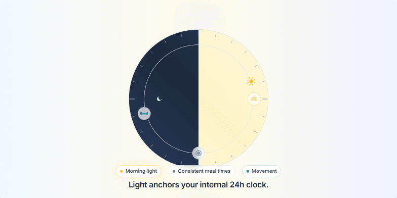
Create a slide visualizing the circadian rhythm and how light, consistent meal times, and movement help regulate it. The slide should feature a 24-hour dial, with the right half representing daytime (light) and the left half representing nighttime (dark). Animate a sun moving across the daytime arc. Include icons representing sunrise, lunch, and a workout at their respective times on the dial. The slide should have a headline emphasizing the importance of light for regulating the circadian rhythm. Add a list of the three key cues: Morning light, Consistent meal times, and Movement.
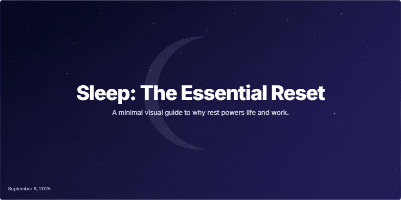
Create a title slide for a presentation about sleep and its importance for overall well-being, including improved cognitive function, creativity, and long-term health. The slide should have a dark, calming background with subtle animations, possibly a crescent moon, and evoke a sense of tranquility and rest. The title should be impactful and the overall design minimal and visually appealing. The color scheme should be dark with shades of indigo and hints of white or light indigo for contrast. Include a date (September 8, 2025) and a subtitle that briefly explains the presentation's purpose.
Create a visually appealing slide emphasizing the importance of sleep for overall well-being and performance. The slide should have a calming, dreamlike aesthetic with gentle animations. The core message should be 'Protect your sleep. It protects you.' Include subtle background animations, perhaps with gradients and blur effects. The target audience is professionals and high-achievers who may be sacrificing sleep for work. The slide should serve as a gentle reminder of the crucial role sleep plays in maintaining physical and cognitive health, ultimately enhancing productivity and performance. Include resources/references on sleep hygiene for further exploration by the audience. The overall tone should be serene and motivational, encouraging viewers to prioritize sleep.
Want to generate your own slides with AI?
Start creating high-tech, AI-powered presentations with Slidebook.