This slide uses a split-screen design with calming pastel blues on the 'Analog Focus' side, showcasing a person peacefully journaling in a sunlit room with subtle dust mote animation. The 'Digital Distraction' side uses vibrant, almost frantic neon pinks and oranges with a stylized, glitching phone screen displaying endless notifications. The contrast emphasizes the core message visually. Transition: a smooth swipe to reveal the stark difference.
Categories
Generated Notes
Start by framing the contrast: on the left, analog focus; on the right, digital distraction. Invite the audience to notice the color temperature and mood shift.
Point to the left panel: highlight the calm blues, the journal elements, and the floating dust motes that suggest stillness. Emphasize single-task depth and reflective thinking.
Now, trigger the next fragment to swipe in the right panel. Describe the neon gradient, the jittering notification bars, and how constant alerts fragment attention.
Summarize the takeaway: quieter environments enable stronger cognition, while notification loops trade clarity for novelty. Encourage choosing the left mode intentionally for deep work.
Behind the Scenes
How AI generated this slide
Analyze the topic 'Analog Focus vs. Digital Distraction' and identify key visual elements representing each concept.
Select a split-screen layout to directly contrast the two themes.
Choose a calming pastel blue color palette for 'Analog Focus' and vibrant neon pinks and oranges for 'Digital Distraction' to evoke contrasting moods.
Design visuals: a person journaling in a sunlit room for 'Analog Focus' and a glitching phone screen with notifications for 'Digital Distraction'.
Add subtle animations: dust motes for 'Analog Focus' and pulsing notifications/glitching effect for 'Digital Distraction' to enhance the visual storytelling.
Implement a smooth swipe transition to reveal the stark difference between the two sides and create a dynamic presentation experience.
Generate code using Framer Motion for animations and Tailwind CSS for styling, ensuring responsiveness and visual appeal.
Why this slide works
This slide effectively communicates the contrast between analog focus and digital distraction through a compelling visual narrative. The split-screen design, color palettes, and animations work together to create a clear and memorable message. The use of calming blues and subtle dust motes on the 'Analog Focus' side evokes a sense of peace and tranquility, while the vibrant neon colors and glitching phone screen on the 'Digital Distraction' side represent the overwhelming nature of constant notifications. This visual dichotomy reinforces the core message, making it easily digestible and impactful for the audience. The smooth swipe transition further enhances the presentation by dynamically revealing the stark difference between the two states of being. The code leverages Framer Motion for seamless animations and Tailwind CSS for efficient styling, resulting in a visually appealing and responsive slide optimized for various screen sizes. The use of specific visual cues, such as the journal and the overflowing notifications, strengthens the message and improves audience engagement and understanding of the concepts of focus and distraction in the digital age. The incorporation of animation adds a layer of depth and dynamism, making the presentation more captivating and memorable.
Slide Code
You need to be logged in to view the slide code.
Frequently Asked Questions
What is the main message of this slide?
The slide visually contrasts analog focus, represented by journaling in a peaceful setting, with digital distraction, symbolized by a phone overflowing with notifications. It highlights how analog activities can promote deep work and mindfulness, while digital distractions can hinder productivity and clarity.
How do the visuals support the message?
The calming blue hues and subtle dust motes animation on the 'Analog Focus' side create a sense of tranquility. Conversely, the vibrant neon colors and glitching phone screen on the 'Digital Distraction' side evoke a feeling of overwhelm and anxiety. This visual contrast effectively communicates the core message about the impact of different environments on focus and productivity.
What technologies were used to create this slide?
The slide was created using Framer Motion for animations, Tailwind CSS for styling, and a component-based approach with React. Framer Motion allows for smooth and engaging transitions and animations, while Tailwind CSS provides a utility-first approach for efficient and responsive styling. React facilitates a modular and maintainable code structure.
How does the slide's animation enhance the presentation?
The subtle animations, like the floating dust motes and the pulsing notifications, add a layer of depth and dynamism to the slide. They enhance the visual storytelling by drawing attention to key elements and emphasizing the contrast between the two sides. The smooth swipe transition further strengthens the presentation by dynamically revealing the digital distraction side.
Imagine a slide that unfolds like a storybook, parchment-colored background with whimsical, hand-drawn illustrations of robots painting. Soft, sepia tones evoke a sense of nostalgia. Watch as brushstrokes animate onto the canvas, revealing stunning AI-generated artwork. A gentle, twinkling soundtrack underscores the magical evolution of technology.
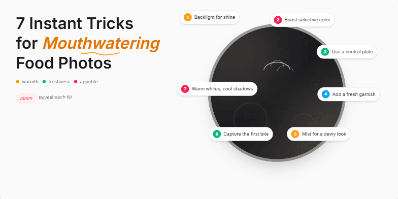
Deep, rich color palettes showcasing vibrant food photography. Dynamic transitions mimicking the sizzle of a hot pan and the freshness of ingredients. Clean, minimalist typography with handwritten font accents for a personal touch. Each trick revealed with a subtle zoom and light animation, creating a sense of discovery and anticipation.
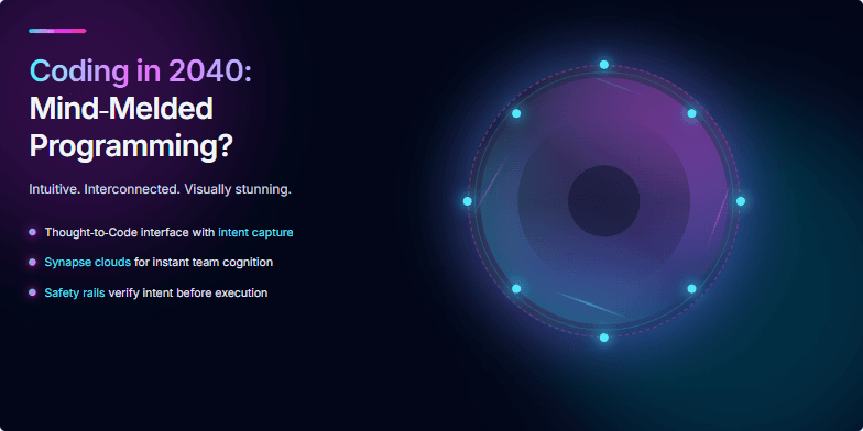
Imagine vibrant neon visuals swirling around a central holographic brain, pulses of light representing code flowing between synapses. The slide uses a dark, cyberpunk aesthetic with electric blue and fuchsia accents. A subtle animation shows the brain rotating slowly, creating an illusion of depth and complexity. Experience the future of coding – intuitive, interconnected, and visually stunning.
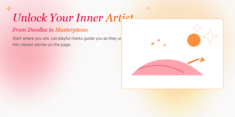
Imagine a soft watercolor wash background, transitioning from pale pinks to vibrant oranges as the title appears in elegant script. Each word gently fades in, accompanied by a delicate sparkle animation. As the description appears, a playful sketch of a hand holding a paintbrush morphs into a stunning finished artwork, showcasing the transformative power of art. The overall mood is inspiring and inviting, using warm hues and subtle animations to create a sense of wonder and possibility.
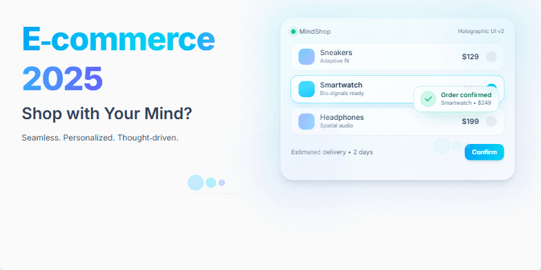
Imagine a slide bathed in cool, futuristic blues and silvers. A sleek, minimalist design showcases a conceptual holographic interface shimmering with product options. Subtle animations depict thought bubbles transforming into purchase confirmations. Clean typography and strategic use of negative space create a sense of effortless, intuitive shopping. This slide visually embodies the future of e-commerce, promising a seamless, personalized experience.
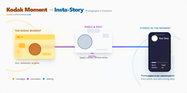
A visually stunning journey through photography's transformation. Sepia-toned vintage photos gently transition into vibrant, modern digital imagery. Subtle animations bring old cameras to life, morphing into sleek smartphones. Smooth parallax scrolling reveals hidden details, mimicking the unfolding of a photographic story. Clean typography and a minimalist design ensure the focus remains on the captivating visuals, evoking a sense of nostalgia and wonder.
Want to generate your own slides with AI?
Start creating high-tech, AI-powered presentations with Slidebook.