Beyond Swiping: Designing Your Algorithmic Soulmate in the Post-AI Dating Apocalypse
Description provided by the user:
A deep indigo background melts into a soft magenta glow. A holographic heart, woven from shimmering data points, rotates slowly at the center. Luminous lines of code pulse from its core like gentle heartbeats, branching across the screen. The title text appears with a subtle, elegant glitch effect, creating a mood that's both futuristic and deeply intimate.
Categories
Generated Notes
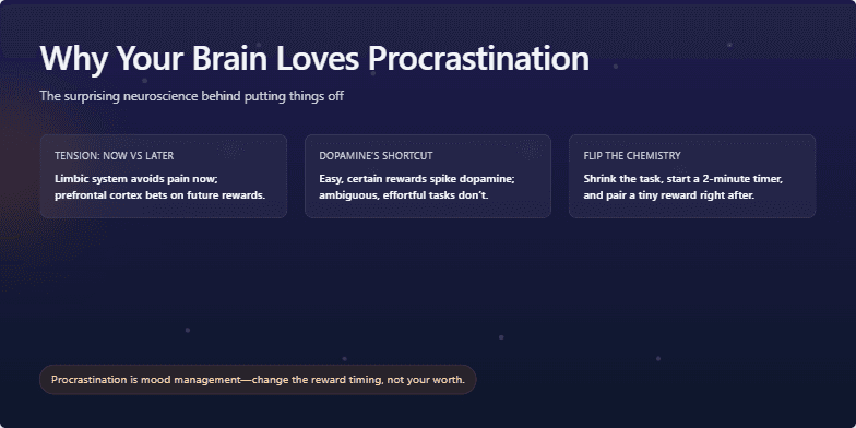
Open by acknowledging the saturated swipe era and set the tone: intimate, not just futuristic. This slide’s glow and heartbeat lines signal a shift from cold algorithms to felt experiences.
Draw attention to the rotating data heart. Explain it as the convergence of vectors and values—signals, consent, and intent shaping a living profile.
Point to the pulsing lines. These represent feedback loops—data in, meaning out—moving away from static filters toward adaptive compatibility.
Reference the floating code chips. Call out matchScore, biasGuard, and serendipity as guardrails and generators: safe, fair, and delightfully unpredictable.
Land on the title: “Beyond Swiping.” Frame the thesis—design systems that orchestrate introductions, not just matches; that optimize for connection quality over engagement minutes.
Promise specifics next: signals you model, consent-first architectures, bias mitigation, and intentionally engineered serendipity.
Behind the Scenes
How AI generated this slide
First, I conceptualized the core theme: a fusion of futuristic technology and deep human intimacy, aiming to visually represent an 'algorithmic soulmate'.
Next, I designed the ambient background using a CSS gradient from deep indigo to magenta, overlaid with blurred radial gradients to create a soft, glowing nebula effect, setting a futuristic yet warm tone.
The central 'holographic heart' was programmatically generated using a parametric equation in JavaScript to plot points in a heart shape. These points were then rendered as an SVG with varying dot sizes and opacities to simulate a complex data structure.
To bring the heart to life, I applied a slow, continuous 360-degree rotation animation using Framer Motion, giving it a weightless, holographic quality.
I then created the 'pulsing code' effect by defining several curved SVG paths radiating from the center. I animated the 'strokeDashoffset' property on a duplicate set of paths, creating the illusion of energy or data flowing outwards, like a heartbeat.
To add more context and reinforce the 'algorithmic' theme, I created floating 'code chips' with conceptual snippets like 'biasGuard.on()' and 'serendipity += noise', animating their position and opacity to make them drift in and out of focus.
For the typography, I chose a clean, modern font and applied subtle Framer Motion animations. The main title features a quick 'glitch' effect, achieved by rapidly shifting its x and y position for a fraction of a second, to enhance the futuristic aesthetic.
Finally, I orchestrated the appearance of each visual element using Fragment components, ensuring a sequential build-up that guides the viewer's attention from the environment to the central icon and then to the title.
Why this slide works
This slide is highly effective because it masterfully translates the abstract concept of an advanced dating algorithm into a compelling visual metaphor. The 'data heart' is a powerful symbol, immediately connecting the coldness of data with the warmth of human connection. The use of sophisticated animations with Framer Motion on SVG elements creates a dynamic and premium feel, elevating the presentation beyond static text and images. The color palette of deep indigos and vibrant fuchsias is both futuristic and emotionally resonant. By embedding conceptual code snippets like 'biasGuard.on()', the slide communicates key features of the proposed system—like ethical AI and engineered serendipity—in a visually integrated and easily digestible way. This approach demonstrates a deep understanding of visual storytelling, UI/UX design, and front-end development, making the topic of AI in relationships feel innovative and aspirational.
Slide Code
You need to be logged in to view the slide code.
Frequently Asked Questions
How is the 'holographic heart' effect created in the code?
The heart is an SVG graphic generated programmatically within a React component. It uses a well-known parametric equation to calculate hundreds of (x, y) coordinates that form a perfect heart shape. These coordinates are then used to render small, colored circles with varying sizes and opacities, giving the impression of shimmering data points. The entire SVG group is then animated with the Framer Motion library to rotate slowly and continuously, creating a dynamic, pseudo-3D holographic feel.
What is the significance of the pulsing 'lines of code'?
The pulsing lines, created using animated SVG stroke-dasharray properties, symbolize the dynamic and continuous flow of data in this futuristic dating algorithm. They represent the 'heartbeat' of the system—the constant processing of signals, user intent, and feedback loops. Unlike static profiles, these lines suggest a living, learning system that adapts to find a 'soulmate,' reinforcing the presentation's theme of moving beyond simple, static matching to a more organic, evolving connection.
What technologies are used to build this slide?
This slide is built using a modern web development stack. The core structure is a React component ('use client' indicates a Next.js or similar framework context). Styling is likely handled by Tailwind CSS, as seen in the class names like 'bg-indigo-950'. All the complex animations and visual effects are powered by Framer Motion, a popular React animation library. The main graphics, like the heart and rays, are rendered as SVGs (Scalable Vector Graphics), which allows for crisp, programmatically generated and animatable visuals.
What do the floating 'code chips' like 'biasGuard.on()' and 'serendipity += noise' represent?
The floating code chips are conceptual snippets that represent the core design principles of the proposed 'algorithmic soulmate' system. 'biasGuard.on()' suggests a commitment to fairness and mitigating algorithmic bias. 'serendipity += noise' indicates that the system intentionally introduces randomness to create unexpected, delightful connections, moving beyond hyper-optimized matches. 'intent > impulse' highlights a focus on deeper compatibility over fleeting attraction. They serve as visual shorthand for the key pillars of a more thoughtful, ethical, and human-centric AI dating platform.
A deep, calming navy blue background sets a thoughtful mood, with faint, animated neural pathways softly pulsing like distant stars. Clean, white sans-serif typography emerges with a gentle fade-in. A single, glowing orb of warm orange light drifts slowly across the screen, representing focus and clarity, drawing the eye and promising a moment of profound insight.
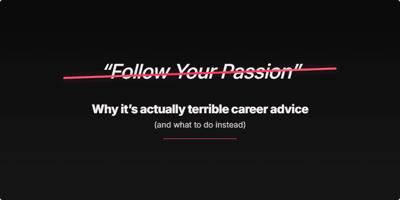
A deep, matte black background sets a dramatic stage. The words 'Follow Your Passion' appear in a soft, elegant script. After a pause, a sharp, neon-coral line animates, decisively striking through the phrase with a subtle glass-shattering sound. The rest of the title then fades in with a clean, bold sans-serif font. The mood is iconoclastic and modern, designed to feel like a well-kept secret is about to be revealed.
A minimalist, full-screen hero image of a serene, well-lit workspace. The color palette is a sophisticated blend of muted sage green, cream, and charcoal gray. As the slide appears, the title text elegantly animates, with the '70%' subtly glowing for a moment before fading to a crisp white. A soft, ambient light leak effect gently pulses in one corner, creating a mood of calm authority and high-end professionalism.
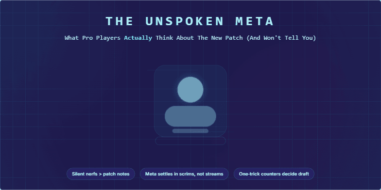
A deep indigo background hums with a barely-visible grid, crossed by thin, neon cyan lines that pulse like a motherboard. The title text flickers into view with a subtle static effect, glowing in a sharp, digital font. A central, holographic icon of a game character shimmers and glitches, revealing hidden data streams in magenta that animate across the screen before fading into the dark, minimalist layout.
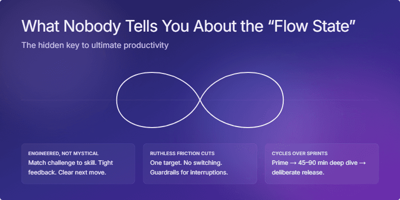
A mesmerizing slide bathed in deep indigo and soft violet hues. A single, fluid line of light gracefully animates across the screen, morphing into an elegant infinity symbol that pulses with a calm, white glow. The design is minimalist and serene, with soft-focus, abstract light refractions drifting in the background like gentle thoughts. The mood is one of profound clarity and effortless focus, creating a visual sanctuary that sells the promise of peak performance.
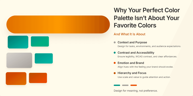
Imagine a soft, minimalist design where a single, animated brushstroke of vibrant ochre elegantly sweeps across a warm, matte cream background. As it moves, it reveals shimmering, micro-detailed swatches of complementary teals and terracottas that gently float into place. The mood is sophisticated, calm, and inspiring, using a subtle parallax effect to give the color chips a sense of depth and weight. It's pure visual harmony.
Want to generate your own slides with AI?
Start creating high-tech, AI-powered presentations with Slidebook.