Challenge & Key Insights: Clarity in Creation Flow
Description provided by the user:
This slide is for a presentation about improving a creation flow that's suffering from drop-off. The key insight is that the flow lacks clarity, leading to hesitation and users abandoning the process. Four main pain points are identified: too many steps, unclear progress, weak live preview, and friction during export. These issues, combined with mobile pain points and template overwhelm, contribute to the drop-off, especially in the later stages of the flow (preview and export). The goal is to restore clarity and reduce friction across these touchpoints. The presentation aims to convince the audience of the need for improvements and set the stage for discussing solutions.
Introduce the slide with the headline: The Challenge & Key Insights.
State the core problem: our creation flow loses clarity, which slows people down and increases drop-off. Lightly emphasize the word clarity as a theme for the rest of the talk.
Walk through the four cards quickly, one sentence each: too many steps; progress is unclear; live preview is weak; export has friction.
Reveal the small funnel to hint at behavior. Explain that drop-off intensifies after preview and export, and note that mobile pain points and template overwhelm likely amplify the effect even though they are not shown as cards.
Close with a transition: our goal is to restore clarity and reduce friction across these touchpoints.
Behind the Scenes
How AI generated this slide
Analyze user context to understand the core message: clarity and drop-off in the creation flow.
Structure the slide with a title, problem statement, key insights (pain points), and a visual representation (funnel).
Select visuals that communicate the concepts effectively: icons for pain points, funnel for drop-off.
Craft concise and impactful text for title, problem statement, and supporting details.
Incorporate animations (using Framer Motion) to enhance engagement and visual appeal.
Use a clean and professional design with appropriate typography, spacing, and color palette.
Why this slide works
This slide effectively communicates the core problem and key insights. The title clearly states the topic, while the problem statement concisely explains the issue of clarity and drop-off. The four pain points are presented with clear icons and short titles, making them easy to understand. The funnel visualization provides a clear representation of the drop-off pattern. The use of animations adds visual interest and helps guide the audience through the information. The clean design ensures readability and professionalism. Overall, the slide is well-structured, visually appealing, and effectively conveys the intended message.
Slide Code
You need to be logged in to view the slide code.
Frequently Asked Questions
How does this slide address the issue of clarity?
The slide addresses clarity by visually representing the problem areas. Clear icons and concise text for each pain point make it easy for the audience to grasp the issues. The funnel visualization clearly depicts the drop-off, emphasizing the impact of the clarity problem. The overall clean design also contributes to clarity.
What is the purpose of the funnel visualization?
The funnel visualizes the user journey through the creation flow. It shows how the number of users decreases from the start to the preview and finally to the export stage. This decline visually represents the drop-off problem, illustrating how users are abandoning the process at different stages.
What is the significance of the 'clarity' emphasis?
Clarity is emphasized because it's the core problem identified in the creation flow. The lack of clarity leads to confusion, hesitation, and ultimately, user drop-off. By highlighting 'clarity,' the slide sets the stage for subsequent discussions about solutions that aim to improve the flow and retain users.
This slide is part of a presentation on promoting a sleep-positive culture in the workplace. The aim is to highlight how prioritizing rest can improve team performance and well-being. The slide visually represents three key practices: no after-hours pings, late starts after late work, and a 10-4 meeting window. It uses animated icons and a cityscape backdrop to convey a sense of calm and focus. The overall message is that rest is crucial for productivity and a key element of a healthy work environment. The goal is to convince the audience that these practices are beneficial and should be adopted.
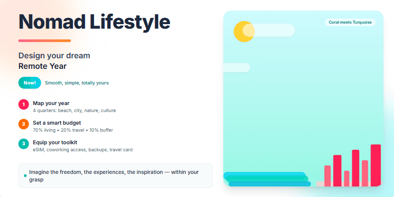
Bold typography paired with dreamy, wanderlust-inducing imagery of tropical beaches and bustling cityscapes. Warm color palette with pops of vibrant coral and turquoise. Smooth transitions between slides mimic the ease of nomadic living. Subtle animated elements, like floating clouds and swaying palm trees, add depth and dynamism. Imagine the freedom, the experiences, the inspiration – all within your grasp.
Create a slide that presents common sleep myths alongside factual counterpoints. The slide should have a visual element that represents 'flipping' between myth and fact, like a toggle switch. It should cover myths such as 'catching up on sleep on weekends,' 'coffee replacing sleep,' and the idea that some people thrive on very little sleep. The design should be clean and modern, with a focus on clear communication of the information. Include speaker notes that elaborate on each myth and fact with scientific backing.
Create a slide demonstrating micro-interactions that enhance user experience while prioritizing accessibility and inclusivity. Showcase examples of reorder with snap, inline help, keyboard focus, and an inclusive checklist. The slide should visually represent these concepts with clear and concise explanations. The examples should demonstrate how these micro-interactions cater to users of varying abilities, including those using assistive technologies. The overall design should be clean and modern, using a neutral color palette with subtle accents to highlight key elements. The slide should also include speaker notes that provide a deeper explanation of each micro-interaction and its benefits.
Create a slide about smart napping. It should cover the optimal nap lengths for different benefits (e.g., alertness boost, full sleep cycle), the ideal timing for napping to avoid disrupting nighttime sleep, and the negative effects of napping for too long during certain times. The slide should have a visual representation of the different nap lengths and their corresponding benefits, such as a pie chart or a similar graphic. The color scheme should be calming and professional. It should also include some practical tips for incorporating smart napping into one's daily routine. The target audience is professionals and productivity enthusiasts looking to optimize their energy levels throughout the day.
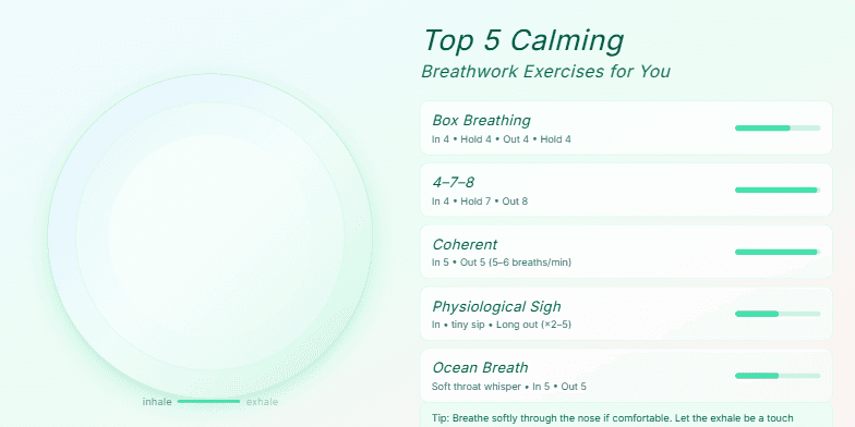
Soft, muted pastel backgrounds transition serenely between slides. Each breathwork exercise is visualized with elegant, flowing animations, mimicking the inhale and exhale. Calming script font accompanies each exercise, enhancing the tranquil mood. Tiny, sparkling details appear and disappear subtly around the screen edges, adding a touch of magic to the experience.
Want to generate your own slides with AI?
Start creating high-tech, AI-powered presentations with Slidebook.