This slide contrasts stark black and white imagery representing logic and intuition, respectively. A dynamic split-screen transition reveals the title, emphasizing the core message. Subtle animations of data points morphing into abstract shapes add an artistic touch. The overall mood is sleek and modern, highlighting the power of informed decision-making.
Categories
Generated Notes
Start with the split-screen animation: explain that decision-making often feels like a tug-of-war between logic and intuition.
Point to the left: the black field and evolving dots represent structured, reliable data points—patterns we can measure and test.
Point to the right: the soft, morphing shapes capture gut instinct—fluid, context-aware, and shaped by experience.
Emphasize the title as it appears: we do not choose one over the other; we let data lead and intuition refine.
Conclude: the best decisions honor evidence and embrace human judgment—use data to narrow options, then apply intuition to move with confidence.
Behind the Scenes
How AI generated this slide
Analyze the topic 'Data-Driven Decisions vs. Gut Feelings' and identify key visual metaphors for logic and intuition.
Select a sleek, modern aesthetic with a black and white color scheme to represent the contrasting concepts.
Implement a dynamic split-screen transition using Framer Motion to reveal the title and emphasize the core message.
Design the left side with a grid of animated dots symbolizing data points, subtly morphing their shape and scale for visual interest.
Craft the right side with amorphous, animated blobs representing the fluidity of intuition, using varying shades of gray for depth.
Add a thin vertical line in the center to further delineate the split-screen and enhance the visual contrast.
Incorporate subtle animations for the title and labels (Logic, Intuition) to guide the viewer's attention and improve engagement.
Optimize animation timings and easing functions for a smooth and polished feel.
Why this slide works
This slide effectively communicates the contrast between data-driven decisions and gut feelings through its strong visual metaphors and dynamic animations. The split-screen design clearly separates the two concepts, while the animations add visual interest and emphasize the distinct characteristics of each. The sleek, modern aesthetic enhances the overall message of informed decision-making. The use of Framer Motion allows for smooth and complex animations, creating a visually appealing and engaging presentation. The contrasting colors and shapes, combined with the clear title and labels, make the message easily understandable. The subtle animations and transitions maintain a professional look while adding a touch of creativity. The slide is well-structured and optimized for audience comprehension and retention, appealing to both visual and logical learners.
Slide Code
You need to be logged in to view the slide code.
Frequently Asked Questions
How does the animation contribute to the slide's message?
The animations play a crucial role in conveying the essence of each concept. The morphing dots on the left side visualize data points as dynamic and adaptable, highlighting the evolving nature of data analysis. On the other hand, the fluid, organic movement of the blobs on the right captures the subjective and often unpredictable nature of intuition. The split-screen transition further emphasizes the contrast, suggesting a dynamic interplay between the two approaches.
What is the significance of the black and white color scheme?
The black and white color palette reinforces the contrast between logic and intuition. Black, often associated with logic, order, and rationality, represents data-driven decisions. White, coupled with shades of gray, portrays intuition's more nuanced and less defined nature, suggesting a realm where clarity may not always be immediate but can be derived through experience and context.
How can this slide be used in a presentation about decision-making?
This slide serves as an excellent visual anchor for discussing the complexities of decision-making. Presenters can use it to introduce the concept of balancing data analysis with intuition, highlighting the strengths and limitations of each approach. It can spark conversations about when to rely on data, when to trust your gut, and how to effectively integrate both for optimal outcomes in various scenarios, from business strategy to personal choices.
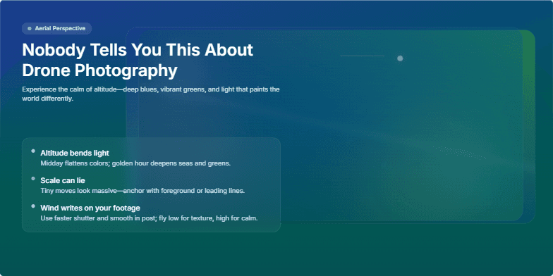
Experience the magic of aerial perspectives. This slide utilizes a mesmerizing parallax effect, showcasing stunning drone footage transitioning between breathtaking landscapes. Deep blues and vibrant greens dominate the color palette, creating a sense of tranquility and awe. Subtle light leaks and lens flares add a touch of artistic flair, while smooth transitions and a minimalist design keep the focus on the captivating visuals.
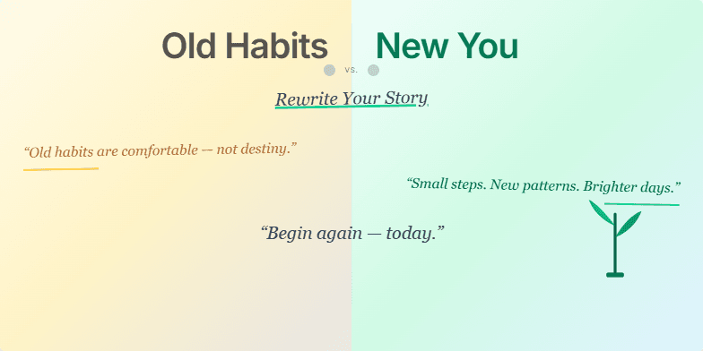
This slide uses a dramatic split-screen effect, contrasting faded sepia tones representing 'Old Habits' with vibrant, energetic colors for the 'New You.' A stylized, handwritten font adds a personal touch, while subtle animation of a growing plant symbolizes growth and transformation. Short, inspiring quotes appear with a gentle fade-in, creating a sense of hope and possibility. The overall design is clean and minimalist, allowing the message to resonate deeply.
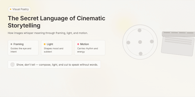
Dive into a world of visual poetry. This slide uses a muted, vintage color palette with soft focus effects to evoke the golden age of cinema. Smooth transitions and subtle animations, like flickering film grain, create a nostalgic and captivating atmosphere. Close-ups of iconic film reels and clapperboards add a touch of classic Hollywood glamour.
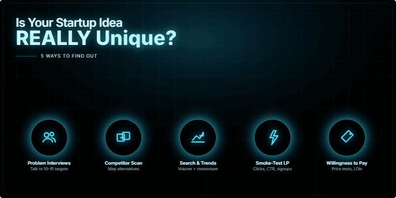
This slide uses a bold, minimalist design with a stark black background and electric blue neon accents. The title appears as a holographic projection, shimmering slightly. Five sleek icons, each representing a key validation method, pulse rhythmically with a soft glow. The overall effect is futuristic and intriguing, drawing the viewer in to discover the secrets within.
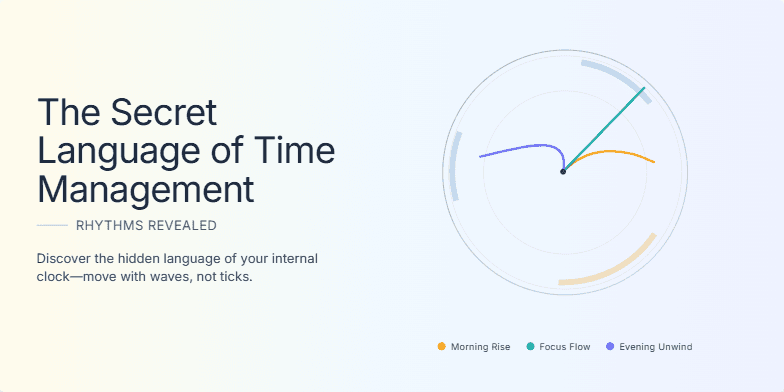
Imagine a slide bathed in the warm glow of sunrise, transitioning to the cool hues of twilight. A stylized clock face subtly animates, its hands moving not in ticks, but in flowing waves, visualizing the natural rhythms of productivity. Clean typography, minimalist design, and whispers of ambient music create an atmosphere of peaceful discovery. Discover the hidden language of your own internal clock.
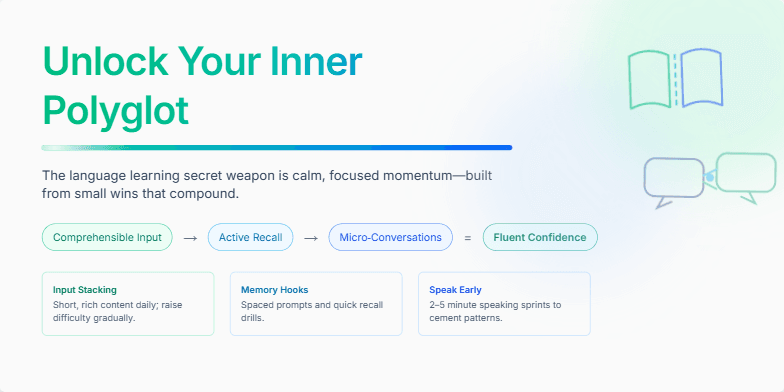
Deep blues and emerald greens evoke the calm focus of successful language acquisition. Stylized icons of open books and interconnected speech bubbles dance across the screen, hinting at the power of communication. A subtle shimmer effect highlights the central message: unlocking your potential. Minimalist typography and clean lines create a sense of elegant simplicity, inviting you to embark on this transformative journey.
Want to generate your own slides with AI?
Start creating high-tech, AI-powered presentations with Slidebook.