David vs. Goliath Startups: Sling Your Way to Success
Description provided by the user:
Bold, contrasting typography (David in a playful, handwritten font vs. Goliath in a stark, corporate typeface) sets the stage. A minimalist color palette of deep blue and vibrant orange highlights key takeaways. A subtle animation of a slingshot launching a stylized pebble towards the 'Goliath' logo adds a touch of whimsy. Clean lines and ample whitespace create a sense of focus and clarity.
Categories
Generated Notes
1. Open with the contrast: David versus Goliath. Point out the playful, human “David” against the bold, corporate “GOLIATH”.
2. State the promise: Sling your way to success—framing the whole talk as a story of leverage.
3. Reveal the three takeaways: focus on a narrow beachhead, leverage asymmetries, and move faster than incumbents.
4. Draw attention to the slingshot animation: the small pebble traveling an arc toward the Goliath logo symbolizes targeted leverage over brute force.
5. Connect each takeaway to the visual: focus is the aim, leverage is the arc, speed is the snap.
6. Close by inviting the audience to identify their “pebble” and where to aim it this quarter.
Behind the Scenes
How AI generated this slide
Analyze the topic and context to identify key visual elements: David, Goliath, slingshot, pebble.
Select a minimalist color palette (deep blue and vibrant orange) for visual contrast and emphasis.
Choose contrasting typography (playful handwritten font for David, stark corporate typeface for Goliath) to visually represent the disparity in size and style.
Design a minimalist layout with clean lines and ample whitespace to ensure focus and clarity.
Incorporate subtle animation of the slingshot launching a pebble towards the 'Goliath' logo to add a touch of whimsy and symbolize the startup's strategic advantage.
Structure the slide content using Fragments for sequenced reveals and animated transitions using Framer Motion library.
Implement the visual elements and animations using React components and styling with Tailwind CSS for rapid development and responsive design.
Optimize code for performance and accessibility.
Why this slide works
This slide effectively communicates the core message of leveraging startup agility against established giants. The contrasting typography, minimalist design, and targeted animation create a visually compelling narrative. The use of Framer Motion adds a dynamic element that captures attention and reinforces the idea of a swift, impactful action. The clean lines and ample whitespace enhance readability and focus, making the key takeaways easily digestible. The color palette is strategically chosen to highlight important elements and maintain visual harmony. The code is well-structured and uses modern libraries like React and Tailwind CSS, demonstrating best practices in front-end development. The animation is subtle and purposeful, enhancing the message without being distracting. The slide is optimized for clarity and impact, effectively conveying the theme of 'David vs. Goliath' in the startup context.
Slide Code
You need to be logged in to view the slide code.
Frequently Asked Questions
What is the significance of the contrasting typography?
The contrasting typography visually represents the key difference between David and Goliath. The playful, handwritten font used for 'David' symbolizes the agility, creativity, and unconventional approach of startups. In contrast, the stark, corporate typeface for 'Goliath' represents the established, traditional, and often rigid nature of large corporations. This visual distinction reinforces the narrative of a small, nimble entity challenging a larger, more established one.
How does the animation contribute to the slide's message?
The subtle animation of the slingshot launching a pebble towards the 'Goliath' logo visually reinforces the concept of leveraging a small, targeted action for a significant impact. It symbolizes the strategic advantage that startups possess – the ability to utilize innovation and agility to disrupt larger, slower-moving competitors. The animation adds a dynamic element, making the slide more engaging and memorable.
What are the key takeaways of the slide?
The slide emphasizes three key takeaways for startups looking to succeed against larger competitors: Focus (owning a narrow beachhead), Leverage (exploiting asymmetries), and Speed (iterating faster than giants). These takeaways are visually represented through text and reinforced by the slingshot animation, encouraging startups to adopt a focused, strategic, and agile approach.
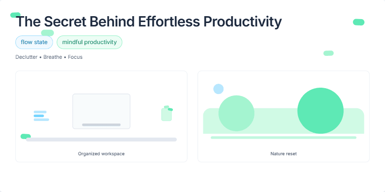
Imagine a slide bathed in calming blues and greens, evoking a sense of tranquility and focus. A subtle animation of leaves gently swaying in the breeze adds a touch of zen. Clean, minimalist typography highlights key phrases like 'flow state' and 'mindful productivity.' Short, impactful visuals of organized workspaces and serene nature scenes further reinforce the message. This slide offers a visual breath of fresh air, promising a pathway to achieving more with less stress.
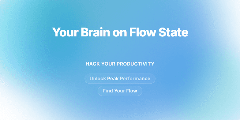
Imagine a calming gradient of blues and greens washing over the slide as the title appears in clean, white sans-serif font. A subtle animation of particles gently swirling around the title evokes the feeling of effortless focus. Short, impactful phrases like 'Unlock Peak Performance' and 'Find Your Flow' appear with a subtle shimmer effect, adding a touch of magic to the promise of enhanced productivity. The overall design is minimalist and calming, emphasizing the ease and power of achieving flow state.
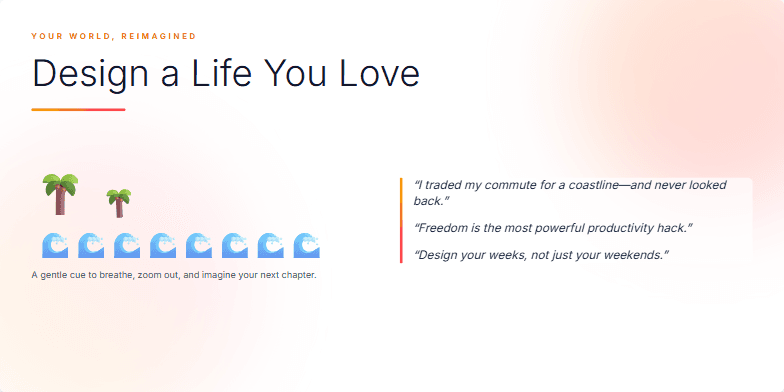
Imagine a slide bathed in warm, inviting sunset hues. A minimalist, elegant typeface whispers the title against this backdrop. Subtle animations of gently swaying palm trees and a tranquil ocean wave evoke a sense of freedom and escape. Short, inspiring quotes from successful digital nomads appear and fade, adding a touch of magic and possibility. This slide sets the stage for a journey of transformation.
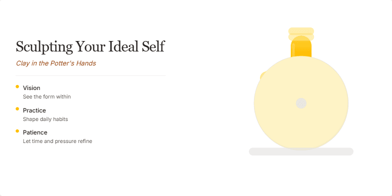
This slide uses a soft, earthy color palette with warm browns and creamy whites, evoking the feeling of working with clay. A subtle animation shows hands gently shaping a figure on a potter's wheel, symbolizing personal growth. The typography is elegant and handwritten, adding a touch of personal warmth. The overall mood is calming and inspiring, encouraging self-reflection and growth.
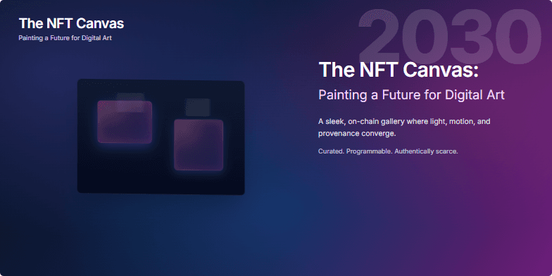
Imagine a mesmerizing gradient backdrop shifting from deep space blue to vibrant magenta, showcasing a single, rotating 3D model of a futuristic art gallery. Spotlights illuminate featured NFT artworks, each pulsing with subtle animation. Clean, minimalist typography highlights the year 2030, emphasizing the forward-thinking nature of the presentation. The overall mood is one of sleek sophistication and technological marvel.
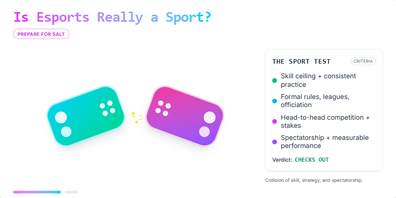
Dynamic, energetic slide with neon accents and a bold, pixelated font. Features a short, stylized animation of clashing game controllers, sparking with electricity. Dark background with vibrant splashes of color representing popular esports team branding. Close-ups on intense player expressions transition to cheering crowds, creating a sense of drama and excitement.
Want to generate your own slides with AI?
Start creating high-tech, AI-powered presentations with Slidebook.