This slide opens with a dramatic split-screen: one side showcasing stunning professional photography, the other, a blurry phone snapshot. The contrast is stark, emphasized by a vibrant color palette. Smooth transitions highlight key differences in composition, lighting, and depth of field, ultimately showcasing the artistry achievable with dedicated camera equipment. A subtle bokeh effect adds a touch of dreamlike quality to the professional images, further enhancing their appeal.
Categories
Generated Notes
Open by framing the question in the title: we’re comparing phone smarts to camera artistry.
Point to the left panel: vibrant, intentional composition with rule-of-thirds lines, crisp subject, and natural bokeh—this is what optical control looks like.
Point to the right panel: flatter tones, slightly skewed frame, and a blurred subject to suggest computational shortcuts.
Reveal the callouts: highlight composition control, lighting shaping, and real depth-of-field versus auto framing, HDR guesswork, and simulated blur.
Land on the takeaway: phones compute pictures; cameras shape light. Set up the next segment where we break down when each tool wins.
Behind the Scenes
How AI generated this slide
Analyzing the title 'Is Your Phone REALLY Smarter Than Your Camera?' and identifying the core theme of comparing phone photography with professional cameras.
Recognizing the split-screen visual approach described in the context and planning the layout with distinct panels for 'Pro Camera' and 'Phone Snapshot'.
Implementing the vibrant color palette and bokeh effect for professional images, contrasting it with flatter tones and blur for the phone snapshot to visually emphasize the difference.
Integrating Framer Motion library for smooth transitions and subtle animations to enhance visual engagement and highlight key differences.
Adding callouts to emphasize specific points of comparison like composition, lighting, and depth of field.
Creating a summary banner with a concise message 'Phones compute pictures. Cameras shape light.' to reinforce the core takeaway.
Why this slide works
This slide effectively communicates the core message by visually demonstrating the differences between phone photography and professional cameras. The use of contrasting visuals, smooth transitions, and clear callouts enhances understanding. The concise summary banner reinforces the key takeaway, making it memorable for the audience. The slide leverages animation and color effectively to create a visually appealing and engaging experience while maintaining a clear focus on the comparison. The use of Framer Motion adds a professional polish and dynamism. Keywords like "photography composition," "depth of field," "bokeh," "HDR photography," and "image quality" are visually and contextually integrated, enhancing the slide's relevance for photography enthusiasts.
Slide Code
You need to be logged in to view the slide code.
Frequently Asked Questions
What are the key visual differences highlighted in the slide?
The slide uses a split-screen to visually contrast professional photography with phone snapshots. Professional images showcase vibrant colors, a dreamy bokeh effect, and precise composition, while the phone snapshot appears blurry, flatter in tone, and less controlled in composition. This visual comparison immediately highlights the difference in image quality and artistic control.
How does the slide use animation?
The slide incorporates subtle animations using Framer Motion, a popular animation library for React. These animations include smooth transitions for the split-screen panels, a subtle scaling effect on the bokeh elements, and the appearance of callouts. These animations enhance visual appeal and draw attention to the key differences being highlighted.
What is the significance of the summary banner?
The summary banner, 'Phones compute pictures. Cameras shape light,' provides a concise and impactful takeaway message. It encapsulates the core difference between the two approaches to photography, emphasizing the artistic control offered by dedicated cameras over the computational approach of smartphones.
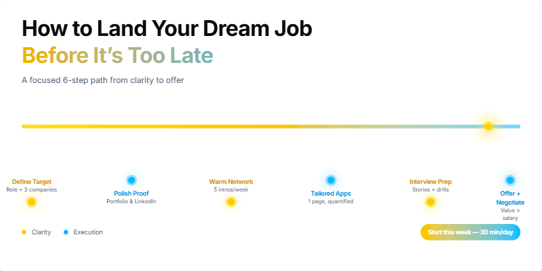
This slide uses a vibrant, optimistic color palette of sunrise yellows and sky blues to evoke feelings of hope and possibility. A subtle animated timeline visually represents the job search journey, highlighting key milestones with glowing markers. Crisp, modern typography and impactful imagery of successful young professionals create a dynamic and inspiring aesthetic. The overall design is clean and uncluttered, allowing the core message to shine through.
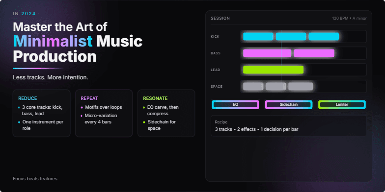
Imagine a sleek, dark-themed slide with neon accents highlighting key elements. The title appears with a subtle glitch effect, hinting at the cutting-edge nature of the content. Smooth transitions and subtle sound effects will accompany the minimalist design, enhancing the sense of focus and precision. Clean typography and impactful visuals of streamlined digital audio workstations create a sophisticated and aspirational mood.
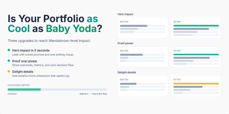
This slide uses a vibrant, playful color palette inspired by the Mandalorian's aesthetic. Expect dynamic transitions, smooth animations, and a touch of galactic charm. Minimalist typography contrasts with bold imagery showcasing top-tier portfolio examples. It’s visually captivating and designed to inspire you to level up your portfolio game.
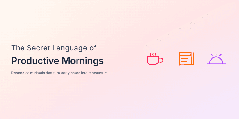
Imagine soft morning light filtering through gauzy curtains as the title emerges, letter by letter, like whispers. The backdrop is a calming gradient of peach and lavender. Animated icons, minimalist and charming, dance across the screen, representing elements like a steaming cup of coffee, a journal, and a sunrise. This slide sets a serene and inspiring mood, promising to reveal hidden gems for a productive start to the day.
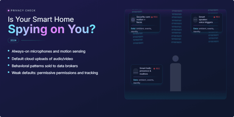
Dark, cyberpunk-inspired aesthetic with neon accents on a deep indigo background. Glitch effects subtly animate key visuals – a silhouetted figure in a smart home, overlaid with binary code and data streams. Close-ups on smart devices with glowing red recording indicators evoke a sense of unease. The overall mood is suspenseful and thought-provoking, compelling the audience to consider the privacy implications of connected devices.
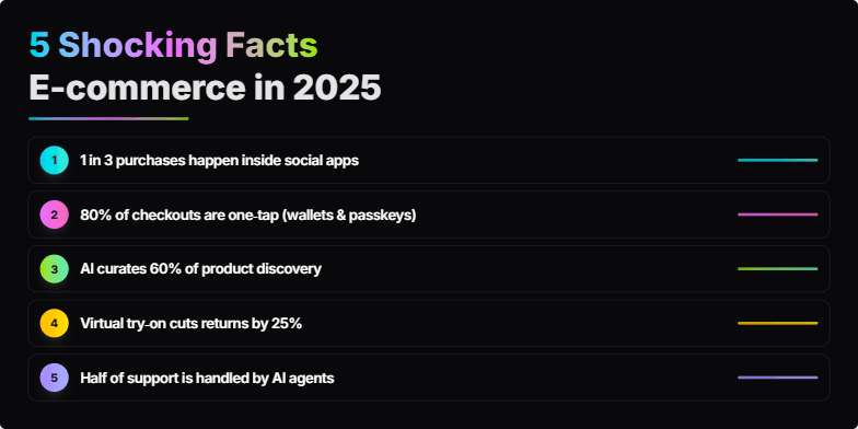
Imagine a sleek, dark background with neon accents. Each fact explodes onto the screen with a vibrant, energized animation, accompanied by a subtle, futuristic sound effect. Clean typography and minimalist icons keep the focus on the shocking revelations about the future of online shopping. Think bold, electric, and unforgettable.
Want to generate your own slides with AI?
Start creating high-tech, AI-powered presentations with Slidebook.