Create a slide about the negative impact of sleep deprivation on adults, highlighting the disparity between recommended and actual sleep duration. The slide should include a statistic about the prevalence of sleep deprivation among adults and briefly mention its consequences on focus, mood, and long-term health. Visually represent the difference between recommended (7-9 hours) and actual (6-6.5 hours) sleep using a bar chart or similar graphic. The slide should have a professional and clean design, suitable for a presentation to a general audience.
Open by naming the problem plainly: we are underslept.
Reveal the headline stat: one in three adults are sleep-deprived. Let the number land; the subtle percent reinforces scale.
Add the short context: chronic short sleep erodes focus, mood, and long-term health. Keep it concise to maintain impact.
Show the minimalist chart: the green band is the recommended 7–9 hours, while the amber band shows where we actually land at 6 to 6.5.
Emphasize the gap visually: the range bar makes it obvious we consistently fall short.
Transition to what this means for the team or audience in the next slide.
Behind the Scenes
How AI generated this slide
Establish the core message: Undersleep is a widespread problem.
Craft a compelling headline statistic: 1 in 3 adults are sleep-deprived.
Provide context: Briefly explain the negative effects of chronic sleep deprivation.
Visualize the data: Use a range bar chart to compare recommended and actual sleep hours.
Design for clarity: Choose a clean layout, clear font, and contrasting colors.
Why this slide works
This slide effectively communicates the problem of sleep deprivation by combining a clear message, impactful statistic, concise explanation, and an easy-to-understand visualization. The clean design and professional aesthetic make it suitable for diverse audiences. The use of motion adds subtle engagement without distracting from the core message. The animated counter for the headline stat draws the viewer's attention and reinforces the scale of the problem. The range bar chart clearly depicts the gap between recommended and actual sleep, emphasizing the main point visually. Overall, this slide is well-structured, visually appealing, and effectively conveys its message.
Slide Code
You need to be logged in to view the slide code.
Frequently Asked Questions
How does this slide use animation effectively?
The slide uses subtle animations, like the counter incrementing to the '1 in 3' statistic and the bars growing in the chart, to draw attention and add visual interest without being distracting. The clock watermark's hover animation provides a delicate interactive element, reinforcing the time theme.
Why is a range bar chart used for this data?
A range bar chart is chosen to effectively visualize the disparity between recommended and actual sleep hours. The bars visually represent the range of sleep (e.g., 7-9 hours), and the different colors clearly distinguish between recommended and actual sleep, highlighting the gap between them.
How does the slide maintain clarity and conciseness?
The slide maintains clarity by using a clean layout, a professional color palette, and an easy-to-read font. The message is kept concise by focusing on the core problem of undersleep, providing one key statistic, and a brief explanation of the consequences. The visual elements support the text without adding unnecessary complexity.
Create a slide demonstrating micro-interactions that enhance user experience while prioritizing accessibility and inclusivity. Showcase examples of reorder with snap, inline help, keyboard focus, and an inclusive checklist. The slide should visually represent these concepts with clear and concise explanations. The examples should demonstrate how these micro-interactions cater to users of varying abilities, including those using assistive technologies. The overall design should be clean and modern, using a neutral color palette with subtle accents to highlight key elements. The slide should also include speaker notes that provide a deeper explanation of each micro-interaction and its benefits.
Create a slide about smart napping. It should cover the optimal nap lengths for different benefits (e.g., alertness boost, full sleep cycle), the ideal timing for napping to avoid disrupting nighttime sleep, and the negative effects of napping for too long during certain times. The slide should have a visual representation of the different nap lengths and their corresponding benefits, such as a pie chart or a similar graphic. The color scheme should be calming and professional. It should also include some practical tips for incorporating smart napping into one's daily routine. The target audience is professionals and productivity enthusiasts looking to optimize their energy levels throughout the day.
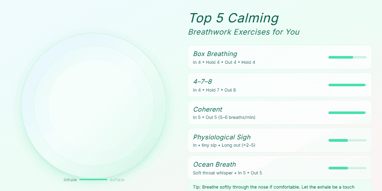
Soft, muted pastel backgrounds transition serenely between slides. Each breathwork exercise is visualized with elegant, flowing animations, mimicking the inhale and exhale. Calming script font accompanies each exercise, enhancing the tranquil mood. Tiny, sparkling details appear and disappear subtly around the screen edges, adding a touch of magic to the experience.
Create a slide visualizing the recommended hours of sleep for different age groups, specifically teens, adults, and older adults. The visualization should clearly display the sleep range for each group, ideally using a bar chart or similar format. Include specific hours of sleep for each group: Teens (8-10 hours), Adults (7-9 hours), and Older Adults (7-8 hours). The slide should be visually appealing and easy to understand, with clear labels and a title. The overall tone should be informative and health-conscious, promoting the importance of adequate sleep.
The slide visually represents the user flow for creating a resume, from choosing a template to exporting the final PDF. It aims to demonstrate a quick and intuitive process, highlighting key steps with distinct icons. The animation emphasizes the smooth transition between stages, guiding the user's eye along the flow. The overall design maintains a clean and modern aesthetic with a calming color palette. The target completion time of approximately six minutes is presented to set expectations for a streamlined user experience.
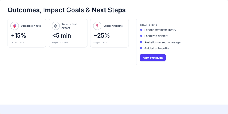
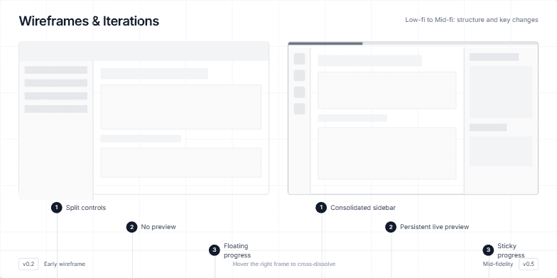
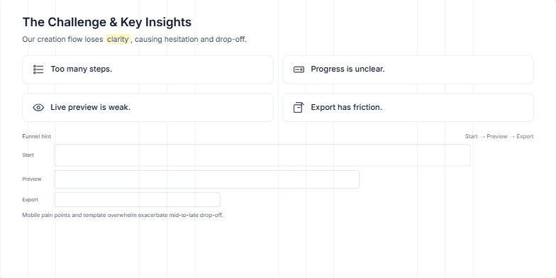
This slide provides a comprehensive overview of a resume builder redesign project. It aims to communicate the project's purpose, goals, scope, deliverables, and key facts like the role, timeline, collaborators, and platforms involved. The redesign focuses on streamlining the resume creation process, enhancing the credibility of the output, and improving completion and export success rates. The scope encompasses onboarding, builder flows, preview and export functionalities, as well as the information architecture and visual system. The deliverables include user flows, wireframes, an interactive prototype, a UI kit, content guidelines, and a metrics plan. The slide also highlights the role of the product designer, the project's timeline with its distinct phases (discovery, design, and delivery), the collaboration between product, engineering, and content teams, and the focus on web platforms with a responsive approach.
Want to generate your own slides with AI?
Start creating high-tech, AI-powered presentations with Slidebook.