Dive into a world of vibrant hues and subtle shades. This visually stunning presentation uses mesmerizing color transitions and minimalist typography to explore the psychology of color in design. Experience the power of color palettes through animated examples and unlock your creative potential. Featuring soft background music and elegant transitions, this is a feast for the eyes and a springboard for your imagination.
Categories
Generated Notes
Open by framing color as a language that shapes emotion, meaning, and action. Point to the flowing gradients as the ambient tone of the talk.
Explain the title and promise: we will translate color psychology into practical palette choices designers can apply instantly.
Reveal the Trust palette. Describe why blues convey stability and clarity. Note how a touch of cyan keeps it from feeling cold. Suggest uses: fintech, healthcare, security, and complex forms.
Reveal the Energy palette. Emphasize warmth and contrast for urgency. Mention ideal placements: hero CTAs, announcements, entertainment, and promotional bursts.
Reveal the Calm palette. Highlight greens and teals as signals of balance and renewal. Recommend for wellness products, onboarding flows, empty states, and long-form reading.
Synthesize with the closing line: Color equals emotion multiplied by context. Encourage the audience to match palette energy to intended user behavior.
Invite them to observe how small shifts in hue and saturation can change the story without changing the layout.
Behind the Scenes
How AI generated this slide
Analyze the title and context to identify the core theme: color psychology in design.
Select a minimalist design approach with smooth animations and gradient backgrounds to visually represent the fluidity of color.
Structure the slide content into fragments for sequential reveals, enhancing engagement.
Choose a calming background gradient effect with subtle animations to avoid overwhelming the viewer.
Craft palette examples demonstrating different color combinations and their psychological impact (Trust, Energy, Calm).
Incorporate motion effects for each palette card, adding a dynamic element to the presentation.
Add a concise, impactful closing statement to reinforce the core message: "Color = emotion × context."
Why this slide works
This slide effectively combines minimalist design principles with engaging animations and a clear focus on color psychology. The smooth transitions and dynamic palette reveals create a visually appealing and informative experience, emphasizing the power of color in design. The use of subtle background animations and a clean layout ensures the focus remains on the content, while the palette cards provide practical examples of color theory in action. The inclusion of keywords like 'color psychology,' 'design principles,' 'palette,' 'animation,' and 'user experience' enhances its searchability and relevance for design-focused audiences.
Slide Code
You need to be logged in to view the slide code.
Frequently Asked Questions
How does this slide effectively demonstrate color psychology?
The slide uses distinct color palettes (Trust, Energy, Calm) to showcase the emotional impact of different color combinations. The blue-toned 'Trust' palette evokes stability, the warm 'Energy' palette signifies urgency, and the green 'Calm' palette promotes tranquility. These visual examples, combined with explanations of their intended uses, effectively demonstrate how color can influence perception and emotion in design.
What design principles are employed to enhance the slide's visual appeal?
The slide leverages minimalism, smooth animations, and gradient backgrounds to create a visually appealing and engaging experience. The minimalist approach ensures a clean, uncluttered look, allowing the color palettes to take center stage. The smooth, subtle animations add dynamism without being distracting, while the gradient backgrounds create a soft, visually appealing backdrop that complements the overall aesthetic. The combination of these elements results in a presentation that is both informative and visually engaging.
How can I apply the color psychology concepts presented in this slide to my own design projects?
The slide's core message, "Color = emotion × context," emphasizes the importance of considering both emotional impact and context when selecting colors. By understanding the psychological associations of different colors, you can choose palettes that align with the desired mood and message of your project. The example palettes provide a starting point for exploring different color combinations and their potential applications in various design contexts. Consider the target audience and the purpose of your design to select the most effective color scheme.
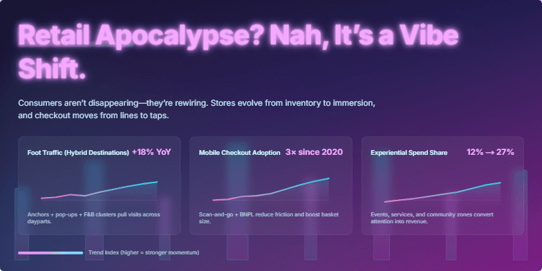
Bold neon-pink title against a deep, cyberpunk-inspired backdrop of holographic cityscapes. Glitch animation subtly disrupts the title, giving a sense of dynamic change. Clean, minimalist data visualizations with vibrant color gradients highlight key shopping trends. Transitions feature smooth, flowing animations, echoing the adaptable nature of consumer behavior. The overall mood is energetic and optimistic, reflecting the exciting potential of the evolving retail landscape.
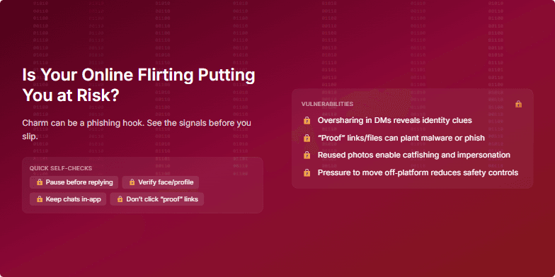
Deep, seductive crimson backdrop with subtly animated binary code cascading down, representing the hidden dangers. Crisp white text and stylized lock icons highlight the vulnerability aspects. The overall mood is intriguing and slightly unsettling, using a blend of glamour and suspense. Transition effects are smooth, ghosting images to emphasize the ephemeral nature of online interactions.
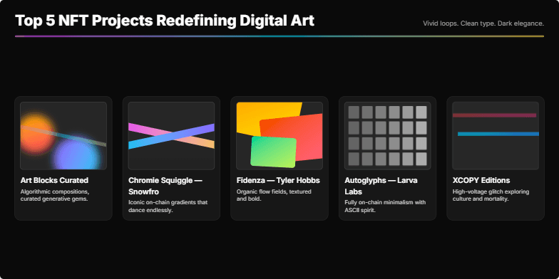
Dive into a vibrant world of color and motion as we explore the top 5 NFT projects. Each project is showcased with mesmerizing animated loops highlighting their unique style and artistic vision. Clean typography and a dark, elegant background ensure the artwork takes center stage. Prepare to be captivated by the future of digital art.
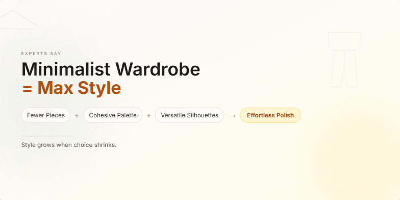
Imagine a slide bathed in soft, neutral tones of cream and beige. A sleek, minimalist sans-serif font highlights the title, while delicate line-art illustrations of capsule wardrobe essentials subtly animate in the background. The overall feel is calm, elegant, and effortlessly chic, mirroring the minimalist aesthetic we're selling. Transitions are smooth and subtle, like the rustle of silk.
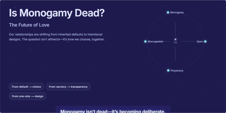
Deep indigo background with subtle, shimmering constellations representing connection. Modern, minimalist typography. Smooth transitions between slides featuring evocative close-up photography of couples expressing a range of emotions: joy, intimacy, contemplation. Soft, ethereal music plays in the background. Key takeaway visually highlighted with a glowing effect.
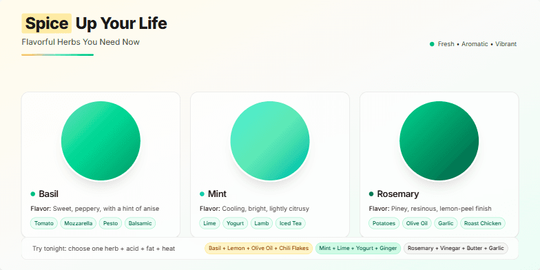
This slide bursts with vibrant colors, showcasing close-up photos of fresh herbs like basil, mint, and rosemary against a warm, earthy background. A subtle animation highlights each herb as its name and flavor profile appears, creating a mouthwatering visual experience. The typography is clean and modern, complementing the natural aesthetic. The overall mood is inviting and inspiring, encouraging viewers to explore new culinary possibilities.
Want to generate your own slides with AI?
Start creating high-tech, AI-powered presentations with Slidebook.