This slide uses a split-screen effect, contrasting a sepia-toned 'then' with a vibrant, neon-infused 'now.' Watch as a simple logo evolves through animated transitions, reflecting the dynamic changes in personal branding. Clean typography and minimalist design highlight key takeaways with subtle glow effects for emphasis. Imagine a morphing logo, transitioning from a static image to a dynamic animated 3D version, symbolizing the shift from traditional to digital presence.
Categories
Generated Notes
First, set the scene. On the left, this is the “Then” world: a sepia-tinged, analog identity. Static logos, business cards, and one-way impressions. Next, call attention to the simple logo mark. It’s solid, consistent, and recognizable — but it doesn’t move or respond. Advance to the bridge. Say “that identity evolves into…” and pause to build anticipation. Reveal the right side. The logo now comes alive — it rotates subtly, shows depth, and feels dynamic. Emphasize motion as a core branding surface today. Walk through the Now bullets: motion design, interactive portfolios and social graphs, and discoverability through SEO, tags, and microvideo. Close with the two bottom panels: brand used to mean recognition; today it’s about relationship. Then highlight the three quick takeaways: own your narrative, design for motion, be discoverable. Invite the audience to imagine their own logo animated across platforms, adapting to context while staying unmistakably theirs.
Behind the Scenes
How AI generated this slide
Analyze the topic 'Then & Now: Branding Yourself in the Digital Age' and identify core visual elements: a historical/analog representation and a modern/digital one.
Conceptualize a split-screen layout to directly contrast 'then' and 'now' visually.
Select color palettes: sepia/amber for 'then' and vibrant neon/gradient for 'now' to reinforce the temporal contrast.
Design simple logos, keeping in mind their animated transitions: a static, layered square for 'then' and a dynamic, rotating circle with inner motion for 'now'.
Implement animations using Framer Motion: subtle entrance animations for 'then', and a continuous rotation/wobble for 'now' to symbolize dynamism.
Structure content with clean typography and minimalist design, using glow effects and color accents (fuchsia, cyan, violet) for emphasis on the 'now' side.
Craft concise bullet points highlighting key differences in branding approaches between 'then' and 'now'.
Add a transitional element ('evolves into') to connect the two halves visually and conceptually.
Include key takeaways and calls to action at the bottom, summarizing the shift in branding focus from recognition to relationship.
Why this slide works
This slide effectively communicates the evolution of personal branding by leveraging several design principles. The split-screen approach provides a clear visual contrast between the past and present. The color palettes (sepia/amber vs. neon/gradient) further emphasize this contrast. The use of animation, particularly the dynamic logo on the 'now' side, immediately draws attention to the importance of motion and interactivity in modern branding. Clean typography and minimalist design ensure the message is clear and easy to digest, while subtle glow effects and strategic use of color highlight key takeaways. The 'evolves into' transition creates a smooth visual flow, guiding the viewer through the narrative. Finally, the concise bullet points and bottom panels distill the core message into easily digestible takeaways, reinforcing the shift from recognition to relationship in personal branding. This multifaceted approach, combining visuals, animation, and concise messaging, makes the slide engaging, informative, and memorable, optimizing its impact for presentations and online content related to personal branding, career development, and digital marketing strategies.
Slide Code
You need to be logged in to view the slide code.
Frequently Asked Questions
How does the animation enhance the slide's message?
The animation plays a crucial role in highlighting the core message of the slide. The static logo on the 'then' side represents the traditional, unchanging nature of past branding efforts. In contrast, the dynamic, rotating logo on the 'now' side embodies the fluidity, interactivity, and constant evolution required for successful personal branding in the digital age. This visual contrast immediately communicates the key takeaway: personal branding today requires a dynamic and adaptable approach.
What are the key takeaways regarding the shift in personal branding?
The slide emphasizes a significant shift in the focus of personal branding. Previously, brand recognition was paramount. Today, building relationships and fostering a sense of connection with your audience are essential. This involves owning your narrative, designing for motion and interactivity, and ensuring your online presence is discoverable through strategies like SEO, tagging, and microvideo content. It's no longer enough to simply be known; you need to actively engage and cultivate relationships in the digital space.
What role does color play in the slide's effectiveness?
The color palette is strategically used to reinforce the contrasting themes of 'then' and 'now'. The sepia and amber tones on the left evoke a sense of nostalgia and history, aligning with the traditional approach to branding. On the right, the vibrant neons, fuchsia, cyan, and violet create a modern, energetic feel, reflecting the dynamic nature of digital branding. This distinct color contrast immediately communicates the temporal shift and emphasizes the key differences between the two eras of personal branding.
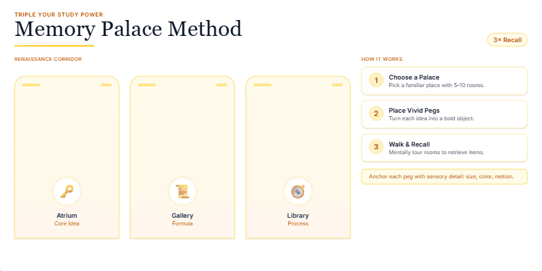
Imagine a vibrant, Renaissance-inspired palace as the backdrop. Each room, bathed in warm, inviting light, houses a memory peg. Watch smooth, elegant animations as information transforms into memorable objects, placed within these rooms. Gold accents and subtle sound effects enhance the luxurious feel of acquiring this powerful memorization technique.
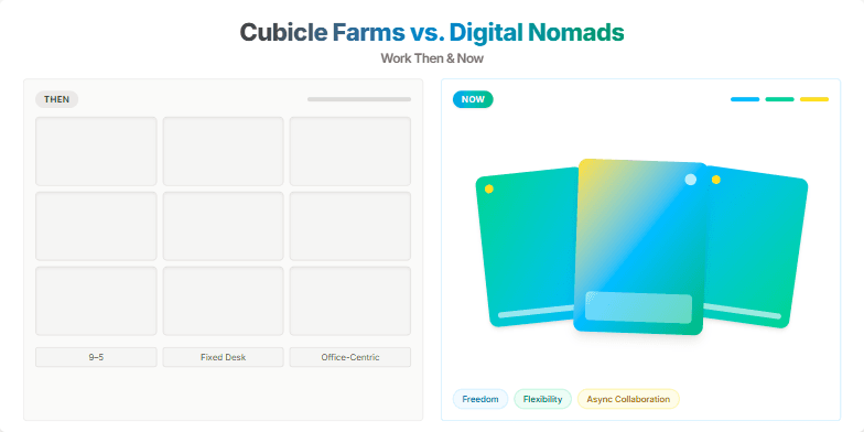
This slide uses a split-screen effect, contrasting a faded, sepia-toned image of rows of cubicles ('Then') with a vibrant, colorful montage of remote workers in inspiring locations ('Now'). Smooth transitions and subtle animations highlight the freedom and flexibility of modern work. The color palette shifts from muted browns and grays to energetic blues, greens, and yellows, creating a visual representation of the shift in work culture. The typography is clean and modern, emphasizing the contrast between the two eras.
This slide opens with a dramatic zoom on a stylized, cracked phone screen, visually representing vulnerability. Dark, moody colors create a sense of urgency. A single, pulsating neon green question mark hangs in the center, demanding attention. Transition to the next slide features a shattering glass effect, emphasizing the fragility of digital security.
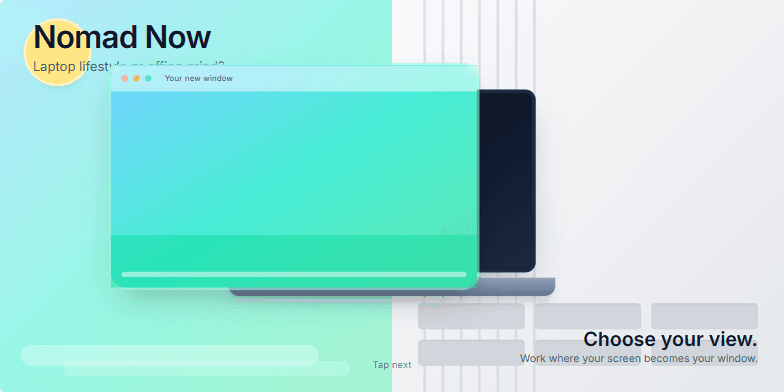
This slide uses a vibrant split-screen effect, contrasting the cool blues and greens of a tropical beach with the stark grays of a corporate office. A subtle animated transition morphs the laptop screen into a window overlooking the ocean, symbolizing the freedom of the digital nomad life. Clean typography and minimalist design highlight the core message: choose your view.
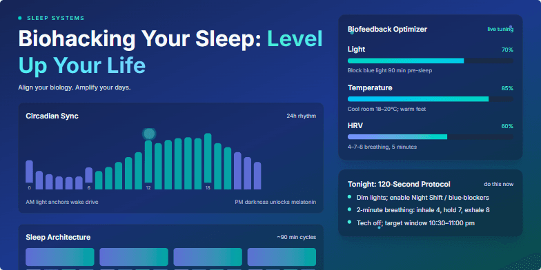
Imagine pulsating neon graphics illustrating the circadian rhythm syncing with personalized data visualizations. Deep blues and vibrant teals create a calming yet energetic atmosphere. Micro-animations of neural pathways firing as you sleep, interwoven with sleek, futuristic UI elements showcasing biofeedback optimization techniques. This slide promises a transformative visual journey into the science of sleep.
Dive into a vibrant, fast-paced world of neon hues and dynamic transitions. This slide explodes with energy, mimicking the short-form video format itself. Imagine quick cuts, playful animations of bouncing icons, and a bold, modern font that screams 'attention-grabbing.' The background shifts subtly from cool blues to energetic pinks, keeping the viewer engaged with every fleeting second.
Want to generate your own slides with AI?
Start creating high-tech, AI-powered presentations with Slidebook.