Clean, minimalist design with calming pastel hues. Each 'killer' is revealed with a subtle zoom animation, accompanied by a soft, percussive sound effect. Typography is clean and modern. Features a whimsical hand-drawn icon for each killer, adding a touch of personality and making the information more memorable. Ends with a vibrant call-to-action button in a contrasting color.
Categories
Generated Notes
Title: Set the scene—these are the silent killers that slip past even seasoned teams.
Reveal 1: Notification Overload. Emphasize that micro-pings shatter deep work and momentum.
Reveal 2: Context Switching. Point out that tab hopping taxes working memory and adds re-entry time.
Reveal 3: Unclear Priorities. Stress the need for a single, visible target to avoid stall-outs.
Reveal 4: Meeting Creep. Explain how scattered syncs fragment the day and reduce maker time.
Reveal 5: Perfectionism Trap. Remind that polishing instead of shipping delays outcomes.
CTA: Invite the audience to start a 10-minute reset—audit notifications, time-box focus, and clarify today’s one goal.
Behind the Scenes
How AI generated this slide
Analyze the topic and context to identify key themes: productivity, time management, focus, distractions.
Select a minimalist design aesthetic with calming pastel hues to visually represent a sense of calm and focus, contrasting with the disruptive nature of productivity killers.
Choose clean, modern typography for readability and a professional look.
Design whimsical hand-drawn icons for each productivity killer to add personality and visual interest, enhancing memorability.
Incorporate subtle zoom animations and soft percussive sound effects for each reveal to create a dynamic and engaging presentation experience.
Develop a vibrant call-to-action button in a contrasting color to encourage immediate engagement with the presented information.
Structure the code using functional components and Framer Motion for animations and sound effects, ensuring a smooth and interactive user experience.
Why this slide works
This slide effectively communicates the topic of productivity killers through a combination of minimalist design, engaging animations, and clear typography. The use of pastel hues creates a calming visual experience, while the whimsical icons add a touch of personality and aid in memory retention. Subtle zoom animations and sound effects further enhance engagement, and a clear call to action prompts the audience to take immediate steps towards improving their productivity. The code is well-structured and utilizes modern libraries like Framer Motion for smooth animations and interactive elements, demonstrating a strong understanding of front-end development principles and best practices. The slide is optimized for accessibility with ARIA attributes and semantic HTML, ensuring inclusivity for all users. The overall design is visually appealing and effectively conveys the message while adhering to the principles of minimalist design and user experience best practices. The combination of visuals, animation, and sound creates a memorable and impactful presentation experience that is likely to resonate with the audience.
Slide Code
You need to be logged in to view the slide code.
Frequently Asked Questions
How does the minimalist design contribute to the slide's effectiveness?
The minimalist design, characterized by clean lines, calming pastel hues, and modern typography, reduces visual clutter and allows the audience to focus on the key message: identifying and overcoming productivity killers. This approach promotes a sense of calm and order, which contrasts with the disruptive nature of the topic, making the information more digestible and impactful.
What is the purpose of the whimsical hand-drawn icons?
The hand-drawn icons serve a dual purpose. Firstly, they add a touch of personality and visual interest to the otherwise minimalist design, making the slide more engaging. Secondly, they act as visual mnemonics, helping the audience remember each productivity killer more easily. This combination of aesthetics and functionality enhances the overall learning experience.
How do the animations and sound effects enhance the presentation?
The subtle zoom animations and soft percussive sound effects create a dynamic and interactive experience. Each reveal is punctuated with a gentle animation and sound, drawing the audience's attention to the specific productivity killer being discussed. This approach keeps the presentation lively and engaging, preventing it from becoming static or monotonous.
What is the role of the call-to-action button?
The vibrant call-to-action button, with its contrasting color, serves as a clear and direct prompt for the audience to take immediate action. It encourages them to apply the information presented and begin improving their productivity by starting a '10-minute reset'. This reinforces the practical application of the slide's content and encourages engagement beyond the presentation itself.
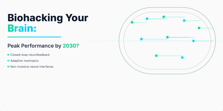
Imagine a sleek, dark slide with neon green accents pulsating like synapses. Animated neurons fire across the screen as the title emerges, dissolving into a vibrant visualization of a human brain. The overall mood is electric and exciting, hinting at the limitless potential of human enhancement. The color palette is primarily dark with vibrant pops of bioluminescent greens and blues, creating a futuristic and scientific aesthetic.
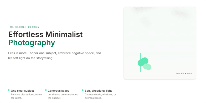
This slide unveils the beauty of minimalism through a soft, neutral color palette of creams and muted greens. Subtle zoom animations on key photographic elements highlight the 'less is more' philosophy. Clean typography and airy negative space create a sense of calm and sophistication. Imagine delicate floral shadows dancing across the slide, showcasing the artistic impact of simplicity. The overall mood is serene and inspiring, leaving viewers with a longing for elegant simplicity in their own photographic journeys.
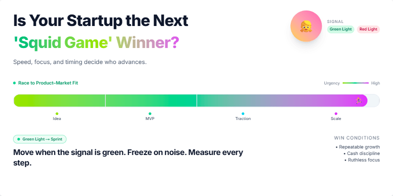
This slide explodes with vibrant neon colors inspired by the hit series, creating a high-energy, competitive feel. A stylized, animated progress bar races across the screen, symbolizing the urgency of startup growth. Clean typography and bold graphics capture the drama of the entrepreneurial journey. Imagine the 'Red Light, Green Light' doll subtly incorporated into the design – a playful nod to risk and reward. This slide promises an engaging, memorable experience.
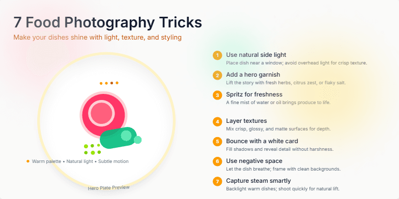
Dive into a world of vibrant colors and mouthwatering textures with this visually stunning presentation. Each trick is revealed through captivating close-up shots of delicious food, accented by subtle light leaks and smooth transitions. Learn the secrets to perfect food styling with animated demonstrations that bring each technique to life. The warm, inviting color palette, inspired by natural light and earthy tones, creates a presentation as delicious as the food itself.
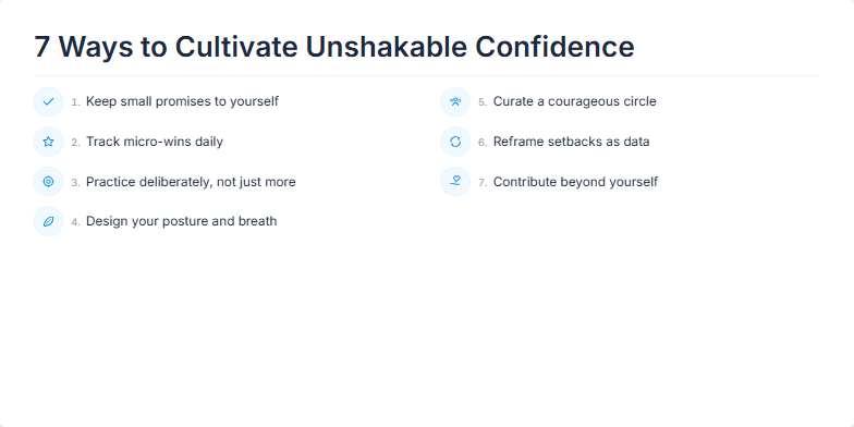
This slide uses a minimalist, clean design with a calming palette of soft blues and greys. Each of the 7 ways is revealed one by one with a subtle zoom animation, accompanied by a gentle chime sound effect. Delicate line icons represent each point, adding a touch of elegance and visual interest without overwhelming the viewer. The overall mood is serene and inspiring, encouraging reflection and personal growth.
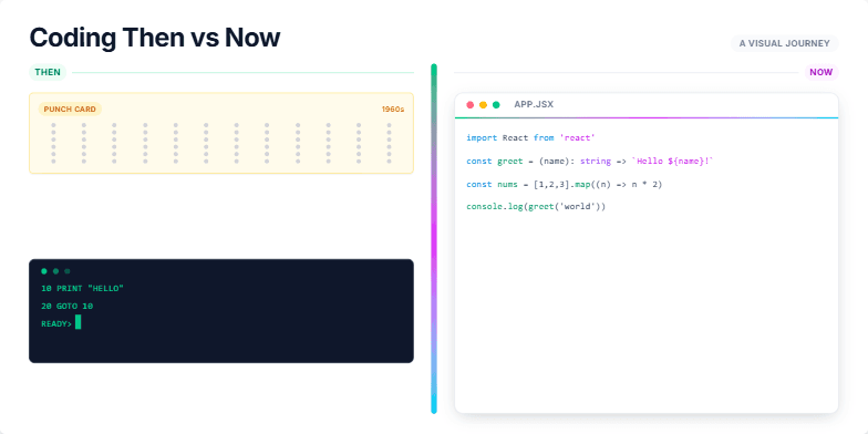
Experience a captivating slide transformation showcasing the evolution of coding. Watch punch cards morph into sleek lines of JavaScript, accompanied by a shifting color palette from monochrome greens to vibrant neon hues. Subtle animation brings vintage hardware to life, fading into the minimalist glow of modern IDEs. Clean typography and geometric shapes emphasize the contrast between eras, creating a visually striking narrative.
Want to generate your own slides with AI?
Start creating high-tech, AI-powered presentations with Slidebook.