This slide visually compares early low-fidelity wireframes with refined mid-fidelity designs, highlighting key structural changes and improvements in clarity and flow. It showcases two versions of an interface side-by-side, allowing for direct comparison and demonstration of the iterative design process. The left side presents the initial wireframe (v0.2), while the right side displays the improved mid-fidelity version (v0.5). The slide utilizes callouts to explain specific changes made between iterations, focusing on improvements in control consolidation, live preview integration, and progress visibility. A hover effect on the mid-fidelity wireframe triggers a cross-dissolve animation, revealing the underlying low-fidelity version for a quick visual overview of the evolution. The slide aims to communicate the design decisions and rationale behind the improvements, emphasizing the value of iteration in user interface design.
Title: “Wireframes & Iterations.” I’ll orient the room: left is the early low-fidelity concept; right is the refined mid-fidelity direction.
I’ll point out the faint grid in the background as a framing cue, then focus on the two-up layout.
On the right, I’ll hover to cross‑dissolve between states, showing the evolution at a glance.
Next, I’ll advance to reveal the callouts.
Left, callout 1: Split controls scattered in a wide sidebar. Callout 2: No live preview available. Callout 3: Progress floated and was easy to miss.
Right, callout 1: Consolidated, compact sidebar improves scannability. Callout 2: Persistent live preview on the right provides immediate feedback. Callout 3: Sticky progress at the top keeps completion visible.
I’ll close by linking the version tags in the bottom band to our iteration checkpoints, v0.2 to v0.5, underscoring the structural changes that improved clarity and flow.
Behind the Scenes
How AI generated this slide
Establish layout: Create a two-up layout for side-by-side comparison of wireframes.
Visualize wireframes: Design low-fi and mid-fi wireframes using grayscale and basic shapes to represent UI elements.
Implement interactivity: Add a hover effect to the mid-fi wireframe, triggering a cross-dissolve transition to the low-fi version.
Incorporate callouts: Design numbered callouts to highlight specific design changes and improvements.
Add annotations: Include version numbers (v0.2 and v0.5) and descriptive text to contextualize the wireframes.
Style and refine: Apply consistent styling and formatting for visual clarity and coherence.
Why this slide works
This slide effectively communicates design iterations by visually presenting two wireframe versions side-by-side. The use of callouts and a cross-dissolve animation clearly highlights the specific changes made and the rationale behind them. Version tags provide context, and the consistent styling enhances readability. This approach facilitates clear communication of design decisions and the iterative design process, showcasing improvements in clarity, flow, and user experience. The use of visual aids and interactive elements makes the presentation more engaging and memorable. Keywords: wireframe, iteration, UI design, UX design, low-fidelity, mid-fidelity, cross-dissolve, animation, visual communication, design process.
Slide Code
You need to be logged in to view the slide code.
Frequently Asked Questions
What is the purpose of showing both low-fidelity and mid-fidelity wireframes?
Presenting both versions side-by-side allows for a clear comparison of the design evolution. It visually demonstrates the iterative process, highlighting the improvements and refinements made from the initial low-fidelity concept to the more polished mid-fidelity version. This approach effectively communicates the design decisions and rationale behind the changes, showcasing the value of iteration in user interface and user experience (UI/UX) design.
What are the key improvements highlighted in the mid-fidelity wireframe?
The mid-fidelity wireframe showcases several key improvements, including a consolidated sidebar for better scannability, a persistent live preview for immediate feedback, and a sticky progress bar for enhanced visibility. These changes contribute to a more streamlined and user-friendly interface, addressing the issues identified in the initial low-fidelity design.
Create a slide about designing a sleep environment for better sleep. It should cover the key elements of a good sleep environment, such as temperature, light, noise, and consistency. The slide should have a checklist format, and visually dim a bedroom image as each checklist item is completed. Include speaker notes that elaborate on each checklist item and offer specific recommendations. Add a sound effect when a checklist item is completed, with a toggle to turn the sound on or off.
This slide is for a presentation concluding a discussion about improving a product, likely a software application. It aims to summarize the desired outcomes, quantify the impact goals with specific targets, and outline the next steps for achieving these goals. The presenter wants to emphasize a target-oriented mindset and invite the audience to engage with a prototype for validation. The slide needs to visually represent key metrics like completion rate, time to first export, and support tickets, along with a list of actionable next steps. Animations should be used to introduce elements sequentially, guiding the audience's attention and enhancing engagement. The overall tone should be positive and forward-looking, encouraging collaboration and feedback on the proposed plan.
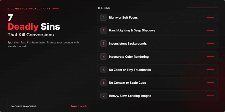
Dark, moody visuals with crimson highlights emphasize the 'deadly' theme. Bold typography and dramatic, fast-paced transitions between slides create a sense of urgency and highlight the costly mistakes. Each 'sin' is revealed with a stylized 'shattering glass' animation, adding a touch of visual flair.
This slide showcases the three core user interfaces of our design tool: the Template Library, the Builder, and the Export Modal. The goal is to emphasize the seamless workflow and intuitive design that allows users to quickly create and export high-quality visuals. The Template Library offers pre-designed templates with clear filtering and preview options. The Builder features a split-screen view with a live preview that updates instantly as edits are made. The Export Modal allows users to select their desired format and quality level with ease. The overall design aims for polish, speed, and efficiency.
This slide is part of a presentation on promoting a sleep-positive culture in the workplace. The aim is to highlight how prioritizing rest can improve team performance and well-being. The slide visually represents three key practices: no after-hours pings, late starts after late work, and a 10-4 meeting window. It uses animated icons and a cityscape backdrop to convey a sense of calm and focus. The overall message is that rest is crucial for productivity and a key element of a healthy work environment. The goal is to convince the audience that these practices are beneficial and should be adopted.
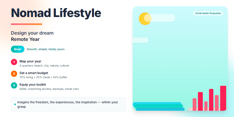
Bold typography paired with dreamy, wanderlust-inducing imagery of tropical beaches and bustling cityscapes. Warm color palette with pops of vibrant coral and turquoise. Smooth transitions between slides mimic the ease of nomadic living. Subtle animated elements, like floating clouds and swaying palm trees, add depth and dynamism. Imagine the freedom, the experiences, the inspiration – all within your grasp.
Want to generate your own slides with AI?
Start creating high-tech, AI-powered presentations with Slidebook.