Business Outcomes & Key Performance Indicators (KPIs)
Description provided by the user:
Create a slide showcasing the positive impact of a product or service on core business metrics. Present four key performance indicators (KPIs) with before-and-after values, highlighting improvements. Include a trendline for each KPI to visualize the progress. Add a testimonial from a VP of Product reinforcing the positive results. The KPIs should include Activation rate, Time-to-Value, Retention (90-day), and Support tickets / 1k. Use a clean and modern design with clear data visualization. The slide should be suitable for a business presentation or report.
Title the slide: Outcomes & Metrics. Set the expectation: we will show impact and proof across four core KPIs.
First row: Activation increased from 28% to 62%. Emphasize the green improvement and the upward trend line.
Then Time-to-Value: reduced from 14 days to 3 days. Highlight that the down arrow is good here — faster value realization.
Second row: Retention improved from 68% to 82% at 90 days — more users stay engaged.
Support tickets per 1k dropped from 210 to 94 — less friction and better product quality.
Close with the testimonial: read the quote to reinforce the metrics with a human voice and credibility.
Behind the Scenes
How AI generated this slide
Analyze user request and extract key information: KPIs, before/after values, testimonial, design preferences.
Select a layout that effectively displays four KPIs with their respective trends and supporting information.
Design KPI cards: use clear typography, color-coded arrows (green for improvement, red for decline), and concise labels.
Implement animated count-up for each KPI value to emphasize change.
Generate sparkline graphs to visualize trends for each KPI over time.
Integrate the testimonial to add a human element and credibility.
Apply a clean and modern design aesthetic using a light color palette and minimal visual clutter.
Ensure mobile responsiveness for various screen sizes.
Why this slide works
This slide effectively communicates the positive impact of a product or service by showcasing improvements across four key performance indicators. The use of clear visuals, including animated count-ups and sparkline graphs, makes the data easy to understand. The testimonial adds credibility and a human touch, while the clean and modern design ensures a professional and engaging presentation. The use of color-coded arrows helps quickly identify areas of improvement, further enhancing the slide's effectiveness. Keywords: KPI, performance indicator, data visualization, business metrics, trend analysis, testimonial, presentation design, animation, sparkline.
Slide Code
You need to be logged in to view the slide code.
Frequently Asked Questions
How are the trendlines generated?
The trendlines are generated using the `buildSparkPath` function which takes an array of data points and converts them into an SVG path. This path is then animated using Framer Motion's `pathLength` property, creating the visual effect of a line drawing itself. The sparklines visualize the progression of each KPI over a period, providing context for the before-and-after values.
What's the purpose of the color-coded arrows?
The color-coded arrows visually indicate the direction of change for each KPI. Green arrows (emerald-600) represent positive change or improvement, while red arrows (rose-600) represent negative change or decline. This helps the audience quickly grasp whether a KPI has improved or worsened.
How does the animation enhance the presentation?
The animated count-up effect on the 'after' values draws attention to the magnitude of change for each KPI. It creates a dynamic and engaging visual element that emphasizes the improvements achieved. The gradual increase in value adds a sense of progress and positive momentum to the presentation.
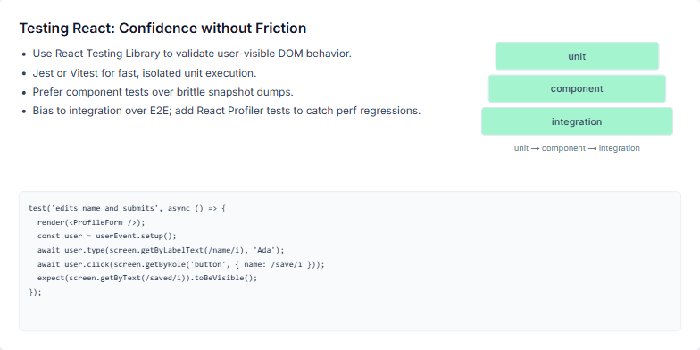
This slide is part of a presentation on testing React applications effectively. It emphasizes the importance of finding a balance between confidence and development speed. The slide content focuses on using practical tools and techniques like React Testing Library, Jest/Vitest, and component/integration tests over brittle snapshot tests. It also highlights the need for performance regression testing using React Profiler. The visual aid uses a pyramid to represent the testing layers: unit, component, and integration, emphasizing a focus on component and integration tests for optimal results. Finally, a code example demonstrates a typical test using React Testing Library, emphasizing its simplicity and focus on user interaction and visible outcomes.
Create a slide explaining why React is still a relevant and powerful JavaScript framework for front-end development in 2024. Highlight its key strengths, including stability, ecosystem, performance, and community, while acknowledging its maturity. The slide should be visually appealing and engaging for a technical audience familiar with web development concepts.
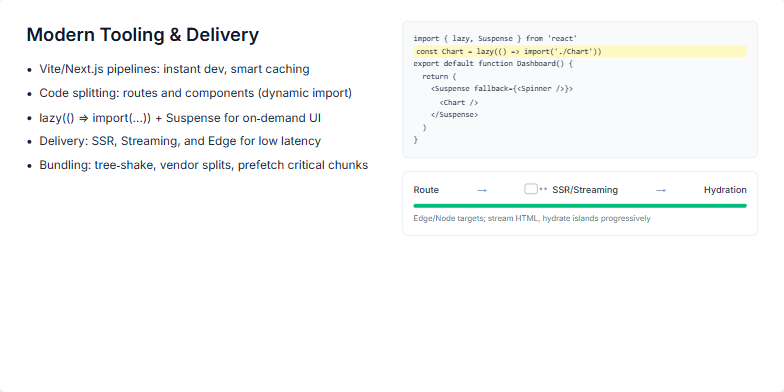
This slide focuses on explaining how modern web development tools and delivery techniques contribute to faster and more efficient user experiences. It covers the use of Vite and Next.js for optimized development pipelines, including features like Hot Module Replacement (HMR) and smart caching. The core concept of code-splitting, both at the route and component level, is highlighted, with a specific emphasis on dynamic imports and React's lazy() function combined with Suspense for on-demand loading of UI elements. The delivery aspect is also explored, covering SSR, streaming, and edge rendering for low latency, and touching upon bundling strategies like tree-shaking, vendor chunk splitting, and critical path prefetching to improve metrics like Time To First Byte (TTFB) and Time To Interactive (TTI). The slide also aims to visually showcase code examples demonstrating the use of lazy() and Suspense alongside a diagram illustrating the flow from routing to hydration, highlighting the progressive nature of modern web experiences.
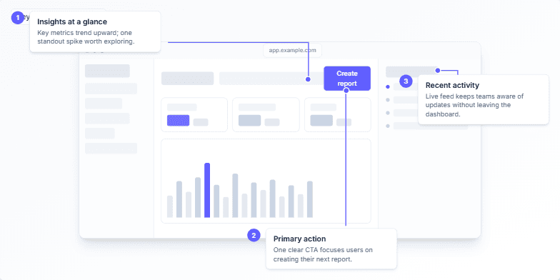
Create a slide demonstrating the key design principles of a dashboard UI. The dashboard should focus on delivering quick insights, guiding users with one clear callout color (e.g., indigo), and a simple layout with minimal clutter. The main components to highlight are an insights/metrics trend area, a primary call-to-action button (e.g., “Create report”), and a recent activity feed. The slide should include animated annotations to guide viewers through the key elements. Speaker notes should explain the design choices: grayscale for calm, one accent color for guidance, and a simple structure to shorten time to insight.
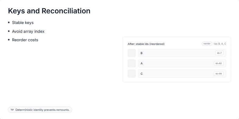
This slide explains the importance of using keys in React for efficient reconciliation. It visually demonstrates how stable keys, unlike array indices, help React identify and preserve component state during re-renders, especially when list items are reordered. The key concept is that stable identifiers prevent unnecessary component unmounts and remounts, leading to better performance and user experience. The slide shows a 'before' and 'after' comparison of a list rendered with array indices as keys versus stable IDs. This visualization emphasizes the benefits of stable keys in reducing re-rendering overhead. The goal is to educate developers on the proper usage of keys in React for optimal performance.
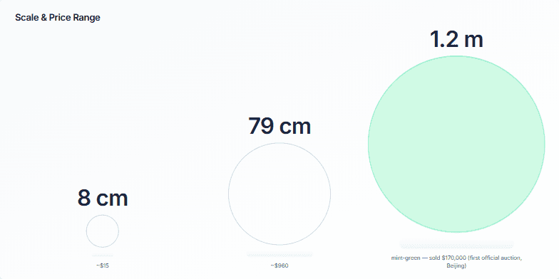
Create a slide visualizing the relationship between the size of an artwork and its price. Show how a small piece can be relatively inexpensive, while larger pieces command significantly higher prices, culminating in a high-value auction sale. Use circles to represent the artworks, scaling them proportionally to their size. Include labels for dimensions and prices. Highlight the most expensive piece with a distinct color. Provide speaker notes to guide a presentation of this slide, explaining the correlation between size, price, and the significance of the auctioned piece.
Want to generate your own slides with AI?
Start creating high-tech, AI-powered presentations with Slidebook.