Create a slide visualizing the relationship between the size of an artwork and its price. Show how a small piece can be relatively inexpensive, while larger pieces command significantly higher prices, culminating in a high-value auction sale. Use circles to represent the artworks, scaling them proportionally to their size. Include labels for dimensions and prices. Highlight the most expensive piece with a distinct color. Provide speaker notes to guide a presentation of this slide, explaining the correlation between size, price, and the significance of the auctioned piece.
Introduce the idea: we are looking at how size correlates with price across three representative pieces.
Step 1: Point to the smallest circle. Say: eight centimeters, roughly fifteen dollars. This anchors the left end of our range.
Step 2: Reveal the mid-scale. Say: at seventy-nine centimeters, we jump to about nine hundred sixty dollars. Emphasize that the price increases much faster than the physical size.
Step 3: Reveal the largest, mint‑green piece. Say: at 1.2 meters, this one sold for one hundred seventy thousand dollars at the first official auction in Beijing. Note the mint-green highlight as the notable, auctioned piece.
Conclude: the sequence makes the point—scale grows linearly on screen, while price accelerates dramatically, culminating in the auction sale.
Behind the Scenes
How AI generated this slide
Establish layout: Design a clean layout with a title, a main visualization area, and a footer.
Visualize scale: Represent artworks as circles, with diameters proportional to their real-world size, creating a clear visual correlation between size and price.
Label data: Add labels for dimensions (e.g., 8 cm, 79 cm, 1.2 m) and corresponding prices to each circle, ensuring clarity and readability.
Highlight key data point: Use a distinct color (mint green) and a detailed caption for the most expensive piece to draw attention to its significance as an auctioned item.
Animate elements: Introduce subtle animations to guide the viewer's focus from the smallest to the largest circle, enhancing the storytelling aspect of the visualization.
Generate speaker notes: Provide detailed notes for a presenter, guiding them through the narrative of the slide, emphasizing the exponential relationship between size and price, and highlighting the auction sale as the culmination.
Why this slide works
This slide effectively communicates the relationship between size and price of artworks through clear visuals and concise data. The use of circles provides an intuitive representation of scale, while labels and animations guide the viewer's understanding. Highlighting the most expensive piece emphasizes its significance. The speaker notes enhance the presentation by providing a clear narrative and emphasizing key takeaways. The design is clean, uncluttered, and accessible, making it suitable for presentations, reports, or educational materials. Keywords: data visualization, scale, price, art market, auction, presentation design, animation, visual communication
Slide Code
You need to be logged in to view the slide code.
Frequently Asked Questions
How does this slide visualize the relationship between size and price?
The slide uses circles of different sizes to represent artworks, directly correlating the diameter of the circle to the size of the artwork. Labels below each circle indicate the dimension and price, allowing viewers to quickly grasp the relationship. The increasing size of circles alongside increasing prices visually demonstrates how larger artworks generally command higher prices in the art market.
Why is the largest circle highlighted in mint green?
The mint green color and detailed caption highlight the largest circle to emphasize its significance. This piece represents a notable sale at an official auction, adding another layer to the price-size correlation. It showcases that exceptional pieces can reach extraordinarily high prices in the art market, especially when validated by the auction process.
How do the animations enhance the slide's effectiveness?
The subtle animations, scaling each circle from small to large, guide the viewer's eye across the visualization. This dynamic presentation enhances storytelling by controlling the flow of information. It emphasizes the progression from smaller, less expensive pieces to the larger, significantly more valuable artwork sold at auction.
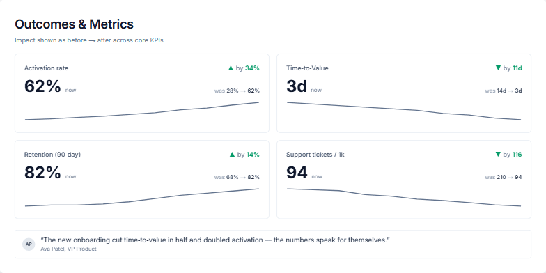
Create a slide showcasing the positive impact of a product or service on core business metrics. Present four key performance indicators (KPIs) with before-and-after values, highlighting improvements. Include a trendline for each KPI to visualize the progress. Add a testimonial from a VP of Product reinforcing the positive results. The KPIs should include Activation rate, Time-to-Value, Retention (90-day), and Support tickets / 1k. Use a clean and modern design with clear data visualization. The slide should be suitable for a business presentation or report.
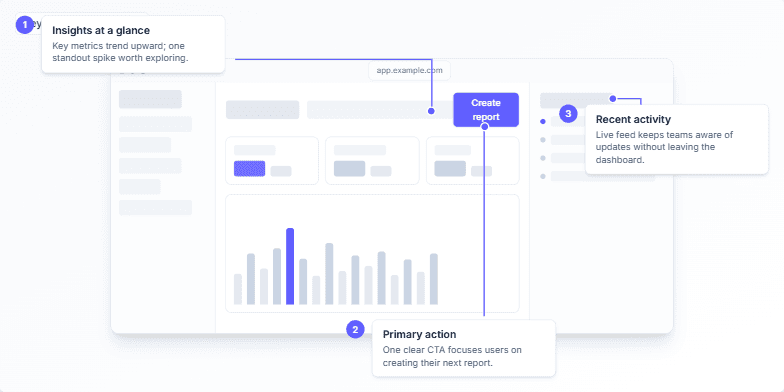
Create a slide demonstrating the key design principles of a dashboard UI. The dashboard should focus on delivering quick insights, guiding users with one clear callout color (e.g., indigo), and a simple layout with minimal clutter. The main components to highlight are an insights/metrics trend area, a primary call-to-action button (e.g., “Create report”), and a recent activity feed. The slide should include animated annotations to guide viewers through the key elements. Speaker notes should explain the design choices: grayscale for calm, one accent color for guidance, and a simple structure to shorten time to insight.
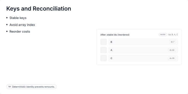
This slide explains the importance of using keys in React for efficient reconciliation. It visually demonstrates how stable keys, unlike array indices, help React identify and preserve component state during re-renders, especially when list items are reordered. The key concept is that stable identifiers prevent unnecessary component unmounts and remounts, leading to better performance and user experience. The slide shows a 'before' and 'after' comparison of a list rendered with array indices as keys versus stable IDs. This visualization emphasizes the benefits of stable keys in reducing re-rendering overhead. The goal is to educate developers on the proper usage of keys in React for optimal performance.
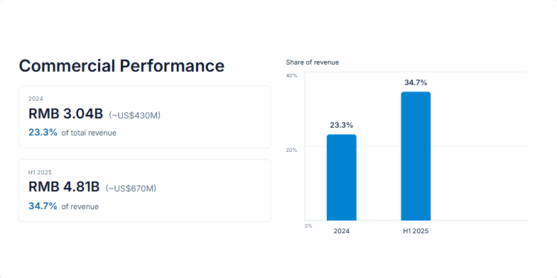
Create a slide visualizing the growth in commercial performance and its increasing share of total revenue. Show data for 2024 and the first half of 2025. Include specific figures for revenue in RMB and USD equivalents, along with percentages representing their share of total revenue. Use a bar chart to visually represent the change in revenue share between these two periods. The slide should be clean, professional, and easy to understand, suitable for a business presentation. Animate elements for a dynamic presentation flow, revealing data points sequentially. Use a modern and sleek design, with a professional color palette. The slide dimensions should be 1200px by 600px. Include speaker notes outlining the key points to emphasize during the presentation.
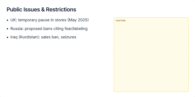
Create a slide that visually represents public issues and restrictions affecting product availability in different regions. Include specific examples such as a temporary pause in stores in the UK, proposed bans in Russia due to fear/labeling concerns, and sales bans/seizures in Iraq (Kurdistan). Design the slide with a cautionary theme, using yellow and black colors. Add speaker notes that explain the information on the slide in more detail. The overall tone should be neutral and informative, focusing on situational awareness rather than alarm.
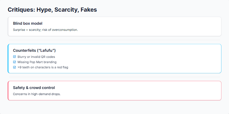
This slide is part of a presentation discussing critiques of Pop Mart, a popular collectible toy company. The presentation aims to inform the audience about the potential downsides of the blind box model, the prevalence of counterfeit products, and safety concerns during high-demand product launches. The slide uses a checklist format to highlight key points about identifying fake Pop Mart figures and briefly touches upon the potential risks associated with the hype surrounding limited edition releases and the need for better crowd control measures at these events. The goal is to promote a balanced perspective on collecting, encouraging enthusiasm while emphasizing the importance of authenticity verification and personal safety.
Want to generate your own slides with AI?
Start creating high-tech, AI-powered presentations with Slidebook.