Dashboard Design Breakdown: Focus, Clarity, and Action
Description provided by the user:
Create a slide demonstrating the key design principles of a dashboard UI. The dashboard should focus on delivering quick insights, guiding users with one clear callout color (e.g., indigo), and a simple layout with minimal clutter. The main components to highlight are an insights/metrics trend area, a primary call-to-action button (e.g., “Create report”), and a recent activity feed. The slide should include animated annotations to guide viewers through the key elements. Speaker notes should explain the design choices: grayscale for calm, one accent color for guidance, and a simple structure to shorten time to insight.
Introduce the hero: this is the Dashboard, our product’s daily home base. Point out the clean browser chrome and lifted card to frame it as the key screen.
Reveal the first callout: highlight the insights area. Explain that the greyscale UI puts the focus on the data, while the single indigo accent flags noteworthy changes.
Advance to the second callout: draw attention to the primary CTA, Create report. Emphasize that the layout gives a single, confident action without clutter.
Advance to the third callout: show Recent activity on the right. Describe how it keeps context live so teams see what changed moments ago.
Close by reinforcing the design choices: greyscale for calm, one accent for guidance, and a simple structure that shortens time to insight.
Behind the Scenes
How AI generated this slide
Establish the visual: Create a mockup of a sleek, functional dashboard with grayscale UI elements, an indigo call-to-action button, and a recent activity feed.
Structure for clarity: Organize the dashboard layout logically with distinct sections for insights, actions, and recent activity.
Animate for impact: Add animated lines and anchor dots to guide the viewer's eye to each highlighted element, following the sequence in the speaker notes.
Craft callouts: Design numbered callout boxes with concise titles and descriptions for each key feature, reinforcing the design principles.
Refine and polish: Ensure smooth animations, clear visuals, and a consistent design language across the slide.
Optimize for presentation: Integrate speaker notes to align with the animated sequence and provide deeper context for the design decisions.
Why this slide works
This slide effectively combines visual demonstration with animated annotations and clear explanations to convey the design principles behind a user-friendly dashboard. The grayscale UI with a single accent color creates visual focus, and the animated callouts enhance understanding. The detailed speaker notes further reinforce the message, providing a comprehensive guide to the design choices. The use of Framer Motion adds a polished and engaging touch, making the presentation more dynamic. Keywords: dashboard design, UI design, user experience, data visualization, call-to-action, visual hierarchy, animation, Framer Motion, presentation design
Slide Code
You need to be logged in to view the slide code.
Frequently Asked Questions
How does the use of grayscale in the dashboard UI contribute to a better user experience?
The predominantly grayscale UI creates a calm and neutral backdrop, minimizing visual distractions and allowing the user to focus on the data and key insights. This design choice enhances readability and reduces cognitive load, promoting a more efficient and pleasant user experience. The use of a single accent color, such as indigo, further guides the user's attention to important elements like call-to-action buttons, ensuring that key functionalities are easily discoverable.
What is the purpose of the animated lines and anchor dots in the slide?
The animated lines and anchor dots serve as visual cues, directing the viewer's attention to specific areas of the dashboard as they are being discussed in the presentation. This dynamic approach enhances engagement and ensures that the audience follows the speaker's narrative smoothly, understanding the rationale behind each design choice. Animations, implemented using libraries like Framer Motion, add a polished touch to the presentation, making it more visually appealing and memorable.
How does the single call-to-action design principle benefit the user?
A single, clear call-to-action (CTA) button, like the "Create report" button in the example, minimizes confusion and guides users towards the desired action without overwhelming them with choices. This streamlined approach improves conversion rates and contributes to a more focused and effective user journey. By eliminating clutter and emphasizing one key action, the design promotes a sense of purpose and encourages user engagement.
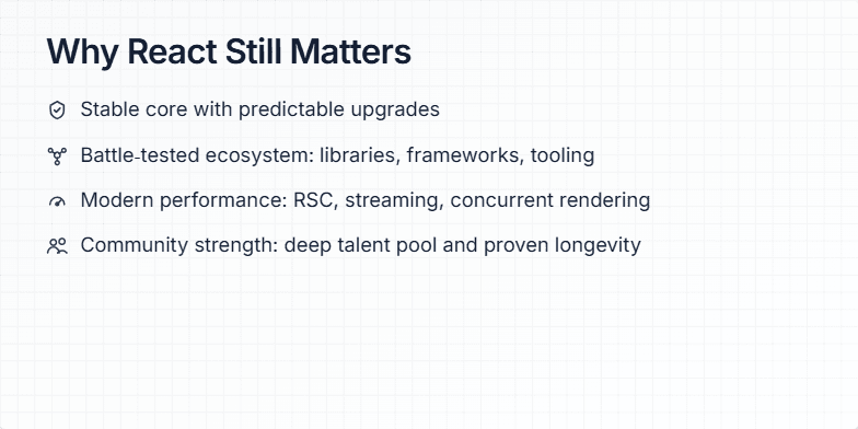
Create a slide explaining why React is still a relevant and powerful JavaScript framework for front-end development in 2024. Highlight its key strengths, including stability, ecosystem, performance, and community, while acknowledging its maturity. The slide should be visually appealing and engaging for a technical audience familiar with web development concepts.
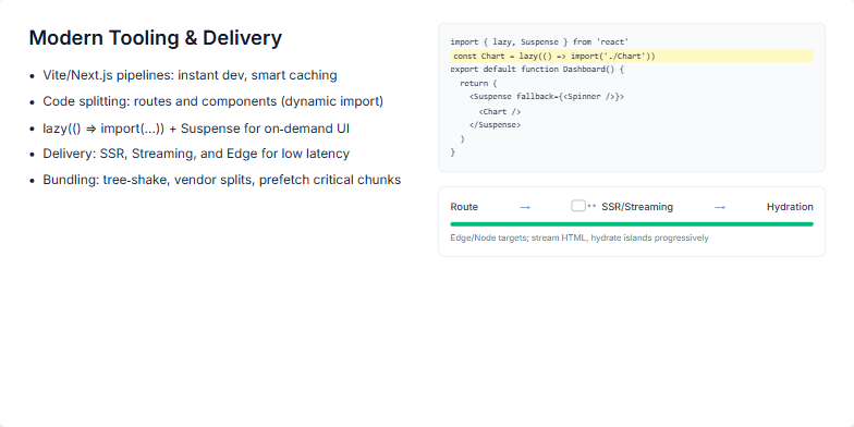
This slide focuses on explaining how modern web development tools and delivery techniques contribute to faster and more efficient user experiences. It covers the use of Vite and Next.js for optimized development pipelines, including features like Hot Module Replacement (HMR) and smart caching. The core concept of code-splitting, both at the route and component level, is highlighted, with a specific emphasis on dynamic imports and React's lazy() function combined with Suspense for on-demand loading of UI elements. The delivery aspect is also explored, covering SSR, streaming, and edge rendering for low latency, and touching upon bundling strategies like tree-shaking, vendor chunk splitting, and critical path prefetching to improve metrics like Time To First Byte (TTFB) and Time To Interactive (TTI). The slide also aims to visually showcase code examples demonstrating the use of lazy() and Suspense alongside a diagram illustrating the flow from routing to hydration, highlighting the progressive nature of modern web experiences.
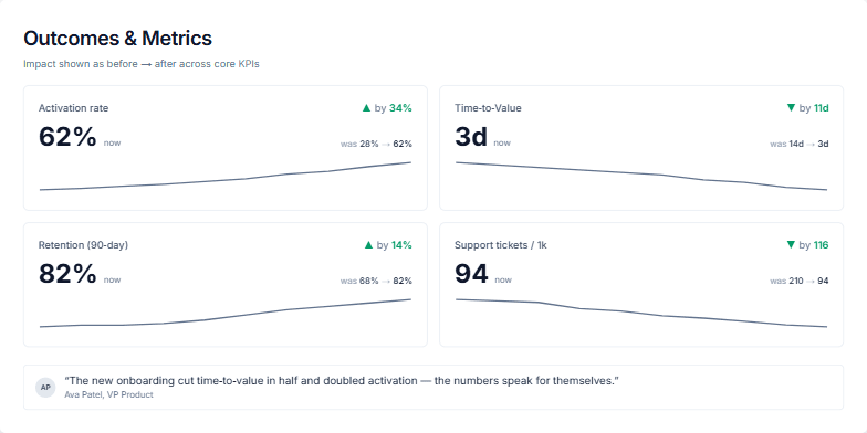
Create a slide showcasing the positive impact of a product or service on core business metrics. Present four key performance indicators (KPIs) with before-and-after values, highlighting improvements. Include a trendline for each KPI to visualize the progress. Add a testimonial from a VP of Product reinforcing the positive results. The KPIs should include Activation rate, Time-to-Value, Retention (90-day), and Support tickets / 1k. Use a clean and modern design with clear data visualization. The slide should be suitable for a business presentation or report.
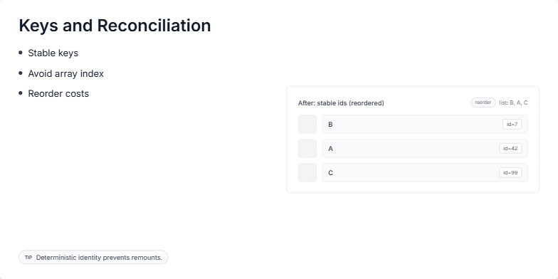
This slide explains the importance of using keys in React for efficient reconciliation. It visually demonstrates how stable keys, unlike array indices, help React identify and preserve component state during re-renders, especially when list items are reordered. The key concept is that stable identifiers prevent unnecessary component unmounts and remounts, leading to better performance and user experience. The slide shows a 'before' and 'after' comparison of a list rendered with array indices as keys versus stable IDs. This visualization emphasizes the benefits of stable keys in reducing re-rendering overhead. The goal is to educate developers on the proper usage of keys in React for optimal performance.
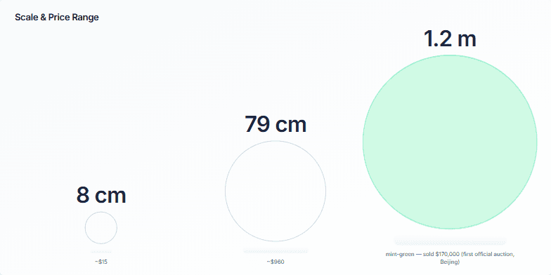
Create a slide visualizing the relationship between the size of an artwork and its price. Show how a small piece can be relatively inexpensive, while larger pieces command significantly higher prices, culminating in a high-value auction sale. Use circles to represent the artworks, scaling them proportionally to their size. Include labels for dimensions and prices. Highlight the most expensive piece with a distinct color. Provide speaker notes to guide a presentation of this slide, explaining the correlation between size, price, and the significance of the auctioned piece.
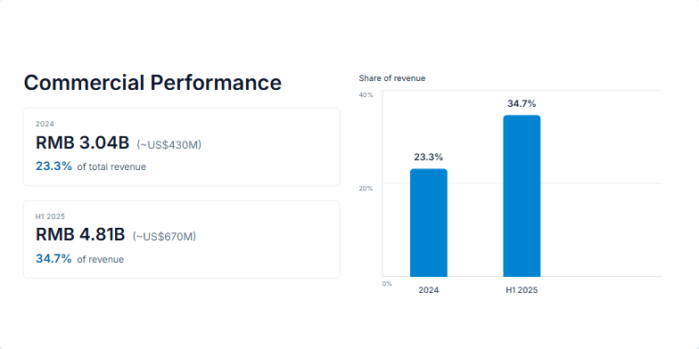
Create a slide visualizing the growth in commercial performance and its increasing share of total revenue. Show data for 2024 and the first half of 2025. Include specific figures for revenue in RMB and USD equivalents, along with percentages representing their share of total revenue. Use a bar chart to visually represent the change in revenue share between these two periods. The slide should be clean, professional, and easy to understand, suitable for a business presentation. Animate elements for a dynamic presentation flow, revealing data points sequentially. Use a modern and sleek design, with a professional color palette. The slide dimensions should be 1200px by 600px. Include speaker notes outlining the key points to emphasize during the presentation.
Want to generate your own slides with AI?
Start creating high-tech, AI-powered presentations with Slidebook.