Design Principles and Visual Language for Products
Description provided by the user:
Create a slide showcasing design principles and their visual representation, including color palettes, typography, spacing, elevation, and component examples. The design should emphasize clarity, guidance, focus, and credibility. The slide should include a title, short description, sections for principles, color, typography, spacing, elevation, and components. Use a light gray background with a subtle grid, and cobalt as the accent color. The principles should be listed with short explanations. The color section should display color swatches with names. The typography section should show examples of display and UI text styles. Spacing should be represented with numerical tokens. Elevation should be shown with examples of different shadow levels. Component examples should include a primary button and a neutral tag. The overall style should be clean and professional.
Today I’ll define the guiding principles for our brand and how they translate into a consistent visual language.
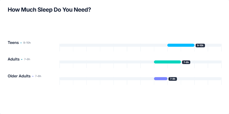
First, look at the right: our color system appears. We keep a calm gray foundation and a single cobalt accent to drive emphasis and actions.
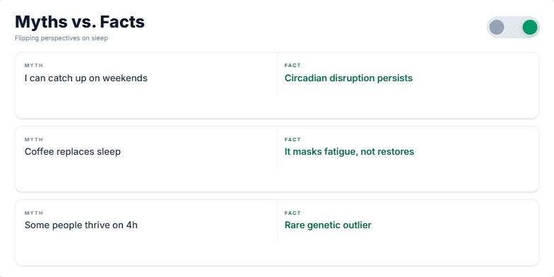
Now the principles slide in on the left. Clarity: plain language with strong contrast. Guidance: always reveal the next best action. Focus: reduce cognitive load and show only what’s necessary. Credibility: be consistent, restrained, and trustworthy.
Typography pairing: a confident display style for headlines and a compact UI text for dense interfaces. This balances personality with usability.
Spacing scale: small, predictable steps that compose layouts quickly and cleanly.
Elevation: subtle shadows create hierarchy without noise—use just enough to indicate interactivity and layering.
Finally, two micro components: a primary button using the cobalt accent, and a neutral tag for secondary metadata. This is how principles and tokens meet in real components.
Together, these choices create clarity, guidance, focus, and credibility across the product.
Behind the Scenes
How AI generated this slide
Establish layout: Divide the slide into sections for principles, color, typography, spacing, elevation, and components using a grid system.
Visualize principles: Represent each principle with a bullet point and concise description, animating them for sequential emphasis.
Showcase color palette: Display color swatches with labels, using Framer Motion for a dynamic appearance.
Present typography: Show examples of headline and body text styles, highlighting their purpose and characteristics.
Illustrate spacing and elevation: Use tokens and visual examples to demonstrate spacing and elevation levels, enhancing understanding through direct visualization.
Integrate components: Include a primary button and a neutral tag as practical applications of the design principles and visual elements.
Apply animations: Utilize Framer Motion to add subtle animations to the elements, creating a visually engaging presentation.
Why this slide works
This slide effectively communicates design principles and their visual translation. The clear structure, concise descriptions, and visual examples facilitate understanding. The use of Framer Motion adds a touch of dynamism, making the presentation more engaging. The slide's clean and professional aesthetic aligns with the principles it conveys, reinforcing the message of clarity and credibility. The incorporation of SEO keywords like 'design principles,' 'visual language,' 'UI design,' 'UX design,' 'color palette,' 'typography,' 'spacing,' and 'elevation' enhances its searchability and relevance.
Slide Code
You need to be logged in to view the slide code.
Frequently Asked Questions
How can I apply these design principles to my own projects?
These design principles, encompassing clarity, guidance, focus, and credibility, can be implemented in your projects by ensuring clear and concise communication, guiding users through intuitive interfaces, minimizing distractions to maintain focus, and establishing trust through consistent and reliable design. Leverage visual elements like color palettes, typography, spacing, and elevation to reinforce these principles, creating a cohesive and user-centered experience.
What is the significance of Framer Motion in this slide?
Framer Motion enhances the slide's visual appeal and engagement by introducing subtle animations. These animations, applied to elements like the principle list and color swatches, create a dynamic presentation that captures attention and improves information retention. Framer Motion's ease of use and smooth transitions contribute to a polished and professional feel, enhancing the overall impact of the design principles being presented.
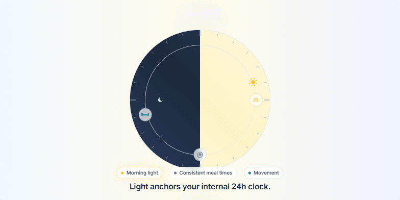
Create a slide visualizing the circadian rhythm and how light, consistent meal times, and movement help regulate it. The slide should feature a 24-hour dial, with the right half representing daytime (light) and the left half representing nighttime (dark). Animate a sun moving across the daytime arc. Include icons representing sunrise, lunch, and a workout at their respective times on the dial. The slide should have a headline emphasizing the importance of light for regulating the circadian rhythm. Add a list of the three key cues: Morning light, Consistent meal times, and Movement.
Create a title slide for a presentation about sleep and its importance for overall well-being, including improved cognitive function, creativity, and long-term health. The slide should have a dark, calming background with subtle animations, possibly a crescent moon, and evoke a sense of tranquility and rest. The title should be impactful and the overall design minimal and visually appealing. The color scheme should be dark with shades of indigo and hints of white or light indigo for contrast. Include a date (September 8, 2025) and a subtitle that briefly explains the presentation's purpose.
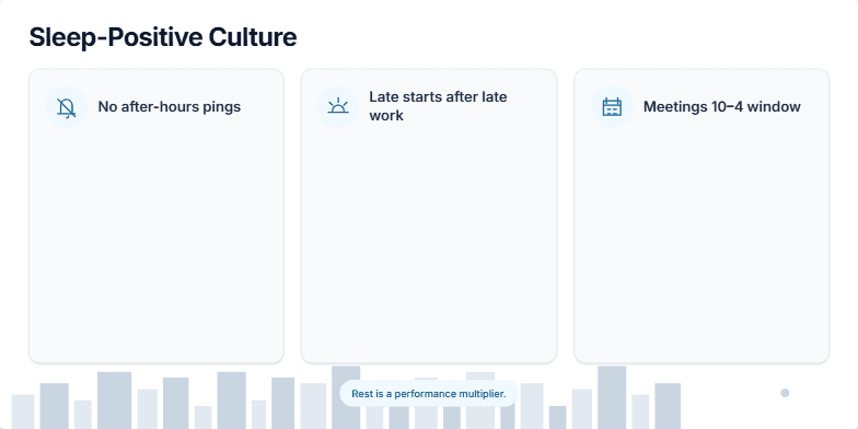
Create a visually appealing slide emphasizing the importance of sleep for overall well-being and performance. The slide should have a calming, dreamlike aesthetic with gentle animations. The core message should be 'Protect your sleep. It protects you.' Include subtle background animations, perhaps with gradients and blur effects. The target audience is professionals and high-achievers who may be sacrificing sleep for work. The slide should serve as a gentle reminder of the crucial role sleep plays in maintaining physical and cognitive health, ultimately enhancing productivity and performance. Include resources/references on sleep hygiene for further exploration by the audience. The overall tone should be serene and motivational, encouraging viewers to prioritize sleep.
Create a slide about how morning and evening light affects sleep. Show a before and after scenario, with the 'before' depicting a dark room with a glowing phone at night, and the 'after' showing someone waking up to natural morning light. Include micro-actions like getting morning sun, enabling night mode, and charging the phone outside the bedroom. The overall message should be about improving sleep quality by aligning with natural light patterns.
Create a slide about the negative health consequences of sleep deprivation. It should emphasize the increased risks of various health problems due to lack of sleep. The slide should be visually appealing and easy to understand, using clear language and concise explanations. It should cover the connection between sleep debt and cardiovascular issues, type 2 diabetes, weight gain, and mental health problems like depression and anxiety. Include specific statistics or facts to support these claims. The design should be professional and suitable for a presentation to a general audience.
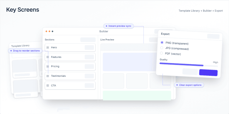
This slide showcases a modular component system for building user interfaces, emphasizing consistency and accessibility. It demonstrates various UI elements like template cards, section blocks, form fields, toolbars, drag handles, preview panels, export modals, and toasts. Each component is presented in its default, hover, and focus states, highlighting the consistent use of corners, shadows, and spacing rhythm. The slide also emphasizes accessibility features such as strong focus rings and validation messages. The design includes subtle gridlines and a soft backdrop for an organized canvas. The speaker notes provide a detailed walkthrough of each component and its features, including interaction previews and accessibility considerations.
Want to generate your own slides with AI?
Start creating high-tech, AI-powered presentations with Slidebook.