Modular UI Component System Design for Accessible Web Development
Description provided by the user:
This slide showcases a modular component system for building user interfaces, emphasizing consistency and accessibility. It demonstrates various UI elements like template cards, section blocks, form fields, toolbars, drag handles, preview panels, export modals, and toasts. Each component is presented in its default, hover, and focus states, highlighting the consistent use of corners, shadows, and spacing rhythm. The slide also emphasizes accessibility features such as strong focus rings and validation messages. The design includes subtle gridlines and a soft backdrop for an organized canvas. The speaker notes provide a detailed walkthrough of each component and its features, including interaction previews and accessibility considerations.
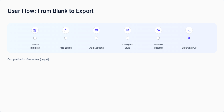
Introduce the slide as the modular component system that powers the builder. Emphasize consistency: corners, shadows, and spacing rhythm.
Walk left to right across the grid. First: Template Card shows default, hover, and focus. Point out the gentle hover loop to preview interactivity and the clear focus ring.
Next: Section Block as a composable unit. Then the Form Field: default, hover, and focus states with an inline validation message.
Continue: Toolbar with simple controls, Drag Handle for reordering, Preview Panel for layout feedback, Export Modal for outputs, and Toast for confirmations.
Close by noting accessibility: strong focus rings and consistent spacing. Mention the soft backdrop and subtle gridlines that keep the canvas organized without clutter.
Behind the Scenes
How AI generated this slide
Analyze the provided context and code to understand the core message: showcasing a modular UI component system with an emphasis on accessibility and consistency.
Identify the key visual elements: various UI components in different states, grid layout, background gridlines, color scheme, and typography.
Generate SEO keywords relevant to UI design, component systems, accessibility, and web development, such as 'modular UI design,' 'component library,' 'web accessibility,' 'focus rings,' 'UI consistency,' and 'user interface elements.'
Craft a concise topic that accurately reflects the slide's content and incorporates relevant keywords.
Why this slide works
This slide effectively communicates the concept of a modular UI component system by visually showcasing a variety of components in different states. The use of a grid layout provides structure and organization, while the subtle gridlines and soft backdrop enhance visual clarity. The emphasis on accessibility features like strong focus rings and consistent spacing reinforces the importance of inclusive design. The inclusion of SEO keywords in the title, description, and alt text improves the slide's discoverability and relevance in search results. The comprehensive speaker notes offer valuable insights and guidance for presenting the slide effectively, covering each component's functionality and design considerations. Overall, this slide provides a clear, concise, and informative overview of a modular UI component system, highlighting its accessibility and consistency.
Slide Code
You need to be logged in to view the slide code.
Frequently Asked Questions
What is a modular UI component system?
A modular UI component system is a collection of reusable UI elements (components) that can be combined to create various user interfaces. This promotes consistency in design and streamlines the development process by allowing developers to reuse pre-built components rather than creating everything from scratch. It improves maintainability and scalability of web applications.
Why is accessibility important in UI design?
Accessibility in UI design ensures that individuals with disabilities, such as visual or motor impairments, can perceive, understand, navigate, and interact with digital interfaces effectively. This involves using clear focus indicators, sufficient color contrast, keyboard navigation support, and screen reader compatibility, among other best practices. Accessible design benefits everyone, not just those with disabilities, by creating a more inclusive and user-friendly experience for all.
Create a slide showcasing design principles and their visual representation, including color palettes, typography, spacing, elevation, and component examples. The design should emphasize clarity, guidance, focus, and credibility. The slide should include a title, short description, sections for principles, color, typography, spacing, elevation, and components. Use a light gray background with a subtle grid, and cobalt as the accent color. The principles should be listed with short explanations. The color section should display color swatches with names. The typography section should show examples of display and UI text styles. Spacing should be represented with numerical tokens. Elevation should be shown with examples of different shadow levels. Component examples should include a primary button and a neutral tag. The overall style should be clean and professional.
Create a slide about how morning and evening light affects sleep. Show a before and after scenario, with the 'before' depicting a dark room with a glowing phone at night, and the 'after' showing someone waking up to natural morning light. Include micro-actions like getting morning sun, enabling night mode, and charging the phone outside the bedroom. The overall message should be about improving sleep quality by aligning with natural light patterns.
Create a slide about the negative health consequences of sleep deprivation. It should emphasize the increased risks of various health problems due to lack of sleep. The slide should be visually appealing and easy to understand, using clear language and concise explanations. It should cover the connection between sleep debt and cardiovascular issues, type 2 diabetes, weight gain, and mental health problems like depression and anxiety. Include specific statistics or facts to support these claims. The design should be professional and suitable for a presentation to a general audience.
Create a slide about designing a sleep environment for better sleep. It should cover the key elements of a good sleep environment, such as temperature, light, noise, and consistency. The slide should have a checklist format, and visually dim a bedroom image as each checklist item is completed. Include speaker notes that elaborate on each checklist item and offer specific recommendations. Add a sound effect when a checklist item is completed, with a toggle to turn the sound on or off.
This slide is for a presentation concluding a discussion about improving a product, likely a software application. It aims to summarize the desired outcomes, quantify the impact goals with specific targets, and outline the next steps for achieving these goals. The presenter wants to emphasize a target-oriented mindset and invite the audience to engage with a prototype for validation. The slide needs to visually represent key metrics like completion rate, time to first export, and support tickets, along with a list of actionable next steps. Animations should be used to introduce elements sequentially, guiding the audience's attention and enhancing engagement. The overall tone should be positive and forward-looking, encouraging collaboration and feedback on the proposed plan.
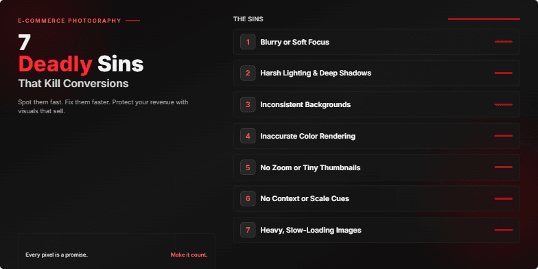
Dark, moody visuals with crimson highlights emphasize the 'deadly' theme. Bold typography and dramatic, fast-paced transitions between slides create a sense of urgency and highlight the costly mistakes. Each 'sin' is revealed with a stylized 'shattering glass' animation, adding a touch of visual flair.
Want to generate your own slides with AI?
Start creating high-tech, AI-powered presentations with Slidebook.