This slide visually represents the evaluation metrics used for different machine learning tasks, including classification, regression, and LLMs. It showcases how to visualize progress and performance using metrics like F1, ROC-AUC, RMSE, MAE, hallucination rate, toxicity, and latency. The slide includes a bar chart comparing accuracy across different models and a gauge visualizing latency against a target. The purpose is to emphasize the importance of selecting appropriate metrics for each task, visualizing them effectively, and focusing on metrics that directly impact user outcomes.
First, set the stage: this slide is a quick map from task to metric and how we visualize progress.
Highlight that classification focuses on quality trade-offs, so F1 and ROC-AUC are the go-to signals.
Move to regression: underline that RMSE and MAE complement each other—RMSE penalizes large errors, MAE shows average miss.
For LLMs, emphasize safety and reliability: hallucination rate and toxicity for quality and risk, then latency for UX responsiveness.
Now point to the right side. The accuracy micro-bar chart shows relative model performance; the neon bar marks the best performer.
Then the latency gauge: we’re at about 420 ms against a 600 ms target—comfortably within the envelope, but still room to shave off.
Close by tying metrics to decisions: choose metrics per task, visualize them minimally, and track the one that moves user outcomes.
Behind the Scenes
How AI generated this slide
Identify key metrics for classification, regression, and LLMs: F1-score, ROC-AUC, RMSE, MAE, hallucination rate, toxicity, and latency.
Select appropriate visualizations: metric groups for listing key metrics, bar chart for comparing model accuracy, and gauge chart for visualizing latency against a target.
Design layout: Divide the slide into two sections, one for metric groups and the other for visualizations.
Implement animations using Framer Motion to enhance visual engagement and highlight key elements sequentially.
Style components using Tailwind CSS for a clean and modern look.
Why this slide works
This slide effectively communicates complex information through clear visuals and concise text. The use of Framer Motion adds a layer of polish and engagement, drawing the viewer's attention to specific elements. The layout is well-organized, and the choice of visualizations is appropriate for the data being presented. The slide is also well-structured for presentation purposes, allowing the speaker to guide the audience through the information step-by-step. The use of SEO keywords like "machine learning metrics," "data visualization," "performance evaluation," and "Framer Motion animation" enhances its discoverability and relevance.
Slide Code
You need to be logged in to view the slide code.
Frequently Asked Questions
What is the purpose of this slide?
This slide aims to demonstrate the selection and visualization of appropriate evaluation metrics for different machine learning tasks, such as classification, regression, and LLMs. It highlights the importance of choosing metrics aligned with task objectives and visualizing them effectively for clear communication. SEO keywords: machine learning metrics, data visualization, performance evaluation.
What are the key metrics used in this slide?
The slide features several key metrics including F1-score, ROC-AUC for classification, RMSE and MAE for regression, hallucination rate, toxicity, and latency for LLMs. These metrics provide insights into model performance, quality, safety, and responsiveness. SEO keywords: classification metrics, regression metrics, LLM metrics, F1-score, ROC-AUC, RMSE, MAE, hallucination rate, toxicity, latency.
How are the metrics visualized?
The metrics are visualized using various methods including metric groups for listing key metrics per task, a bar chart for comparing model accuracy, and a gauge chart for visualizing latency against a target. These diverse visualizations aid in understanding the data presented. SEO keywords: data visualization techniques, bar chart, gauge chart, metric visualization, performance visualization.
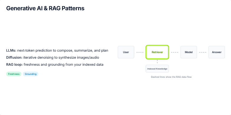
Explain the concept of Retrieval Augmented Generation (RAG) in the context of Generative AI. The slide should focus on how RAG addresses the limitations of Large Language Models (LLMs) by incorporating external knowledge sources. Explain how the RAG loop works, emphasizing the role of the retriever and its connection to indexed knowledge. Highlight the benefits of freshness and grounding that RAG brings. Visually represent the flow of information in a RAG system, including the user, retriever, model, and the final answer.
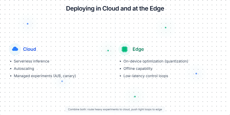
Create a slide that compares and contrasts deploying machine learning models in the cloud versus at the edge. Highlight the advantages and disadvantages of each approach, and suggest scenarios where one might be preferred over the other. The slide should be visually appealing and easy to understand, using clear language and concise bullet points. Consider using icons or visuals to represent cloud and edge deployments. The target audience is technical professionals and business stakeholders who are involved in making decisions about ML model deployment.
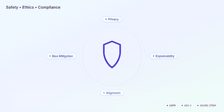
This slide is for a presentation about our commitment to safety, ethics, and compliance in developing and deploying AI-enabled systems. It visually represents our core principles: Privacy, Bias Mitigation, Explainability, and Alignment. The presentation emphasizes these are not mere add-ons but fundamental to our product development process. It also highlights our adherence to industry standards and regulations like GDPR, SOC 2, and ISO/IEC 27001, showcasing our dedication to responsible AI practices. The target audience includes potential clients, partners, and internal stakeholders interested in understanding our approach to AI governance and ethical considerations.
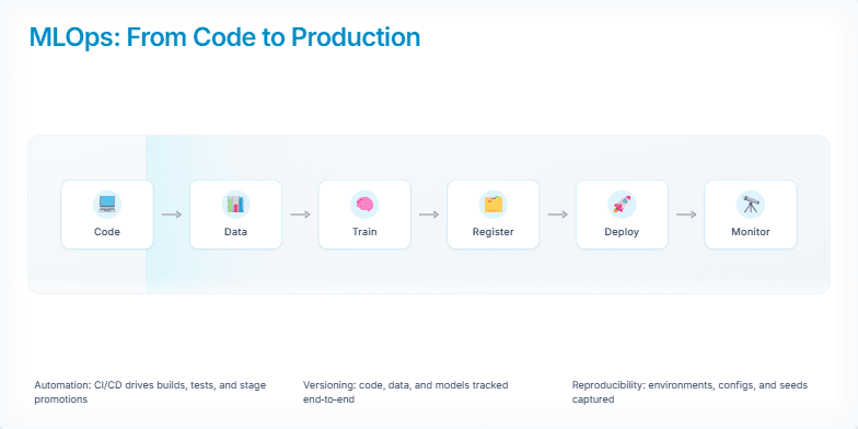
Create a slide visualizing the MLOps pipeline from code to production. Include stages like code, data, train, register, deploy, and monitor. Show a visual representation of the pipeline flow. Mention key MLOps enablers like automation, versioning, and reproducibility. The slide should have a modern, clean design. Target audience is technical professionals interested in learning about MLOps.
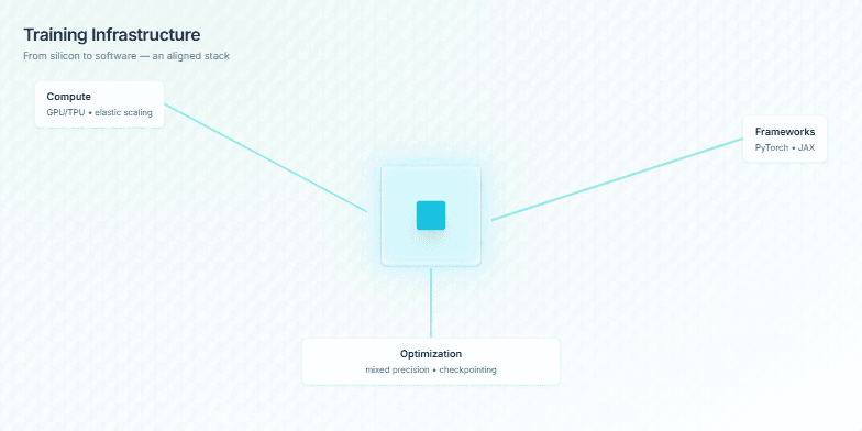
This slide visually represents a training infrastructure, emphasizing the interconnectedness of its components. It focuses on the key elements required for efficient and scalable training, from the underlying hardware to the software frameworks and optimization techniques. The central visual element, a pulsing chip, symbolizes the compute power at the heart of the system. The slide highlights GPUs and TPUs for compute, PyTorch and JAX as frameworks, and optimization strategies like mixed precision and checkpointing. The parallax scrolling effect reinforces the layered nature of the infrastructure and how these elements interact. The intent is to convey the message that a well-aligned stack leads to faster, cheaper, and more reliable training.
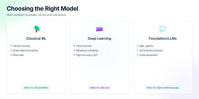
Create a slide to help choose between Classical ML, Deep Learning, and Foundation/LLM models. The slide should emphasize selecting the right model based on the problem's constraints and goals, not the other way around. It should highlight the strengths of each paradigm and provide clear criteria for selection. Classical ML excels in structured, smaller datasets where interpretability is key. Deep Learning is best suited for complex patterns with large datasets. Foundation/LLMs are ideal for open-ended language tasks. The slide should be visually appealing and easy to understand.
Want to generate your own slides with AI?
Start creating high-tech, AI-powered presentations with Slidebook.