Deep indigo background sets the stage for electric pink and neon green accents highlighting key portfolio elements. Dynamic transitions mimic the flow of a website, showcasing your work with stylish kinetic typography. Clean, minimalist design keeps the focus on your talent, leaving a lasting impression of sleek professionalism.
Categories
Generated Notes
Open with the question: “Is your portfolio a snoozefest?” Let the kinetic word draw attention and set the playful tone. Emphasize the deep indigo stage and the electric accents as our aesthetic.
Point to the left: this is the typical, gray skeleton of a portfolio—safe, but forgettable. Headlines, cards, sidebars; everything looks the same.
Advance to reveal the spice: highlight the hero area with electric pink, a confident CTA in neon green, and subtle motion that suggests flow. Explain that small, intentional movement helps people scan and remember.
Introduce the three spices on the right: 1) Hook in ten seconds with your sharpest win and a bold visual. 2) Show, don’t tell — compress the story into before/after, role, and measurable impact. 3) Micro-interactions — subtle motion to guide attention and convey polish.
Close with a nudge: pick one section today and apply all three. The goal is sleek professionalism that still feels alive.
Behind the Scenes
How AI generated this slide
Establish the color palette: Deep indigo background, electric pink and neon green accents. This high-contrast combination is visually striking and modern, aligning with design trends for portfolio presentations.
Layout the title elements: 'Is Your Portfolio a Snoozefest? Spice It Up!' using kinetic typography for the 'Snoozefest' portion to create a playful and engaging entry point.
Design placeholder elements to represent a 'before' portfolio: Grayscale, minimalist blocks suggest a common, somewhat bland portfolio structure.
Introduce motion: Animate the title's entrance with staggered fades and subtle bounces. Apply a horizontal slide transition to showcase a 'spiced up' version of the portfolio, demonstrating the dynamic flow advocated for.
Add visual interest: Include glowing, blurred orbs in pink and green to complement the accent colors and create a sense of depth and dynamism.
Incorporate supporting content: Position a list of key takeaways ('Hook in 10 seconds', 'Show, don’t tell', 'Micro-interactions') with corresponding number icons and brief descriptions to reinforce the core message of enhancing portfolio presentations.
Optimize for presentation flow: Implement Fragment components to control the timed appearance of each element, guiding the viewer's attention and building the narrative step by step.
Why this slide works
This slide effectively communicates its message through a compelling combination of visuals and motion. The high-contrast color scheme and kinetic typography grab attention, while the animated transitions clearly demonstrate the impact of dynamic design. The use of placeholder portfolio elements allows viewers to easily visualize the 'before' and 'after' states, and the supporting text reinforces the core message with actionable tips. The slide is well-structured for a presentation format, utilizing timed animations to control the flow of information and maintain audience engagement. The design incorporates modern design trends, appealing to a professional audience seeking to enhance their online presence. Keywords: portfolio design, presentation design, kinetic typography, micro-interactions, motion graphics, visual communication, UI/UX design, web design, graphic design, branding.
Slide Code
You need to be logged in to view the slide code.
Frequently Asked Questions
How can kinetic typography improve my portfolio?
Kinetic typography, which involves animating text, can add significant visual interest to your portfolio. It can make your presentation more engaging, draw attention to key headlines, and create a more memorable experience for viewers. This helps differentiate your portfolio from static presentations, reflecting current trends in web and graphic design.
What are micro-interactions, and why are they important?
Micro-interactions are small, subtle animations that respond to user actions. These can include hover effects, button clicks, transitions, and more. They enhance the user experience by providing visual feedback, guiding attention, and adding a sense of polish and professionalism. In a portfolio context, they can elevate the perceived quality of your work and subtly guide the viewer's eye.
How can I apply these 'spices' to my existing portfolio?
Start by choosing one section of your portfolio to revamp. Consider adding a striking visual to immediately grab attention (the 'hook'). Clearly communicate the value of your work with concise before-and-after examples or quantifiable impact metrics. Finally, sprinkle in some micro-interactions, such as hover effects on project cards or smooth transitions between sections. These additions can create a much more engaging and professional presentation.
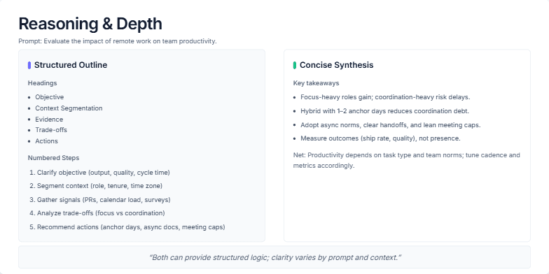
This slide visually compares two approaches to explaining complex topics: a structured outline and a concise synthesis. It uses the example prompt 'Evaluate the impact of remote work on team productivity' to demonstrate how both methods can effectively deliver information. The structured approach breaks down the analysis into headings (Objective, Context, Evidence, Trade-offs, Actions) and numbered steps, offering a detailed, step-by-step explanation. The concise approach presents key takeaways in a bulleted list, summarizing the core findings and offering a high-level overview. The slide aims to demonstrate how both methods can provide structured logic and clarity, with the choice depending on the prompt, audience, and available time.
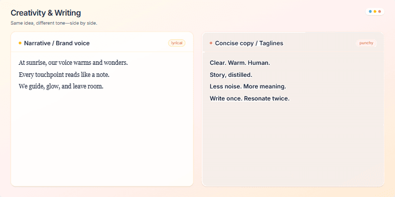
Create a slide demonstrating two distinct writing styles: narrative/brand voice (lyrical) and concise copy/taglines (punchy). The slide should visually compare these styles, showcasing how the same idea can be conveyed with different tones. Include example text for both styles, a visual cue (e.g., a color-coded icon) to indicate the style difference, and a title/heading. Aim for a clean and modern design. Include speaker notes that guide the presenter on how to use this slide effectively, emphasizing the importance of tone, audience, and context in writing.
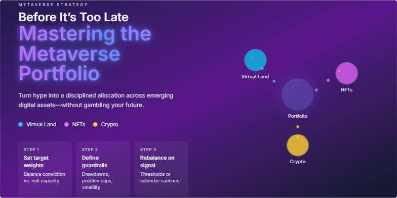
Imagine a slide bathed in the deep blues and purples of the metaverse, with shimmering constellations of digital assets. The title glows with a neon energy, drawing the eye. A subtle animation of a portfolio diversifying across virtual lands, NFTs, and cryptocurrencies plays seamlessly, hinting at the potential within. Clean, futuristic typography emphasizes the cutting-edge nature of the topic. This slide promises a journey into the future of finance, visualized with stunning clarity.
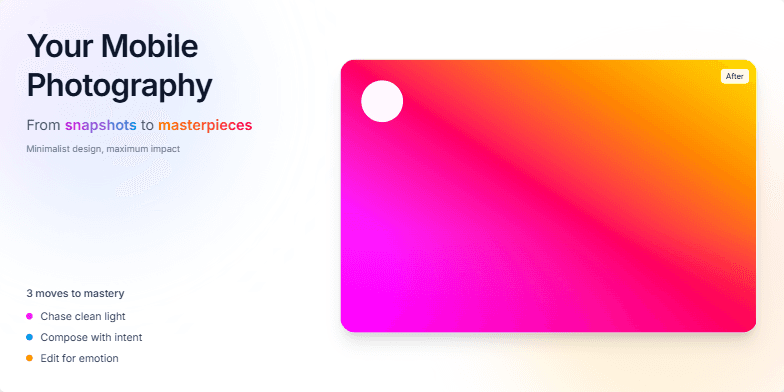
Dive into a world of vibrant color gradients and smooth transitions as we unveil the secrets to stunning mobile photography. Crisp typography and captivating before-and-after image reveals will ignite your creative spark. Experience the magic of transforming ordinary moments into extraordinary art, all from the palm of your hand. Minimalist design, maximum impact.
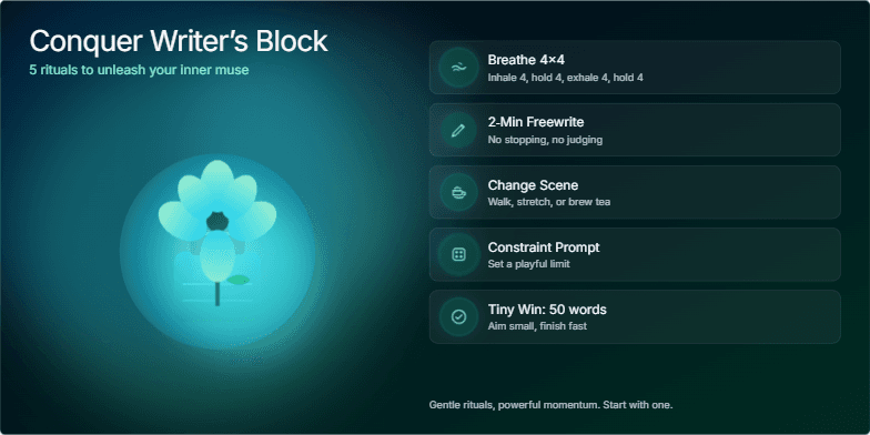
Deep blues and calming greens create a serene backdrop for this visually inspiring slide. Gentle watercolor animation of an inkwell transforming into a blossoming flower symbolizes the unfolding of creativity. Five elegantly styled icons represent the rituals, each revealed with a soft glow animation. The overall mood is peaceful and encouraging, sparking a sense of hope and possibility.
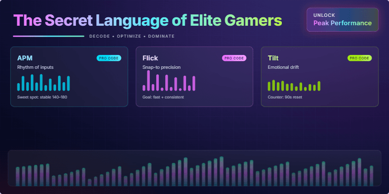
Dive into a neon-infused world of sleek, geometric design, pulsating with rhythmic animations. Discover hidden patterns visualized through dynamic data streams and vibrant infographics. Experience the thrill of unlocking peak performance secrets with stylized close-ups and slow-motion highlights, all set against a dark, electric backdrop. This slide is designed to captivate and inspire.
Want to generate your own slides with AI?
Start creating high-tech, AI-powered presentations with Slidebook.