Crafting Compelling Copy: Narrative vs. Concise Styles
Description provided by the user:
Create a slide demonstrating two distinct writing styles: narrative/brand voice (lyrical) and concise copy/taglines (punchy). The slide should visually compare these styles, showcasing how the same idea can be conveyed with different tones. Include example text for both styles, a visual cue (e.g., a color-coded icon) to indicate the style difference, and a title/heading. Aim for a clean and modern design. Include speaker notes that guide the presenter on how to use this slide effectively, emphasizing the importance of tone, audience, and context in writing.
Set the frame: We are comparing tone, not just wording. Left is narrative/brand voice—right is concise copy/taglines.
Point to the left card: Read one line aloud to show warmth, rhythm, and imagery. Emphasize how it feels like a note from a person.
Point to the right card: Read a couple of taglines. Highlight clarity and punch. These are for fast recall and high-visibility placements.
Call out the tiny palette icon: It signals style exploration. We can swap palettes or tonal choices while keeping meaning intact.
Wrap with guidance: Adjust tone via prompts; specify audience and length for consistency. Add constraints like channel (email vs. ad), emotion (warm vs. bold), and reading level.
Behind the Scenes
How AI generated this slide
Establish Layout: Divide the slide into two sections for direct comparison of narrative and concise copy.
Content Population: Fill each section with sample text reflecting the respective styles (lyrical vs. punchy).
Visual Cues: Implement color-coded elements and clear headings ('Narrative / Brand Voice', 'Concise copy / Taglines') to differentiate styles.
Animation & Effects: Introduce subtle animations (using Framer Motion) to enhance visual engagement and draw attention to each section.
Typography Choices: Employ distinct font styles (serif for narrative, sans-serif for concise) to further emphasize the contrast in tone.
Speaker Notes: Provide comprehensive notes guiding presenters on how to effectively explain the nuances of each style.
Why this slide works
This slide effectively leverages visual hierarchy, color-coding, typography, and animation to showcase the contrast between narrative and concise copywriting. The clear headings, distinct font styles, and color-coded elements enable quick comprehension of the core message. Subtle animations add a touch of sophistication and draw attention to each section, making the presentation more engaging. The detailed speaker notes empower presenters to confidently explain the nuances of each style, discuss their applications, and emphasize the importance of tone, audience, and context in writing. The use of Framer Motion for animation and the focus on visual clarity exemplify modern design principles for impactful presentations. This slide is optimized for keywords such as 'copywriting,' 'brand voice,' 'taglines,' 'narrative writing,' 'concise copy,' 'presentation design,' and 'Framer Motion'.
Slide Code
You need to be logged in to view the slide code.
Frequently Asked Questions
How can I adapt this slide for different content?
Easily replace the example text with your own copy while maintaining the visual structure. Consider adjusting the color palette to align with your brand or topic. The core design, contrasting fonts, and animation remain effective for diverse content comparisons, including different writing styles, product features, or marketing strategies. Remember to update the speaker notes accordingly to reflect the new content and its key takeaways. For consistent branding, consider using a design system for color palettes and fonts.
What is the benefit of using Framer Motion for animations?
Framer Motion provides a streamlined and declarative approach to creating animations in React, offering fine-grained control over timing, easing, and other animation properties. It enables smooth and engaging transitions, enhancing the presentation's visual appeal without requiring complex animation logic. The subtle animations, like the initial entrance of content blocks, contribute to a more polished and professional presentation experience, drawing viewers' attention in a sophisticated manner.
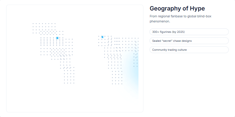
This slide visually represents the spread of a product's hype, starting from a concentrated region and expanding globally. The visualization uses a dotted world map with varying dot density to indicate presence and intensity of the hype. A soft glow highlights East and Southeast Asia, the origin point, while pulsing markers indicate key regions like North America and Europe that amplified the trend. Supporting statistics about the product and its community are included to provide further context to the visualization. The overall narrative focuses on how a regional trend transformed into a global phenomenon due to factors like retail adoption, influencer marketing, community engagement, and the product's inherent characteristics like scarcity and variety.
Create a slide introducing the character Labubu, an original IP by Hong Kong illustrator Kasing Lung. It's part of The Monsters series and has a distinct visual style: zoomorphic elf with exaggerated expressions. Key features are big ears, a prominent tooth, and furry texture. The pronunciation is "lah-BOO-boo" (IPA: /lɑːˈbuːbu/, Chinese: 拉布布, Pinyin: Lābùbù). The slide should be visually appealing and informative, highlighting the character's design, creator, and pronunciation.
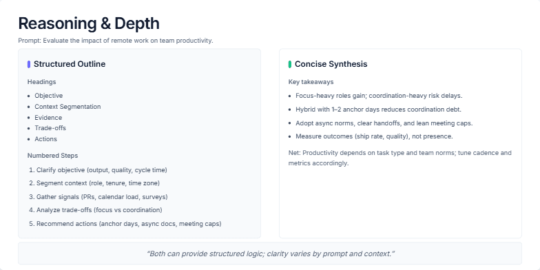
This slide visually compares two approaches to explaining complex topics: a structured outline and a concise synthesis. It uses the example prompt 'Evaluate the impact of remote work on team productivity' to demonstrate how both methods can effectively deliver information. The structured approach breaks down the analysis into headings (Objective, Context, Evidence, Trade-offs, Actions) and numbered steps, offering a detailed, step-by-step explanation. The concise approach presents key takeaways in a bulleted list, summarizing the core findings and offering a high-level overview. The slide aims to demonstrate how both methods can provide structured logic and clarity, with the choice depending on the prompt, audience, and available time.
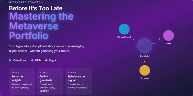
Imagine a slide bathed in the deep blues and purples of the metaverse, with shimmering constellations of digital assets. The title glows with a neon energy, drawing the eye. A subtle animation of a portfolio diversifying across virtual lands, NFTs, and cryptocurrencies plays seamlessly, hinting at the potential within. Clean, futuristic typography emphasizes the cutting-edge nature of the topic. This slide promises a journey into the future of finance, visualized with stunning clarity.
Deep indigo background sets the stage for electric pink and neon green accents highlighting key portfolio elements. Dynamic transitions mimic the flow of a website, showcasing your work with stylish kinetic typography. Clean, minimalist design keeps the focus on your talent, leaving a lasting impression of sleek professionalism.
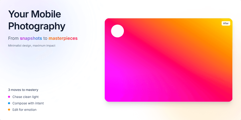
Dive into a world of vibrant color gradients and smooth transitions as we unveil the secrets to stunning mobile photography. Crisp typography and captivating before-and-after image reveals will ignite your creative spark. Experience the magic of transforming ordinary moments into extraordinary art, all from the palm of your hand. Minimalist design, maximum impact.
Want to generate your own slides with AI?
Start creating high-tech, AI-powered presentations with Slidebook.