The Geography of Hype: From Regional Niche to Global Phenomenon
Description provided by the user:
This slide visually represents the spread of a product's hype, starting from a concentrated region and expanding globally. The visualization uses a dotted world map with varying dot density to indicate presence and intensity of the hype. A soft glow highlights East and Southeast Asia, the origin point, while pulsing markers indicate key regions like North America and Europe that amplified the trend. Supporting statistics about the product and its community are included to provide further context to the visualization. The overall narrative focuses on how a regional trend transformed into a global phenomenon due to factors like retail adoption, influencer marketing, community engagement, and the product's inherent characteristics like scarcity and variety.
In one sentence, introduce the idea: we’re mapping how hype spread from a regional niche to a global phenomenon.
Point to the dotted map. Explain it’s intentionally minimal—each dot hints at presence, not exact borders.
Highlight the soft glow over East and Southeast Asia. Say: this is where the earliest and densest momentum formed.
Call out the pulsing markers. First, North America: major retail adoption and influencer amplification. Then Europe: strong design-toy communities and conventions.
Now read the side caption to tie the narrative together: regional energy, then blind-box culture crossing oceans.
Reveal the stat chips in order:
One: 300+ figurines by 2025 signals breadth and sustained releases.
Two: sealed secret chase designs create scarcity loops and repeat purchases.
Three: the trading culture converts buyers into a community, which sustains hype across borders.
Close by connecting the glow and markers: supply, scarcity, and community together explain the geography of hype.
Behind the Scenes
How AI generated this slide
Conceptualize visual representation of hype spread using a world map.
Design a dotted map with varying density to represent the presence and intensity of hype.
Highlight the origin region (East/Southeast Asia) with a soft glow effect.
Use pulsing markers to emphasize key regions like North America and Europe.
Add animations to the markers and statistical elements for dynamic engagement.
Incorporate supporting text elements (title, description, statistics) to provide context and narrative.
Why this slide works
This slide effectively combines data visualization with storytelling. The dotted map provides a clear visual representation of the geographical spread of hype, while the glow and pulsing markers draw attention to key regions and their role in the phenomenon. The animation adds a dynamic element, making the visualization more engaging. The supporting text provides context and reinforces the narrative, explaining the factors contributing to the hype's growth. The use of visual hierarchy, color contrast, and animation creates a visually appealing and informative slide that effectively communicates the intended message. Relevant keywords: data visualization, storytelling, animation, visual hierarchy, color contrast, hype marketing, global trends, regional influence, community engagement.
Slide Code
You need to be logged in to view the slide code.
Frequently Asked Questions
What is the purpose of the dotted map?
The dotted map visually represents the global spread of the product's hype. The density of dots indicates the intensity of the hype in different regions, providing a clear visual representation of its reach and concentration.
What do the pulsing markers signify?
The pulsing markers highlight key regions, such as North America and Europe, that played a significant role in amplifying the product's hype. These regions represent significant milestones in the product's journey from regional trend to global phenomenon. The animation draws attention to these areas and their importance in the overall narrative.
How do the statistics enhance the visualization?
The statistical elements provide concrete data points that support the visual narrative. These figures offer quantifiable evidence of the product's growth and its impact, adding depth and credibility to the visualization. They also provide talking points for a presentation, allowing the speaker to elaborate on the data and its significance.
This slide kicks off a presentation about evaluating different AI agents. It outlines the criteria used for assessment, including UX, answer style, web and citation handling, reasoning, creativity, coding ability, speed, and pricing/privacy considerations. The slide serves as a roadmap for the presentation, visually guiding the audience through the topics that will be covered, using a bullet list and minimal icons that reappear as section markers throughout the presentation. The flow ensures the audience always knows where they are in the discussion. The presentation focuses on practical evaluation, emphasizing the importance of various aspects of AI agent performance. This evaluation methodology is designed to help users make informed decisions about which AI agent best suits their needs.
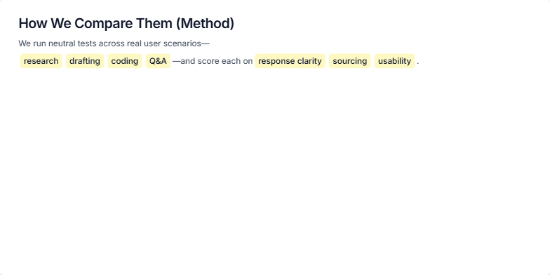
This slide details the methodology used to compare different AI tools. The comparison focuses on neutral tests across real user scenarios like research, drafting, coding, and Q&A. Each tool is scored based on response clarity, sourcing, and usability. The tests adhere to strict rules, including using the same prompts where applicable, conducting a time-bound review, and relying solely on publicly available features. The goal is to provide a transparent and reproducible comparison process.
This slide focuses on how AI assistants can help with coding and technical tasks, specifically generating code snippets, explaining errors, summarizing documentation, and providing references. It highlights the strengths of different AI tools like ChatGPT for iterative coding and Perplexity for quickly surfacing relevant sources. The slide includes a visual code example with highlighted sections demonstrating error handling and summarization, a 'docs' badge to indicate citations, and a blinking cursor to suggest ongoing iteration. The aim is to showcase how these tools can improve coding efficiency and problem-solving.
Create a slide introducing the character Labubu, an original IP by Hong Kong illustrator Kasing Lung. It's part of The Monsters series and has a distinct visual style: zoomorphic elf with exaggerated expressions. Key features are big ears, a prominent tooth, and furry texture. The pronunciation is "lah-BOO-boo" (IPA: /lɑːˈbuːbu/, Chinese: 拉布布, Pinyin: Lābùbù). The slide should be visually appealing and informative, highlighting the character's design, creator, and pronunciation.
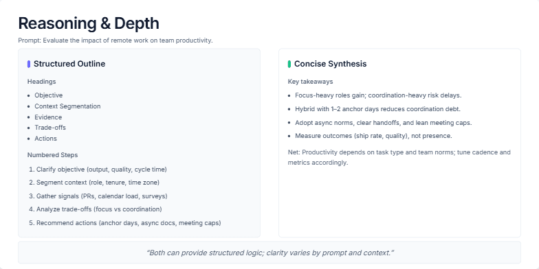
This slide visually compares two approaches to explaining complex topics: a structured outline and a concise synthesis. It uses the example prompt 'Evaluate the impact of remote work on team productivity' to demonstrate how both methods can effectively deliver information. The structured approach breaks down the analysis into headings (Objective, Context, Evidence, Trade-offs, Actions) and numbered steps, offering a detailed, step-by-step explanation. The concise approach presents key takeaways in a bulleted list, summarizing the core findings and offering a high-level overview. The slide aims to demonstrate how both methods can provide structured logic and clarity, with the choice depending on the prompt, audience, and available time.
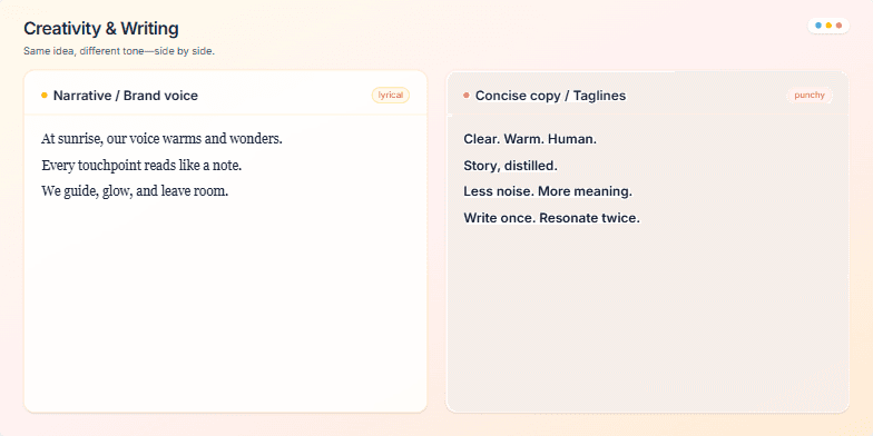
Create a slide demonstrating two distinct writing styles: narrative/brand voice (lyrical) and concise copy/taglines (punchy). The slide should visually compare these styles, showcasing how the same idea can be conveyed with different tones. Include example text for both styles, a visual cue (e.g., a color-coded icon) to indicate the style difference, and a title/heading. Aim for a clean and modern design. Include speaker notes that guide the presenter on how to use this slide effectively, emphasizing the importance of tone, audience, and context in writing.
Want to generate your own slides with AI?
Start creating high-tech, AI-powered presentations with Slidebook.