Top 5 Portfolio Pitfalls: Avoid These Photographer Mistakes
Description provided by the user:
Clean, minimalist design with bold typography. Each pitfall is visualized with a striking, slightly desaturated image showcasing the mistake. Smooth transitions between slides create a sophisticated, gallery-like feel. Subtle zoom effect on each image draws attention to the detail. Deep blues and muted greys create a professional and timeless mood.
Categories
Generated Notes
Open by framing the goal: a portfolio should feel cohesive, fast, and intentional—like a curated gallery.
Introduce the theme: “Top 5 Portfolio Pitfalls” and explain that we’ll reveal them one by one with quick fixes.
First, Inconsistent Style: emphasize that mixed color grades and tones dilute identity. Advise curating a single look and removing outliers.
Second, Too Many Images: explain decision fatigue. Recommend 12–20 strongest works per genre to create rhythm and focus.
Third, Weak First Impression: stress leading with a signature hero image and a clear value line so visitors grasp your voice instantly.
Fourth, No Context or Credits: note that art directors want clarity—add role, client, and purpose so the work’s impact is legible.
Fifth, Slow, Heavy Portfolio: performance reflects professionalism. Advise compression, responsive formats, and lazy loading.
Close by encouraging a periodic “gallery edit”: remove anything that doesn’t serve the story and keep the experience fast and clear.
Behind the Scenes
How AI generated this slide
Analyze the title and context to identify the core message: advising photographers on common portfolio mistakes.
Extract key pitfalls from the provided data and structure them for individual presentation.
Select a clean, minimalist design approach with a focus on typography and subtle animations (zoom, transitions) as specified in the context.
Choose a professional color palette of deep blues and muted greys to create a timeless feel.
Visualize each pitfall with a placeholder image and apply a desaturation effect for artistic consistency.
Implement smooth transitions and subtle zoom effects using Framer Motion library to enhance the gallery-like experience.
Structure the layout with a title section and a list of pitfalls, each featuring a numbered heading, concise tip, and a visual representation.
Optimize code for readability and maintainability by using functional components and clear variable names.
Why this slide works
This slide effectively communicates key information about portfolio pitfalls to photographers. The clean, minimalist design and professional color scheme create a visually appealing and credible presentation. The use of bold typography and subtle animations draws attention to the key takeaways, while the desaturated images enhance the sophisticated feel. The clear structure and concise tips make the information easy to digest, and the smooth transitions create a seamless, gallery-like experience that keeps the audience engaged. The use of Framer Motion adds a touch of modern interactivity, improving user experience. The code is well-structured and utilizes best practices for maintainability and performance. Keywords relevant to this slide include: photography portfolio, portfolio mistakes, portfolio tips, minimalist design, web design, user interface, user experience, Framer Motion, animation, transitions, visual communication, graphic design, presentation design.
Slide Code
You need to be logged in to view the slide code.
Frequently Asked Questions
How can inconsistent style hurt my photography portfolio?
An inconsistent style can make your portfolio appear unprofessional and disjointed. Clients often look for a photographer with a distinct visual identity, and a mix of different editing styles or subject matter can dilute your brand and make it harder for potential clients to understand your strengths. Maintaining a consistent look and feel throughout your portfolio showcases your artistic vision and professionalism, making you a more attractive candidate for projects. This consistency builds trust and allows clients to easily visualize how your work aligns with their needs. Keywords: photography portfolio, visual identity, branding, editing style, client acquisition, professionalism
Why is portfolio speed important?
A slow-loading portfolio reflects poorly on your professionalism and can lead to lost opportunities. In today's fast-paced digital world, clients and viewers expect websites to load quickly. A slow portfolio can frustrate viewers, causing them to leave your site before even seeing your work. Optimizing your portfolio for speed through image compression, lazy loading, and responsive design demonstrates technical proficiency and respect for the viewer's time, ultimately increasing engagement and conversion rates. Keywords: website performance, portfolio optimization, image compression, lazy loading, responsive design, user experience, SEO, conversion rate
What makes a strong first impression in a photography portfolio?
A strong first impression is crucial for capturing a viewer's attention and encouraging them to explore further. Leading with a signature hero image – a piece that best represents your style and skill – immediately communicates your visual identity. Coupled with a clear value proposition or concise statement about your specialization, you quickly establish your expertise and what you offer clients. This clarity and visual impact ensure that viewers understand your strengths within seconds, increasing the likelihood they will engage with the rest of your portfolio. Keywords: photography portfolio, hero image, value proposition, visual identity, user engagement, first impressions, website design, online portfolio
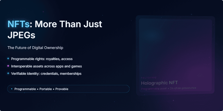
Imagine a sleek, dark slide with neon accents. The title glows with a subtle electric blue. Animated particles, resembling digital dust, drift across the screen, hinting at the intangible yet valuable nature of NFTs. The background features a slowly rotating, holographic 3D model of an NFT, showcasing its potential beyond a static image. Short, sharp transitions add a dynamic feel.
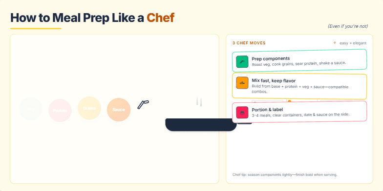
Imagine vibrant close-ups of fresh ingredients, transforming with smooth transitions into perfectly portioned meals. Warm, inviting color palettes with a touch of rustic charm. Hand-drawn icons and subtle animations of chopping, sizzling, and arranging food add a playful touch. This slide emphasizes the ease and elegance of meal prepping, making it feel achievable and aspirational.
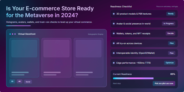
Imagine a neon-drenched cityscape reflecting in the sleek glass surfaces of your virtual storefront. This slide uses vibrant cyberpunk aesthetics, with holographic product displays shimmering against a dark, futuristic backdrop. Smooth, dynamic transitions and subtle parallax scrolling create an immersive experience, highlighting key features of metaverse integration for your e-commerce business. A pulsating synthwave soundtrack adds to the electric atmosphere.
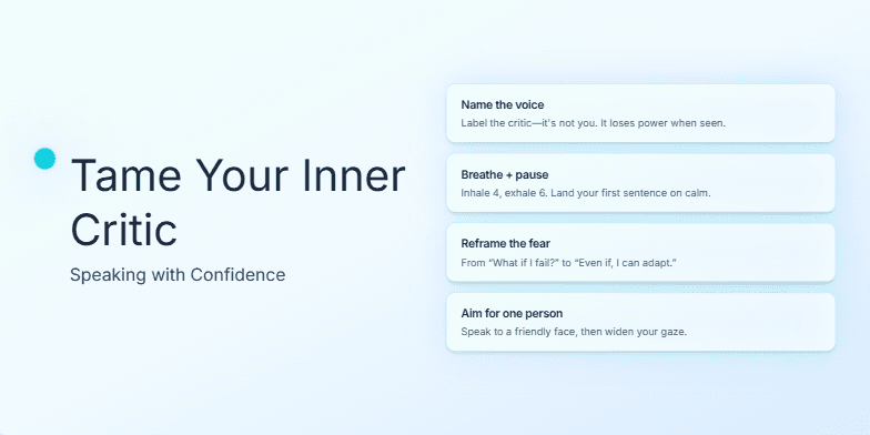
Imagine a calming gradient of blues and greens washing over the slide as the title appears in elegant, handwritten script. A subtle animation of a tiny, flickering flame grows stronger beside the title, symbolizing growing confidence. Each key point is highlighted with a soft glow effect, drawing the audience's eye. Minimalist design, maximum impact.
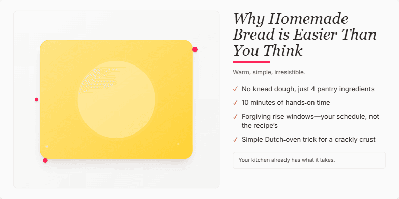
Warm, inviting visuals of golden-brown loaves and flour-dusted hands. A rustic, handwritten font evokes a sense of comforting simplicity. Subtle animation of rising dough adds a touch of magic. Color palette focuses on earthy browns, creamy whites, and pops of vibrant red from cherries or tomatoes. Design is clean and minimalist, emphasizing the beauty of the ingredients.
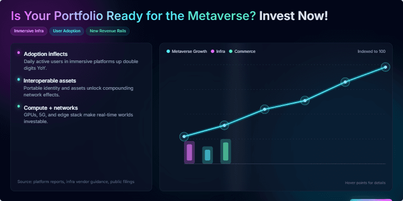
This slide explodes with vibrant neon colors and dynamic, futuristic animations showcasing the potential of metaverse investments. A sleek, dark background contrasts with glowing charts and graphs, creating a high-tech, exciting mood. Intriguing micro-interactions reveal hidden data points upon hover, adding a touch of playful discovery.
Want to generate your own slides with AI?
Start creating high-tech, AI-powered presentations with Slidebook.