Unlock Your Inner Picasso: 5 Design Secrets You NEED
Description provided by the user:
Imagine a slide bathed in warm, inviting hues of sunset orange and deep teal. Hand-drawn, whimsical icons dance alongside each of the 5 secrets, revealed one by one with a charming 'pop' animation. Typography is clean and modern, playing with subtle drop shadows for a touch of depth. The overall feel is playful yet sophisticated, sparking curiosity and a desire to unlock those hidden design gems.
Categories
Generated Notes
Welcome them in and frame the session: we’re unlocking our inner Picasso with five practical design secrets. Emphasize playful yet refined energy.
Point to Secret 1 as it appears: Embrace negative space. Explain that whitespace is an active tool to direct attention and create calm.
Reveal Secret 2: Hierarchy with scale. Show how sizing headlines, subheads, and body creates an instant reading path.
Reveal Secret 3: 60/30/10 color rule. One dominant, one support, one accent—mention using teal/orange here as an example.
Reveal Secret 4: 8pt rhythm grid. Consistent spacing makes interfaces feel intentional. Suggest auditing paddings and margins.
Reveal Secret 5: Micro-interactions. Small, delightful motions reward curiosity and provide feedback—keep them purposeful.
Close by tying back to the floating lines and circles: creativity plus structure. Invite them to try one secret on their next screen.
Behind the Scenes
How AI generated this slide
Establish the layout: A grid system is used to divide the slide into two main sections: content (7/12) and visuals (5/12).
Craft the title: A large, bold title 'Unlock Your Inner Picasso' uses a gradient text effect (orange-amber-teal) to evoke a sense of creativity and energy. A subtitle reinforces the practical application: '5 design secrets you can use today'.
Design the secrets: Each secret is presented with a hand-drawn icon (SVG), a bold title, and a concise description. The icons alternate between teal and orange backgrounds, adding visual rhythm. The 'pop' animation adds a touch of playfulness as each secret is revealed.
Create the visual element: Abstract shapes (lines, circles) in teal and orange are animated with subtle floating and scaling effects. Blurred background elements in teal and orange further enhance the sunset-inspired color palette. The central element is a dynamic, hand-drawn illustration that adds to the artistic theme.
Implement animations: Framer Motion library is used for the 'pop' animation of the secrets and subtle floating animations of icons and background elements, adding depth and dynamism.
Refine typography: Clean, modern sans-serif fonts are used. Subtle drop shadows are applied strategically to titles to add a touch of depth and enhance readability.
Ensure responsiveness: The slide is designed with a fixed width (1200px) and height (600px) but could be further optimized for various screen sizes using relative units.
Optimize for accessibility: While not explicitly addressed in the current code, alt text should be added to the SVG icons for screen reader compatibility. Color contrast should also be checked for WCAG compliance.
Why this slide works
This slide effectively combines visual appeal with clear communication. The warm, inviting color scheme and whimsical hand-drawn elements create a sense of playfulness and intrigue, drawing the audience in. The clear hierarchy of information, use of negative space, and dynamic animations make the content easily digestible and engaging. The design principles discussed in the slide are subtly reflected in the slide's own design, reinforcing the message. The use of Framer Motion allows for sophisticated and performant animations. Keywords: design principles, visual communication, presentation design, Framer Motion, animation, accessibility, web development, user experience, UI design, graphic design, color theory, typography, negative space, visual hierarchy, micro-interactions.
Slide Code
You need to be logged in to view the slide code.
Frequently Asked Questions
What libraries are used in this slide?
The slide utilizes Framer Motion for animations and transitions, React for component structure, and Slidebook (likely a custom or internal library) for slide management within a presentation context.
How does the slide handle responsiveness?
Currently, the slide uses fixed dimensions. For improved responsiveness, consider replacing fixed pixel values with relative units like percentages or viewport units (vw, vh) to adapt to different screen sizes.
How accessible is this slide?
While the slide employs good visual hierarchy and clear typography, accessibility can be further enhanced. Alt text should be added to SVG icons for screen reader users. Color contrast between text and background should be checked for WCAG compliance.
What are the key design principles showcased in the slide?
The slide exemplifies several key design principles, including the use of negative space, visual hierarchy through scale, the 60/30/10 color rule, consistent spacing with an 8pt rhythm grid, and the incorporation of micro-interactions.
How does the slide's design reflect its content?
The slide cleverly embodies the design principles it teaches. The use of whitespace, color palette, typography, animations, and visual hierarchy all directly correspond to the 'secrets' being presented, making the learning experience more immersive and impactful.
Deep indigo background with constellations of twinkling golden stars representing key startup milestones. Smooth, elegant transitions reveal each 'star' and its meaning. Minimalist typography in warm white emphasizes the mystical yet achievable nature of success. Inspiring ambient soundtrack complements the visual journey.
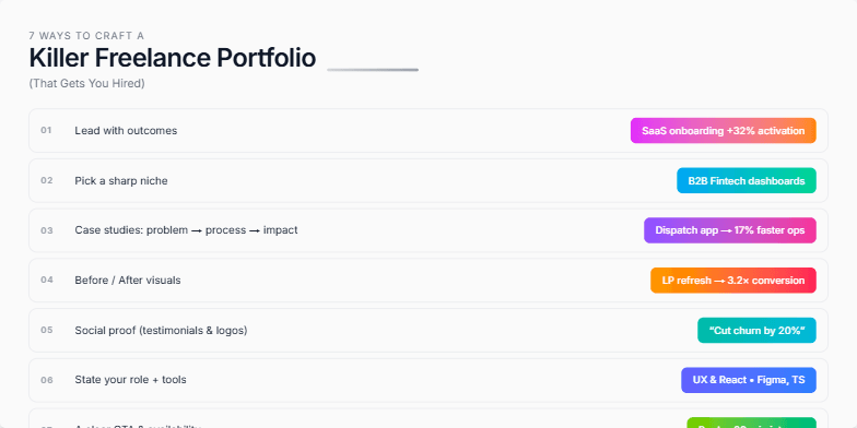
Clean, minimalist design with soft grey background and crisp white typography. Each of the 7 ways is highlighted with a subtle animation, revealing a striking portfolio example in a vibrant color palette. Smooth transitions create a dynamic yet professional feel, leaving a lasting impression of polished expertise.
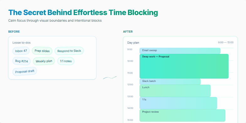
Dive into a world of calming blues and serene greens as this slide reveals the magic of time blocking. Smooth, subtle animations guide you through a visual journey, showcasing a minimalist design with elegant typography. Watch as daily tasks transform into perfectly organized blocks, creating a sense of calm and control. Experience the power of visual clarity with this beautifully designed slide that sparks joy and inspires efficient time management.
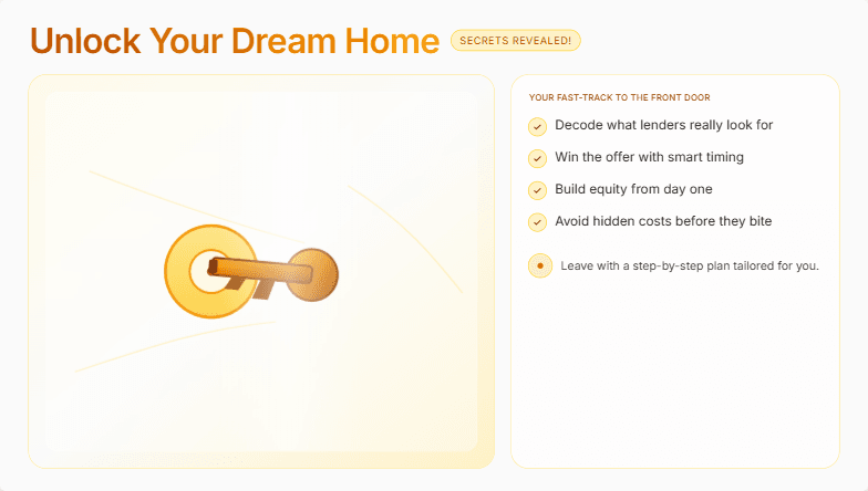
Imagine a sleek, minimalist slide with a soft, warm color palette of creams and golds. A subtle, shimmering animation of a key turning in a lock hints at the secrets to be unveiled. Clean typography and stunning high-resolution images of dream homes evoke a sense of aspirational luxury and attainable comfort. Short, punchy bullet points highlight key takeaways, each appearing with a gentle fade-in effect. The overall mood is one of sophisticated excitement and empowered possibility.
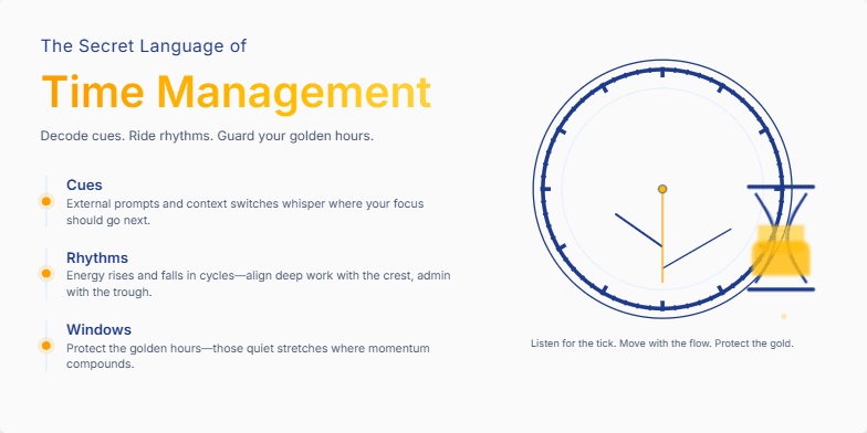
Deep blues and golds create an air of mystery. A subtle animation of an antique clock ticking sets the stage. Stylized hourglass imagery adds a touch of vintage charm. Discover the subtle cues and hidden rhythms that govern productivity through elegant typography and minimalist design.
This slide explodes with vibrant duotone gradients of electric blue and neon pink, setting a dynamic and energetic mood. A stylized split-screen visual dramatically contrasts the bootcamp experience (fast-paced, hands-on coding) with the traditional university setting (lecture halls, textbooks). A subtle 'glitch' animation effect adds a touch of tech-forward flair, hinting at the disruptive nature of coding bootcamps. The title uses a powerful, chiselled font, emphasized by a subtle drop shadow.
Want to generate your own slides with AI?
Start creating high-tech, AI-powered presentations with Slidebook.