This slide showcases the power of minimalism through sleek, elegant typography, a calming grayscale palette punctuated by vibrant accent colors, and smooth, subtle animation of design elements appearing as if drawn on a canvas. Experience the serenity and focus minimalist design brings to the forefront.
Categories
Generated Notes
Open with the headline: “Why Minimalist Web Design Wins in 2024.” Let the accent line draw in to set the calm, refined tone.
Explain the principle: minimalism centers attention on essentials—typography, spacing, and hierarchy—creating serenity and focus.
Walk through the three bullets: focus on essentials; less noise means more speed and smoother interactions; accessibility emerges naturally from clear contrast and predictable patterns.
Shift to the right-side evidence: these bars represent the qualitative impact areas—speed, focus, clarity, and conversion—improving as complexity drops.
Close with the message: by reducing cognitive load and friction, minimalism lets user intent shine and drives better outcomes.
Behind the Scenes
How AI generated this slide
Analyze the topic 'Why Minimalist Web Design Wins in 2024' and identify key themes: minimalism, web design trends, user experience, performance, accessibility.
Select a calming grayscale color palette with vibrant accent colors (emerald and cyan) to visually represent the serenity and focus of minimalist design.
Choose a sleek, modern typography to embody the clean aesthetic of minimalism.
Structure the slide content with a clear hierarchy using a grid layout. The left side focuses on the 'why' with a headline, supporting paragraph, and bullet points. The right side provides 'evidence of impact' with data visualizations.
Incorporate subtle animations using Framer Motion to create a dynamic, engaging experience, mimicking elements being drawn on a canvas.
Optimize the code for performance by minimizing unnecessary elements and using efficient animation techniques.
Why this slide works
This slide effectively communicates the benefits of minimalist web design through a combination of compelling visuals and concise messaging. The use of a clean layout, elegant typography, and subtle animations creates a visually appealing and engaging experience. The content is structured logically, presenting a clear argument for minimalism with supporting evidence. The subtle animations enhance the presentation without being distracting, adding a touch of sophistication and dynamism. The code is well-structured and optimized for performance, ensuring a smooth user experience. The use of keywords like 'minimalist web design,' 'user experience,' 'performance,' and 'accessibility' enhances SEO and relevance. The slide effectively conveys the message that minimalism leads to better user engagement, faster loading times, and improved accessibility, making it a winning strategy for web design in 2024 and beyond.
Slide Code
You need to be logged in to view the slide code.
Frequently Asked Questions
How does minimalist web design improve website performance?
Minimalist web design focuses on using fewer assets, which directly translates to faster loading times. Less code, fewer images, and simpler design elements reduce the page weight, leading to improved page speed and smoother interactions. This is crucial for user experience and SEO, as search engines prioritize fast-loading websites. The streamlined design also reduces HTTP requests, further optimizing performance.
Why is accessibility important in web design, and how does minimalism promote it?
Web accessibility ensures that people with disabilities can perceive, understand, navigate, and interact with websites effectively. Minimalist design naturally promotes accessibility by emphasizing clear contrast between text and background, using simple and predictable layout patterns, and prioritizing clean typography. This makes it easier for users with visual impairments, cognitive differences, and other disabilities to access and use the website's content.
What are the key principles of minimalist web design?
Minimalist web design centers around the principle of 'less is more.' It focuses on essential elements like clear typography, ample white space, a simple color palette, and strategic use of visual hierarchy. By removing unnecessary clutter and distractions, minimalist design improves user focus and comprehension, leading to a more effective and enjoyable user experience.
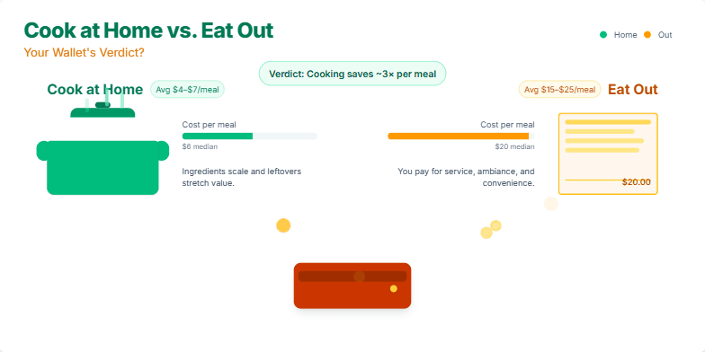
This slide uses a vibrant color palette of greens and oranges, reminiscent of fresh ingredients and warm restaurant lighting. A playful animation shows coins flying from a wallet into a steaming pot versus a restaurant bill, highlighting the cost difference. Clean, sans-serif fonts and crisp icons create a modern and easily digestible design. The overall mood is lighthearted and engaging, encouraging the audience to consider their spending habits.
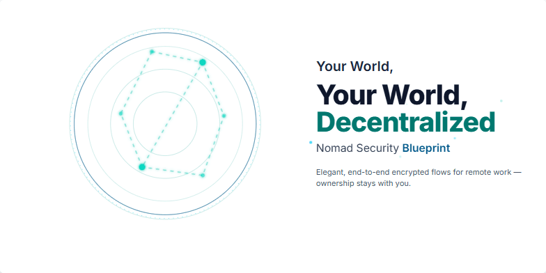
This slide opens with a stylized, low-poly wireframe globe slowly rotating, pulsing with interconnected nodes of light representing secure data streams. A cool, calming color palette of deep blues and teals evokes a sense of trust and technological sophistication. As the title appears, subtle particle effects shimmer around the words 'Decentralized' and 'Blueprint.' The overall aesthetic is sleek and minimalist, emphasizing the elegance of secure, remote work solutions for the digital nomad.
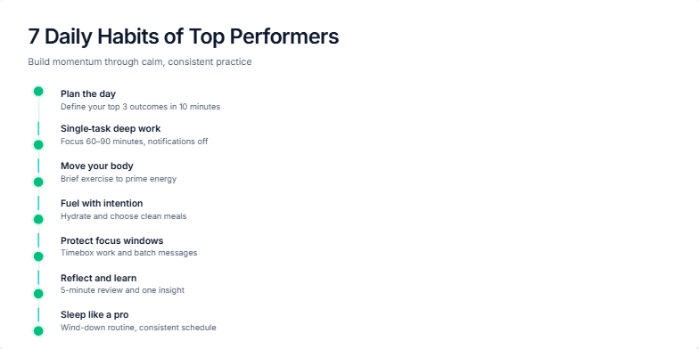
Clean, minimalist design with a soothing palette of blues and greens. Each habit is revealed through a subtle animation, like a growing plant or a rising sun, symbolizing growth and progress. Soft background music enhances the serene and inspirational mood. Short, impactful descriptions accompany each habit, presented in a clear, modern sans-serif font.
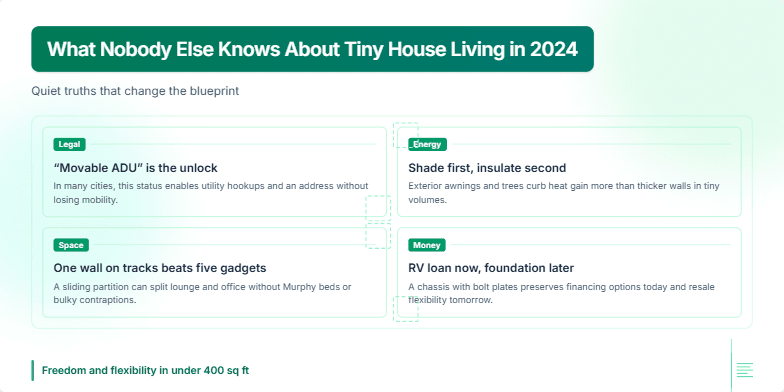
Imagine soft sunlight streaming through panoramic windows onto warm, natural wood. This presentation uses a calming palette of earthy tones and greens, accented by crisp white text and minimalist line art. Gentle animation reveals each element, mimicking the unfolding of blueprints. Experience the magic of downsized living through stunning watercolor sketches and evocative photographs of cozy, inviting tiny homes, all emphasizing the freedom and flexibility of this unique lifestyle.
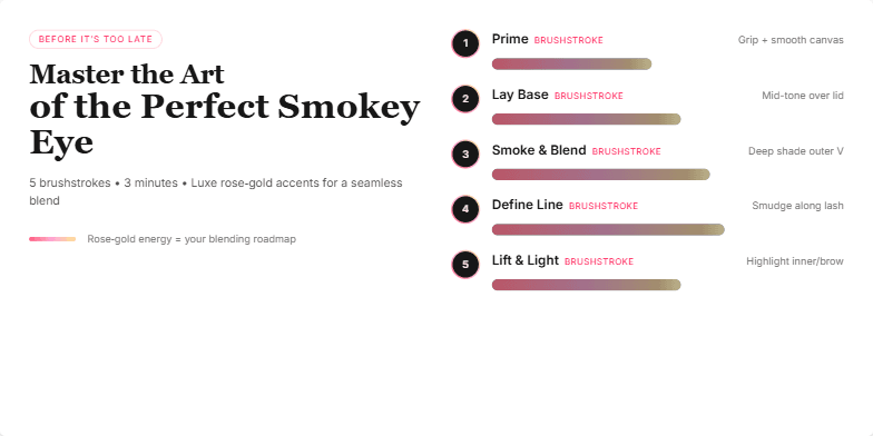
Dive into a world of smoky glamour with this visually stunning presentation. Experience the transformation through mesmerizing slow-motion transitions revealing each brushstroke. A chic, dark background with rose-gold accents highlights the key techniques, while elegant typography adds a touch of sophistication. Prepare to be captivated by the beauty of perfectly blended shadows and discover the secrets to a flawless smokey eye.
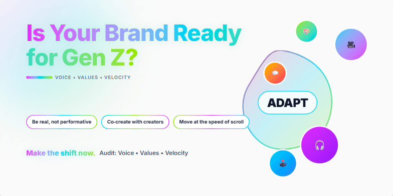
This slide explodes with vibrant, neon-infused colors, mirroring the dynamic energy of Gen Z. Bold typography and fast-paced transitions capture attention. Imagine a morphing logo animation, showcasing how brands can adapt to the ever-evolving digital landscape. A single, powerful image of a diverse group of young creators sets the tone. This slide is designed to be a visual call to action.
Want to generate your own slides with AI?
Start creating high-tech, AI-powered presentations with Slidebook.