A professional title slide introducing a presentation comparing Gen Z and Millennials for the year 2025.
Description provided by the user:
I need an introductory slide for a presentation on the differences between Gen Z and Millennials. The tone should be modern, clean, and data-driven, not stereotypical. The design should be minimalist with a light background, perhaps a subtle texture, and a single accent color like blue. The main title should be 'Gen Z vs Millennials' and the subtitle should be 'Understanding Generational Differences in 2025'. I also need some speaker notes to set the stage for a balanced, nuanced discussion, outlining the topics that will be covered like work styles, communication, and technology habits.
Welcome the audience and introduce the theme: a clear, fair comparison between Gen Z and Millennials.
Point to the clean aesthetic and the single accent color to signal a balanced, data-first conversation.
Explain that today we will frame differences through context: economy, tech eras, and cultural touchpoints.
Outline the categories we will compare: values, work styles, communication, technology habits, and money.
Hint that the lightbulb stands for ideas and innovation; the chat bubble represents dialogue and empathy.
Set expectations: no stereotypes—focus on patterns with nuance and actionable takeaways for 2025.
Behind the Scenes
How AI generated this slide
First, the AI establishes a clean and professional visual theme suitable for a data-focused topic like generational analysis. It selects a minimalist color palette with a light gradient background, dark text for readability, and a single blue accent color for emphasis.
A central layout is chosen for the main text to create a strong focal point. The typography uses a large, bold font for the title and a smaller, lighter font for the subtitle to establish a clear visual hierarchy.
To add subtle visual interest and brand symbolism, the AI designs and places two custom SVG icons—a lightbulb for 'ideas' and a chat bubble for 'communication'—in the corners, framing the content without being distracting.
Subtle animations are added using Framer Motion to enhance the presentation. The title and subtitle fade in sequentially, controlled by the 'Fragment' component, which guides the audience's attention and adds a layer of professional polish.
A subtle 'grain' texture is applied as an overlay using a CSS data URL to give the slide depth and a modern, slightly tactile feel, elevating it beyond a simple flat background.
Finally, comprehensive speaker notes are generated to align with the slide's objective. The notes introduce the topic, explain the design's intent, outline the presentation's structure, and set expectations for a nuanced, stereotype-free discussion.
Why this slide works
This slide is highly effective because it perfectly balances clarity and modern design. The minimalist aesthetic, with its high-contrast typography and strategic use of a single accent color, immediately conveys a sense of professionalism and focus. The sequential animations, powered by Framer Motion and orchestrated by Fragments, create a smooth and engaging introduction that guides the viewer's attention. The inclusion of symbolic icons (lightbulb and chat) adds a layer of thematic depth, hinting at the core topics of innovation and communication. The slide successfully sets the stage for a data-driven, insightful presentation on generational differences, avoiding clichés and establishing a tone of thoughtful analysis right from the start.
Slide Code
You need to be logged in to view the slide code.
Frequently Asked Questions
What is the purpose of the 'Fragment' components in this code?
The 'Fragment' components are a feature from the Slidebook library used to control the animation sequence on a slide. By wrapping elements in a Fragment with a specific 'index', you can make them appear incrementally. In this slide, the title (index={0}) appears first, and then on the next action (like a click), the subtitle (index={1}) appears. This is a powerful technique for storytelling in presentations, allowing the speaker to control the flow of information and build concepts step-by-step.
How can I change the animation effects on the text?
The animations are controlled by the Framer Motion library. To change them, you can modify the props on the 'motion.div' and 'motion.p' components. For example, you could change the 'initial={{ y: 10 }}' to 'initial={{ x: -20 }}' to make the text slide in from the left instead of moving up. You can also adjust the 'transition' prop by changing the 'duration', 'delay', or 'ease' (e.g., 'ease: "circIn"') to completely alter the feel of the animation.
What is the grain effect and how is it created?
The grain effect is a subtle visual texture that adds depth and a tactile feel to the design, making it feel less sterile than a flat digital color. It's created using a CSS class named '.grain'. This class applies a background image that is an inline SVG containing a 'feTurbulence' filter. This filter generates fractal noise, which mimics natural grain. The 'mix-blend-mode: multiply' property ensures this texture blends seamlessly with the background gradient underneath, creating a sophisticated and modern look.
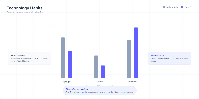
The user requested a presentation slide to visually compare the technology and device preferences of two key demographics: Millennials and Gen Z. The goal was to use a clear data visualization, specifically a clustered bar chart, to show the usage percentages for laptops, tablets, and phones. The slide needed to be animated to engage the audience and include summary callouts that interpret the data, highlighting the core behavioral differences like Millennials' multi-device usage versus Gen Z's mobile-first approach. The overall design was expected to be clean, modern, and easy to understand.
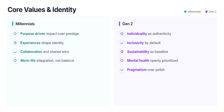
The user requested a presentation slide that visually compares the core values and identity-shaping principles of Millennials and Gen Z. The goal was to create a clear, side-by-side analysis for a business or marketing presentation. The prompt likely specified a two-column layout, with distinct color schemes to differentiate the two generations—teal for Millennials and violet for Gen Z. It would have included the specific value points for each group, such as "Purpose-driven impact" for Millennials and "Individuality as authenticity" for Gen Z. The user also required subtle animations for each point to enhance engagement and detailed speaker notes to guide the presenter.
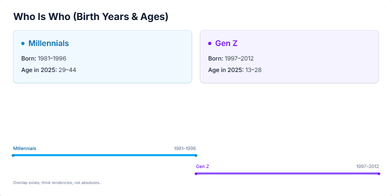
I need a presentation slide that clearly defines and compares the Millennial and Gen Z generations. The goal is to establish a shared understanding for a discussion on marketing or workplace trends. The slide should visually separate the two groups, displaying their respective birth year ranges (Millennials: 1981–1996, Gen Z: 1997–2012) and their corresponding age ranges in 2025. It should also include a simple timeline visualization to show how one generation follows the other. The design should be modern, clean, and professional, using subtle animations to present the information sequentially.
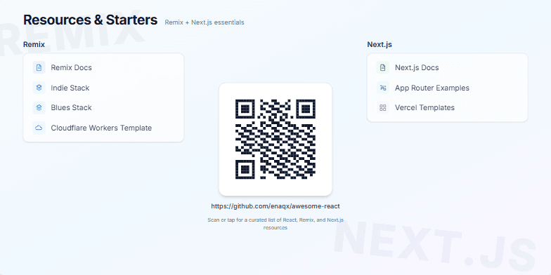
The user requested a resource slide for a technical presentation aimed at web developers. The goal was to provide a concise yet comprehensive list of essential starting points for two popular React frameworks: Remix and Next.js. The prompt specified a clean, modern, and visually appealing design that could effectively compare the resources side-by-side. A key requirement was a central, engaging call-to-action, like a QR code, that links to a more extensive, curated list of resources, encouraging audience interaction. The slide needed to be both informative for beginners and a useful reference for experienced developers evaluating these technologies.
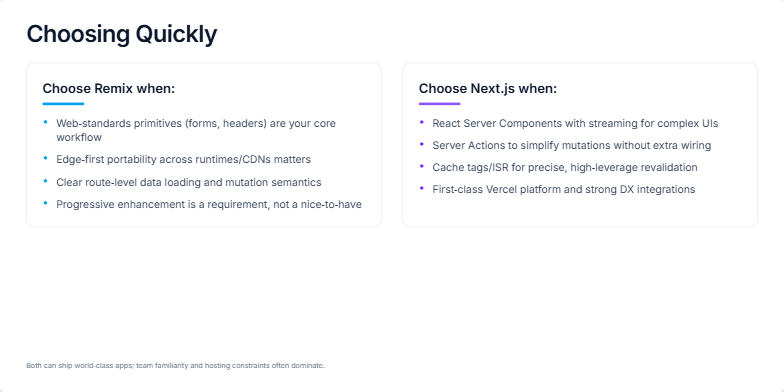
This slide is for a technical presentation aimed at web developers and engineering managers who need to decide between two popular JavaScript frameworks: Remix and Next.js. The goal is to provide a high-level, practical decision-making guide, not an exhaustive technical deep dive. It should quickly summarize the core philosophies and strengths of each framework in a visually balanced, two-column format. The content needs to highlight Remix's focus on web standards and portability, versus Next.js's emphasis on React Server Components, Server Actions, and its tight integration with the Vercel platform.
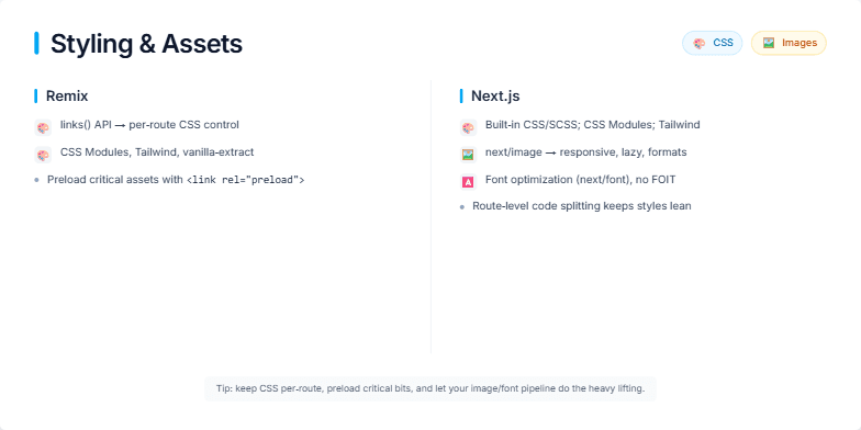
This slide is for a technical presentation aimed at web developers, comparing two popular React frameworks: Remix and Next.js. The goal is to provide a clear, side-by-side breakdown of how each framework approaches the critical aspects of web development related to styling (CSS) and asset management (images, fonts). It highlights the specific tools, APIs, and built-in optimizations each framework offers, such as Remix's `links()` API for per-route CSS control and Next.js's powerful `next/image` and `next/font` components for automated performance gains. The slide helps developers make an informed decision by contrasting the philosophies and features for building fast, visually appealing web applications.
Want to generate your own slides with AI?
Start creating high-tech, AI-powered presentations with Slidebook.