Generational Tech Divide: A Visual Analysis of Millennial vs. Gen Z Device Habits
Description provided by the user:
The user requested a presentation slide to visually compare the technology and device preferences of two key demographics: Millennials and Gen Z. The goal was to use a clear data visualization, specifically a clustered bar chart, to show the usage percentages for laptops, tablets, and phones. The slide needed to be animated to engage the audience and include summary callouts that interpret the data, highlighting the core behavioral differences like Millennials' multi-device usage versus Gen Z's mobile-first approach. The overall design was expected to be clean, modern, and easy to understand.
Start by framing the question: how do Millennials and Gen Z differ in their everyday device habits?
Point out the color legend: slate for Millennials, indigo for Gen Z.
Reveal the chart. Read it left to right:
Laptops: Millennials higher, reflecting work and productivity anchors.
Tablets: Both lower, but Millennials still ahead for browsing and casual media.
Phones: Gen Z dominates, topping the chart.
Introduce the first callout: Multi-device. Emphasize Millennials’ balance between laptops and phones, with tablets still in the mix.
Then highlight Mobile-first for Gen Z. Underscore that the phone is their primary gateway—communication, media, and tasks converge there.
Land on Short-form creation. Connect Gen Z’s phone dominance to vertical video, quick edits, and instant publishing.
Close with the implication: optimize for seamless cross-device experiences for Millennials and prioritize fast, mobile-native flows for Gen Z.
Behind the Scenes
How AI generated this slide
First, I structured the comparative data for Millennials and Gen Z across three device categories into a simple array of objects, making it easy to map over. I chose a clustered bar chart as the most effective visualization for direct, side-by-side comparison.
Next, I architected the slide using React components for modularity, creating separate components for the `BarCluster` and the `BackgroundGrid`. This approach keeps the code organized and reusable.
I then integrated `framer-motion` to add purposeful animations. The bars animate in height, and the text callouts fade and slide into view, with staggered delays to create a professional, step-by-step reveal that guides the audience's focus through the data story.
Finally, I used a clear information hierarchy and a distinct color-coding system (slate for Millennials, indigo for Gen Z) to enhance readability. The layout strategically places the title, legend, chart, and interpretive callouts to build a cohesive and compelling narrative.
Why this slide works
This slide is highly effective because it transforms a dataset into a clear and compelling visual story. The use of a clustered bar chart is a best practice for comparing multiple categories between two groups, making the insights on generational tech habits immediately accessible. The integration of `framer-motion` animations elevates the presentation by guiding the viewer's attention sequentially, preventing information overload and increasing engagement. Furthermore, the slide doesn't just show data; it explains it through strategically placed callouts ('Multi-device', 'Mobile-first'), which reinforces the key takeaways. The clean, component-based code and modern design using Tailwind CSS ensure the slide is not only visually appealing but also a high-quality asset for any presentation on digital marketing, user behavior, or generational trends.
Slide Code
You need to be logged in to view the slide code.
Frequently Asked Questions
What is the main takeaway from this Millennial vs. Gen Z tech chart?
The primary takeaway is the significant shift in primary device usage between generations. The data visualization clearly shows that Millennials exhibit a 'multi-device' behavior, balancing laptops (72%) and phones (68%) for different tasks. In contrast, Gen Z is distinctly 'mobile-first,' with phone usage (90%) far surpassing any other device, making it their central hub for communication, entertainment, and content creation. This highlights a fundamental difference in digital interaction that impacts marketing and product design.
How can I use this data for my business or marketing strategy?
This data is crucial for tailoring your digital strategy. To reach Millennials, focus on creating seamless, cross-device experiences, ensuring your website and applications function perfectly on both desktop and mobile. For Gen Z, you must prioritize a mobile-native approach. This means optimizing content for vertical video formats, ensuring fast mobile page load times, and building a strong presence on mobile-centric platforms. The 'Short-form creation' insight suggests that user-generated content campaigns and interactive mobile apps will be particularly effective with this younger audience.
Why use a clustered bar chart for this type of data visualization?
A clustered bar chart is the ideal choice here because it allows for a direct, side-by-side comparison of two distinct groups (Millennials and Gen Z) across multiple discrete categories (Laptops, Tablets, Phones). This format makes it instantly obvious which demographic has a higher preference in each category, revealing patterns like Gen Z's dominance in phone usage and Millennials' lead in laptop adoption. The visual proximity of the bars for each category simplifies the comparative analysis, making the chart intuitive and easy to interpret for any audience.
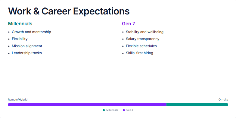
I need a presentation slide to analyze and compare the work and career expectations of two key demographics: Millennials and Gen Z. The slide should be structured to present a clear side-by-side comparison. Please create two distinct sections with bullet points outlining the primary career priorities for each generation. Visually, I want a clean and professional design. It's important to also include a data visualization, like a horizontal bar or a meter, that shows the overall preference for remote/hybrid work versus traditional on-site roles. Use a color scheme, maybe teal and violet, to differentiate the two groups. Finally, please provide comprehensive speaker notes to guide the presenter in explaining the data, the generational differences, and the key takeaways for business leaders.
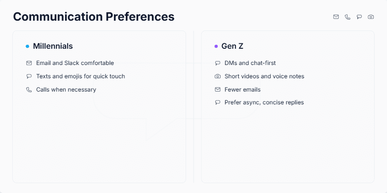
This slide was generated to visually compare the distinct communication styles of two major generations in the workforce: Millennials and Gen Z. The goal is to provide a clear, side-by-side breakdown for managers, team leads, or HR professionals. It highlights the primary channels each generation prefers, from email and calls for Millennials to DMs and short-form video for Gen Z. The slide is designed to be part of a larger presentation on improving internal communication strategies, fostering better team collaboration, and understanding generational diversity in a professional setting.
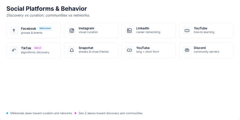
I need a slide that visually compares the social media platform preferences and behaviors of Millennials versus Gen Z. The central theme should be the contrast between two key axes: discovery versus curation, and communities versus networks. Please create two distinct rows, one for each generation. For Millennials, include Facebook, Instagram, LinkedIn, and YouTube, highlighting their use for curation and networking. For Gen Z, include TikTok, Snapchat, YouTube, and Discord, emphasizing their preference for algorithmic discovery and community building. Use icons for each platform and a clean, professional design.
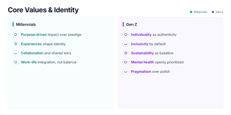
The user requested a presentation slide that visually compares the core values and identity-shaping principles of Millennials and Gen Z. The goal was to create a clear, side-by-side analysis for a business or marketing presentation. The prompt likely specified a two-column layout, with distinct color schemes to differentiate the two generations—teal for Millennials and violet for Gen Z. It would have included the specific value points for each group, such as "Purpose-driven impact" for Millennials and "Individuality as authenticity" for Gen Z. The user also required subtle animations for each point to enhance engagement and detailed speaker notes to guide the presenter.
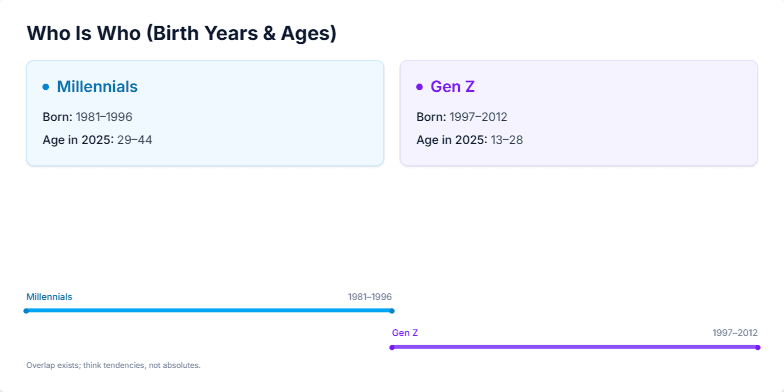
I need a presentation slide that clearly defines and compares the Millennial and Gen Z generations. The goal is to establish a shared understanding for a discussion on marketing or workplace trends. The slide should visually separate the two groups, displaying their respective birth year ranges (Millennials: 1981–1996, Gen Z: 1997–2012) and their corresponding age ranges in 2025. It should also include a simple timeline visualization to show how one generation follows the other. The design should be modern, clean, and professional, using subtle animations to present the information sequentially.
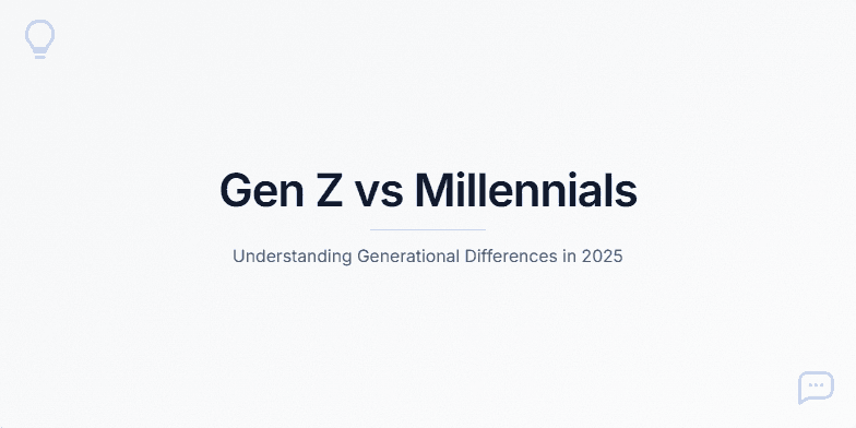
I need an introductory slide for a presentation on the differences between Gen Z and Millennials. The tone should be modern, clean, and data-driven, not stereotypical. The design should be minimalist with a light background, perhaps a subtle texture, and a single accent color like blue. The main title should be 'Gen Z vs Millennials' and the subtitle should be 'Understanding Generational Differences in 2025'. I also need some speaker notes to set the stage for a balanced, nuanced discussion, outlining the topics that will be covered like work styles, communication, and technology habits.
Want to generate your own slides with AI?
Start creating high-tech, AI-powered presentations with Slidebook.