Debunking Generational Stereotypes: A Myths vs. Realities Analysis of Gen Z and Millennials
Description provided by the user:
I need a presentation slide for a business or marketing strategy meeting. The slide should tackle common generational stereotypes, specifically about Gen Z and Millennials. I want a 'Myths vs. Realities' format presented in a clean, professional two-column table. Use a red 'X' icon for myths and a green checkmark '✓' for realities. The design should be modern and engaging, with a clear title and a legend. Each myth/reality pair should be revealed one by one to keep the audience focused. Please include four examples: two for Gen Z (attention span, online life) and two for Millennials (entitlement, communication preferences).
Open by reframing: this isn’t about calling out generations—it’s about replacing lazy myths with useful reality.
Point to the header: the red X marks a myth, the green check marks a reality. We’ll reveal each pair in sequence.
First: “Gen Z has no attention span.” Clarify that Gen Z rapidly filters noise but invests when something matters; design for relevance and depth.
Second: “Millennials are entitled.” Reframe with context—many launched careers during recessions and upheaval; resilience shaped expectations.
Third: “Gen Z only lives online.” Emphasize their desire for in-person connection and community; hybrid, not digital-only.
Fourth: “Millennials hate phone calls.” It’s not avoidance—it’s choosing the best medium for the job; align channel with urgency and nuance.
Close with a takeaway: build strategies around behaviors and context, not stereotypes.
Behind the Scenes
How AI generated this slide
The AI first conceptualizes the core theme: 'Myths vs. Realities' applied to generational stereotypes. It establishes a clear visual language using contrasting colors (rose for myth, emerald for reality) and icons (×, ✓) for immediate comprehension.
A two-column grid layout is chosen for the main content area to facilitate a direct, side-by-side comparison, enhancing clarity and readability. This structure is implemented using Tailwind CSS's `grid grid-cols-2`.
The slide is structured into a header and a main content block. The header contains the title ('Myths vs Realities'), a subtitle for context, and a legend to explain the icons, ensuring the audience understands the format upfront.
Sequential animation is implemented using Slidebook's `<Fragment>` component and Framer Motion's `<motion.div>`. Each `Row` is wrapped in a `<Fragment>`, allowing it to appear individually. A subtle `spring` animation (opacity and y-axis movement) is added to make the appearance of each point smooth and engaging.
A reusable `Row` component is created in React to maintain consistency and simplify the code. This component accepts props for the myth, reality, and index, and conditionally adds a top border to visually separate the items.
Comprehensive speaker notes are generated to guide the presenter. These notes provide deeper context for each point, suggest how to frame the discussion, and offer a powerful concluding message, transforming the slide from a simple visual aid into a full storytelling tool.
Why this slide works
This slide is highly effective because it transforms complex social commentary into a digestible and visually compelling format. The clear 'Myth vs. Reality' structure, reinforced by strong color-coding and iconography, makes the information easy to process. The use of Framer Motion for row-by-row animation is a key strength; it controls the narrative pace, prevents the audience from reading ahead, and ensures each point is absorbed before moving to the next. The component-based React structure and utility-first Tailwind CSS styling create a clean, modern, and maintainable design. By providing nuanced, realistic counterpoints to common stereotypes, the slide offers genuine insight, making it valuable for business strategy, team building, and marketing presentations.
Slide Code
You need to be logged in to view the slide code.
Frequently Asked Questions
What is the benefit of animating each row separately in a list-based slide?
Animating each row individually, a technique known as 'staggering' or 'sequential reveal,' significantly enhances audience engagement and comprehension. It allows the presenter to control the flow of information, focusing attention on a single point at a time. This prevents cognitive overload that can occur when a dense list of text appears all at once. By using Framer Motion and Slidebook's Fragment component, each myth/reality pair gets its moment, making the presentation more dynamic, conversational, and memorable.
How does this slide's design effectively communicate its message?
The design's effectiveness lies in its clarity and strong visual hierarchy. It uses a simple two-column grid, which is an intuitive layout for comparison. The consistent use of color (rose red for negative/myth, emerald green for positive/reality) and universal icons (×, ✓) acts as a powerful visual shorthand, allowing the audience to quickly grasp the concept without extensive reading. The clean typography, ample white space, and subtle container styling (rounded corners, light ring) contribute to a professional and modern aesthetic that builds credibility and keeps the focus on the content.
Why is debunking generational stereotypes important in a business context?
In a business context, challenging generational stereotypes is crucial for effective marketing, management, and team collaboration. Relying on myths leads to flawed strategies, poor communication, and missed opportunities. This slide demonstrates that by replacing broad generalizations (e.g., 'Gen Z has no attention span') with nuanced realities (e.g., 'They filter quickly'), businesses can develop more effective communication channels, create more relevant products, and foster a more inclusive and productive multigenerational workforce. It shifts the focus from inaccurate labels to actionable behavioral insights.
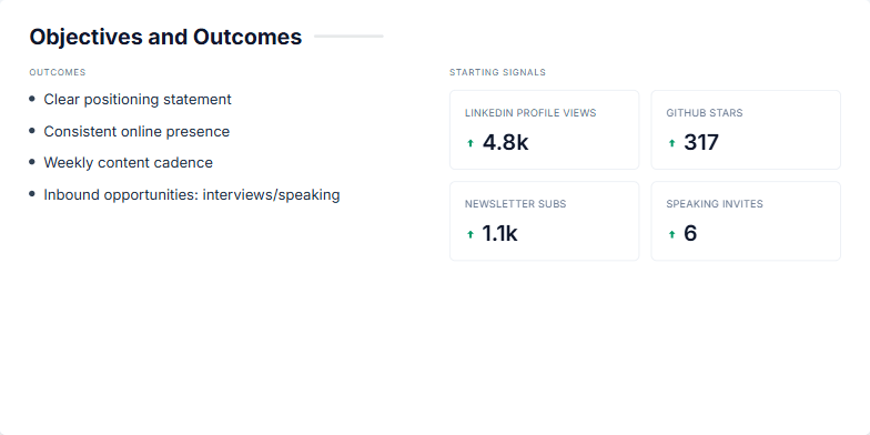
The user requested a slide for a strategic business presentation. The goal was to clearly define the objectives for a new initiative, likely related to personal branding or content marketing for a tech-focused individual or company. The slide needed to present both the high-level qualitative goals (the 'outcomes') and the initial quantitative metrics (the 'starting signals') that would be used to track progress. The design should be clean, professional, and visually engaging to communicate the plan effectively to stakeholders or a team.
I need a title slide for a presentation aimed at software engineers about the importance of building a personal brand. The tone should be professional, modern, and clean. The main title is 'Personal Brand Development for Software Engineers'. I also want a subtitle that summarizes the key pillars: 'Clarity • Credibility • Opportunity'. Please use a light, professional color palette, perhaps with a subtle tech-themed background texture. Add a simple, abstract graphic element that subtly hints at coding. The animations should be smooth and elegant, not distracting.
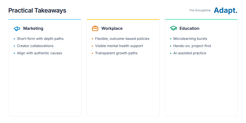
I need a summary slide that presents actionable takeaways for adapting to modern trends. Please structure it into three distinct columns: Marketing, Workplace, and Education. Each column should feature a relevant icon and three concise bullet points outlining key strategies. The overall design should be clean and professional, with a clear title. A crucial element is to have a final, overarching theme that ties all the points together, revealed at the end of the animation sequence. The central theme should be 'Adapt.'
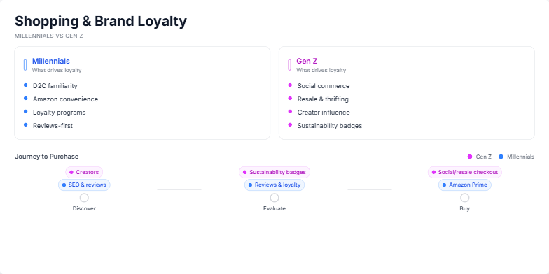
The user requested a slide that visually compares the consumer habits of two key demographics: Millennials and Gen Z. The goal was to create a clear, data-driven presentation slide for a marketing or business strategy meeting. The slide needed to break down what drives brand loyalty for each group and then map out their distinct paths to purchase, from discovery to the final transaction. The design should be modern, easy to understand at a glance, and use color-coding to differentiate the two cohorts, ultimately highlighting the need for tailored marketing strategies.
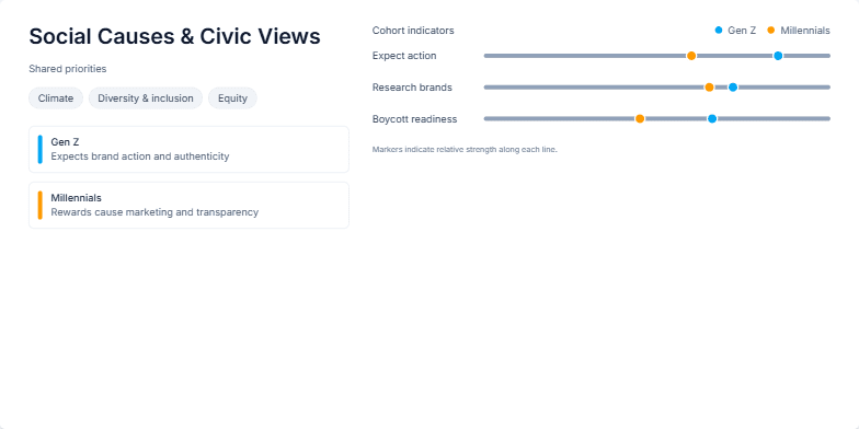
I'm creating a presentation for a marketing team about consumer behavior. I need a slide that compares Gen Z and Millennials on their engagement with social and civic issues. It should start by highlighting their shared values, such as climate and diversity. Then, it needs to visually contrast their expectations from brands using specific data points. Please create a clean, modern design with a chart that clearly shows how the two generations differ on metrics like expecting brand action, researching brands, and their readiness to boycott.
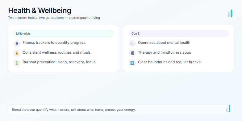
Create a presentation slide that compares the health and wellness habits of Millennials versus Gen Z. The design should be clean, modern, and professional. Use a two-column layout to present the distinct approaches of each generation. For Millennials, focus on themes like fitness tracking, structured routines, and burnout prevention. For Gen Z, highlight their focus on mental health, digital therapy tools, and setting boundaries. Include a title, a brief subtitle, and a concluding summary that suggests a blended approach is best. Add subtle animations to make the slide engaging, and include some decorative elements that fit the health theme.
Want to generate your own slides with AI?
Start creating high-tech, AI-powered presentations with Slidebook.