Create a slide showcasing a design system, including tokens (typography, color), components (button, input, card), states (hover, focus, error), and light/dark mode previews. The slide should have a title 'Design System' with a subtitle 'Foundations and key components'. The design system uses Inter font with size 16 and line height 24 for the body text. The primary color is blue. Include speaker notes explaining the design system's purpose to reduce decision fatigue and speed up delivery while maintaining quality. Also, explain how tokens, components, states, and themes work together. The layout should be clean and informative, suitable for a presentation.
First, frame the purpose: this is our design system as a product. It reduces decision fatigue and speeds up delivery while keeping quality high.
Move to the Tokens tile: point out the type scale with a simple body specimen, the accent blue, neutrals, and semantic chips. Hover over spacing to reveal 8, 16, 24, 32 — these are the primitives everything is built on.
Next, components: show the button variants, inputs, and a compact card. Emphasize that these are composable, accessible by default, and driven by tokens.
Then, states: highlight hover as discoverability, focus for accessibility, and error for clarity. Note that these are consistent across components.
Finally, the light/dark preview: the same components adapt seamlessly. The tokens drive contrast, surfaces, and elevation so themes stay consistent.
Close with the idea: foundations first, then components, then states, then themes — one system, many expressions.
Behind the Scenes
How AI generated this slide
Establish slide layout with title and subtitle: 'Design System' and 'Foundations and key components'.
Divide content into four quadrants for Tokens, Components, States, and Light/Dark Mode.
Populate 'Tokens' with typography (Inter font details) and color palette (blue accent, neutrals, semantic colors).
Design basic components: button (primary, secondary), input field (placeholder, value), and a card with placeholder content.
Illustrate component states: hover effect on the button, focus on the input field, and error state within the input field.
Create Light and Dark mode previews showcasing component adaptations based on defined tokens.
Implement animations using Framer Motion for tile transitions and enhance visual appeal.
Add speaker notes detailing the design system's purpose, benefits, and how it unifies design elements.
Why this slide works
This slide effectively presents a comprehensive overview of a design system. The structured layout with distinct sections for tokens, components, states, and themes facilitates clear communication. Visual examples and concise descriptions ensure quick understanding of the system's key elements. The use of animations adds a polished touch and improves engagement. The speaker notes provide valuable context and guide the presentation flow, emphasizing the system's purpose and benefits. The code utilizes a modern React framework with optimized components and styling for maintainability and scalability. The choice of a popular UI library like Tailwind CSS simplifies styling and responsiveness, while Framer Motion adds smooth transitions. The clear structure and comprehensive information make this slide an effective tool for communicating and showcasing a design system to stakeholders.
Slide Code
You need to be logged in to view the slide code.
Frequently Asked Questions
What is a design system?
A design system is a collection of reusable components, guided by clear standards, that can be assembled together to build any number of applications. It streamlines design and development workflows, ensuring consistency and efficiency across projects.
Why are design systems important?
Design systems promote consistency, improve collaboration between designers and developers, accelerate development speed, reduce design debt, and ensure a cohesive user experience across different platforms and products.
What are design tokens?
Design tokens are the smallest, indivisible building blocks of a design system. They are named entities that store visual design attributes such as color palettes, typography, spacing, and animation values. Using tokens helps maintain consistency and allows for easy updates across a project.
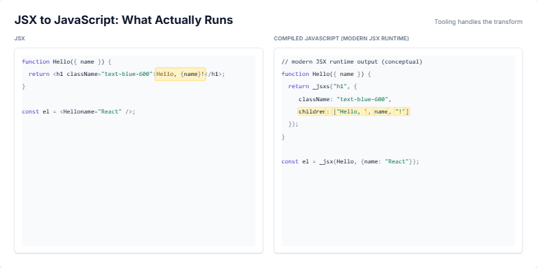
Create a slide visualizing the transformation of JSX code into its compiled JavaScript equivalent. The slide should emphasize that JSX is not a runtime feature but syntax sugar processed by tooling. It should have two code blocks side-by-side, one for JSX and one for compiled JavaScript. Use syntax highlighting to visually represent the code elements. Animate the slide to sequentially highlight corresponding parts of the JSX and its compiled counterpart. Start by highlighting the tags (e.g., 'h1'), then props (e.g., 'className', 'name'), and finally, children. Aim for a modern JSX runtime output. The title should be 'JSX to JavaScript: What Actually Runs', with a subtitle 'Tooling handles the transform'. The initial state should have opacity 0 and y-offset 8, animating to opacity 1 and y-offset 0. The code should include a functional component example, demonstrating the conversion.
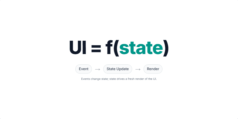
Create a slide explaining the core concept of React, that UI is a function of state. The slide should visually represent the formula UI = f(state) and illustrate how events trigger state updates, leading to UI re-renders. It should emphasize declarative programming over direct DOM manipulation. The animation should first show the formula, then the word 'state' should be highlighted, followed by a flow diagram illustrating Event → State Update → Render. The speaker notes should guide the presenter through these steps, explaining the concept clearly.
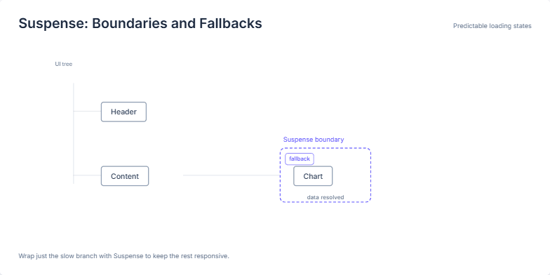
This slide visually explains the concept of Suspense boundaries and fallbacks in React, specifically for handling asynchronous operations and loading states. It demonstrates how Suspense allows developers to isolate slow-loading components (like a chart fetching data) and provide a fallback UI (like a loading indicator) while the data loads. This keeps the rest of the application responsive and provides a better user experience. The slide uses a simplified UI tree to illustrate the relationship between the parent component, the Suspense boundary, the loading component, and the fallback UI. The animation shows the transition from the fallback to the loaded component, emphasizing the predictable and localized nature of the loading state. The speaker notes provide a step-by-step explanation of the slide's elements and key takeaways about using Suspense for efficient loading management in React applications.
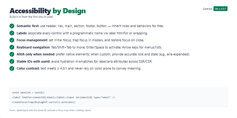
Create a slide about building accessible web applications from the ground up. The slide should emphasize practical techniques and best practices for incorporating accessibility into the development process. It should cover topics like semantic HTML, proper labeling, focus management, keyboard navigation, and ARIA attributes. The target audience is web developers, and the tone should be informative and encouraging. Include a code example demonstrating best practices for associating labels with inputs and managing focus traps.
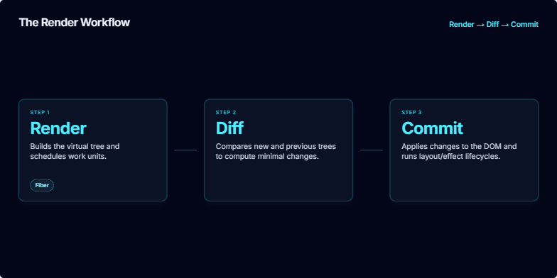
Create a slide explaining the render workflow in React, including the render, diff, and commit phases. It should be visually appealing and easy to understand. The slide should also include speaker notes explaining the process in more detail, highlighting the Fiber architecture for cooperative scheduling and how it impacts rendering performance. It should also mention the importance of this mental model for debugging. The target audience are developers who have some understanding of React.
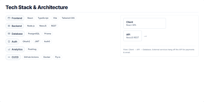
Create a slide visualizing the tech stack and architecture for a web application. The frontend uses React, TypeScript, Vite, and Tailwind CSS. The backend is built with Node.js and NestJS, using a REST API. PostgreSQL is the database, accessed via Prisma. Authentication is handled with OAuth2, JWT, and Auth0. PostHog is used for analytics. The CI/CD pipeline involves GitHub Actions, Docker, and Fly.io. The architecture diagram should show the client (React SPA), API (NestJS REST), and database (PostgreSQL). It should also highlight integrations with Stripe and SendGrid, emphasizing that these external services interact with the API, not directly with the client or database. The flow should be clearly illustrated: Client → API → Database, with integrations decoupled and accessible through the API.
Want to generate your own slides with AI?
Start creating high-tech, AI-powered presentations with Slidebook.