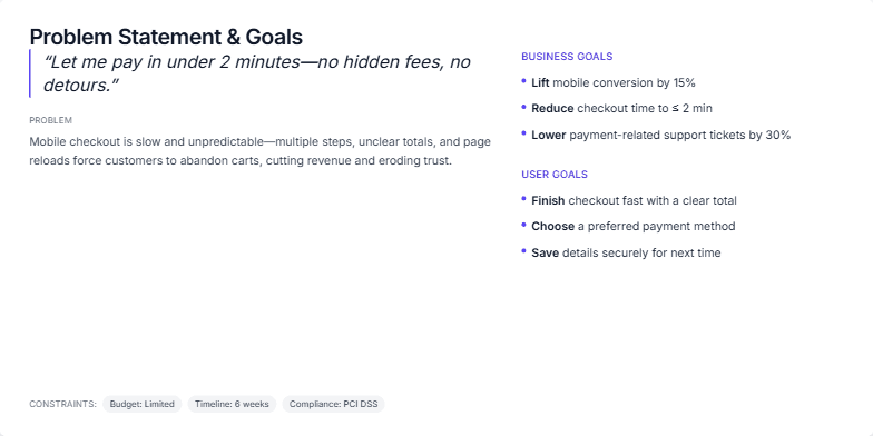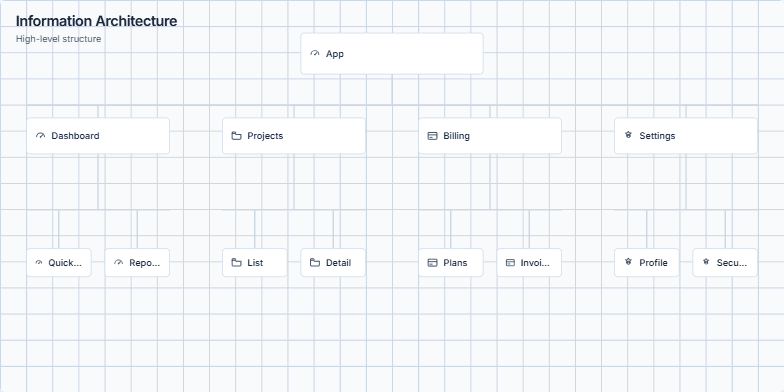
Visualizing Information Architecture for Enhanced User Experience
Create a slide visualizing the information architecture of a web application. The visualization should depict a hierarchical structure with the main app at the top, branching into four primary sections (Dashboard, Projects, Billing, Settings). Each section further expands into 1-2 core tasks (e.g., Dashboard -> Quick Stats, Reports). The visual style should be clean and minimal, using boxes for elements and lines to represent connections. Include tooltips on hover to provide brief descriptions of each element. The overall message should emphasize how clear information architecture improves navigation and reduces cognitive load for users.